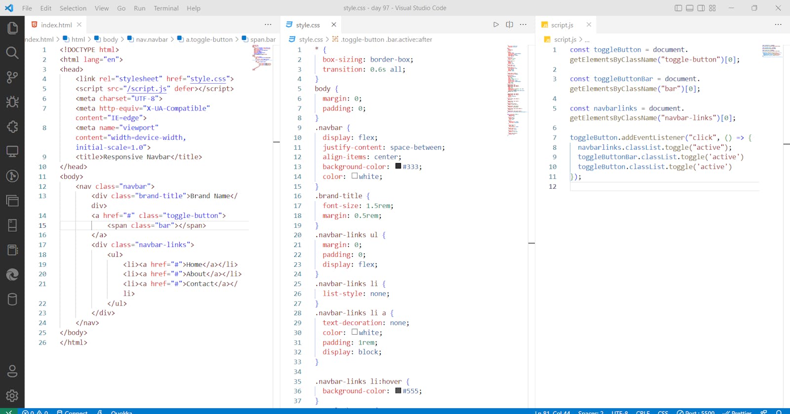
Today #Day97 of #100DaysOfCode, I am coding and explaining by 'Building Responsive Navbar in CSS and JS' taught by [WebDevSimplified].
HTML
create an HTML file with a boilerplate HTML code and import style sheet,
Give defer attribute to script tag to make it render after the HTML file has rendered,
<!DOCTYPE html>
<html lang="en">
<head>
    <link rel="stylesheet" href="style.css">
    <script src="/script.js" defer></script>
    <meta charset="UTF-8">
    <meta http-equiv="X-UA-Compatible" content="IE=edge">
    <meta name="viewport" content="width=device-width, initial-scale=1.0">
    <title>Responsive Navbar</title>
</head>
<body>

</body>
</html>
use the nav element with class,
classes are given to this element to reference it in the CSS,
<nav class="navbar">
</nav>
create sections for brand titles and for all buttons,
<div class="brand-title">Brand Name</div>
create another section containing all the navbar links,
<div class="navbar-links">
</div>
inside this div put an unordered list ul tag as child links,
the hash is given because right now we are not giving any links,
<ul>
<li><a href="#">Home</a></li>
<li><a href="#">About</a></li>
<li><a href="#">Contact</a></li>
</ul>
Marking Hamburger Menue,
the reason why we put this as a sibling to the brand title div is because we want this to appear next to this brand title div,
<a href="#" class="toggle-button">
<span class="bar"></span>
<span class="bar"></span>
<span class="bar"></span>
</a>
CSS
styling for the desktop viewport,
border-box property sizing will make sizing widths easier
* {
    box-sizing: border-box;
}

body {
    margin: 0;
    padding: 0;
}
Now, styling the navbar
display flex property will align the divs side by side
Justify content space between will put push them far
.navbar {
    display: flex;
    position: relative;
    justify-content: space-between;
    align-items: center;
    background-color: #333;
    color: white;
}
styling the brand title div,
give this dev a little bit of margin as in the previous case you have given the body elements margin as zero,
.brand-title {
    font-size: 1.5rem;
    margin: .5rem;
}
styling the navbar links div
display flex property will align the items inside ul tag side by side
.navbar-links ul{
    margin: 0;
    padding: 0;
    display: flex;
}
style the navbar links itself,
list-style none will remove the dots,
.navbar-links li{
    list-style: none;
}
new styling all the a tags.
.navbar-links li a {
    display: block;
    text-decoration: none;
    color: white;
    padding: 1rem;
}
adding hover effect,
.navbar-links li:hover {
    background-color: #555;
}
add the HTML hamburger menue,
Now, styling the menu,
position absolute will bring it out without disturbing the other divs which are the brand name div and the navbar links div,
display none is given by default we want this to appear only on smaller screens,
flex-direction column will make them column-wise,
.toggle-button {
    position: absolute;
    top: .75rem;
    right: 1rem;
    display: none;
    flex-direction: column;
    justify-content: space-between;
    width: 30px;
    height: 21px;
}
style the bars,
.toggle-button .bar {
    height: 3px;
    width: 100%;
    background-color: white;
    border-radius: 10px;
}
now styling the responsiveness using media queries,
@media (max-width:400px) {
    .toggle-button{
        display: flex;
    }
    .navbar-links{
        display: none;
    }
}
Now, styling the nav bar links to appear below,
the flex-direction column will make them appear below,
align-items flex start property will make them start from left,
.navbar{
        flex-direction: column;
        align-items: flex-start;
}
styling the navbar links to make them appear at the center
 .navbar-links ul {
        width: 100%;
        flex-direction: column;
}

    .navbar-links ul li {
        text-align: center;
}
removing the padding
.navbar-links ul li a {
        padding: .5rem 1rem;
}
adding class list active so that we can add it dynamically in JavaScript,
 .navbar-links.active {
        display: flex;
}
JavaScript
Now,
select the toggle button and nav bar links and
add event listener to the toggle button and
then add the class list to the nav bar links,
the reason why we are using the index zero is because to pick the first index returning returned array,
yes even though the array is of length one because there is only one class with toggle button but it will return an array, same goes for the navbar links class,
const toggleButton = document.getElementsByClassName('toggle-button')[0]
const navbarLinks = document.getElementsByClassName('navbar-links')[0]

toggleButton.addEventListener('click', () => {
  navbarLinks.classList.toggle('active')
})
Conclusion
I completed 'Building Responsive Navbar in CSS and JS'. Learned how to use CSS flex property and how to use media queries and add class list in JS.
Code
code

preview

preview 2 mobile view


