


Today #Day66 of #100DaysOfCode, I build a CSS project and got familiar with JavaScript.
JavaScript closures
The environment surrounding the function is called the lexical environment.
The closure is combination of the function definition and its surrounding references
In other words, a closure gives you access to an outer function's scope from an inner function.
In JavaScript, closures are created every time a function is created, at function creation time.
function logfun(message){
    return ()=>{
        console.log(`${message}`)
    }
}
const alertMom = logfun('hi mom')

alertMom()


for(let i =0;i<3;i++){
    const log =()=>{
        console.log(i)
    }
    setTimeout(log,100)
} // 0 1 2
console.log(i) //error

for(var i =0;i<3;i++){
    const log =()=>{
        console.log(i)
    }
    setTimeout(log,100)
} // 3 3 3
console.log(i) //3

let i =0
for(i ;i<3;i++){
    const log =()=>{
        console.log(i)
    }
    setTimeout(log,100)
} // 3 3 3
console.log(i) //3
Code: closures [link]
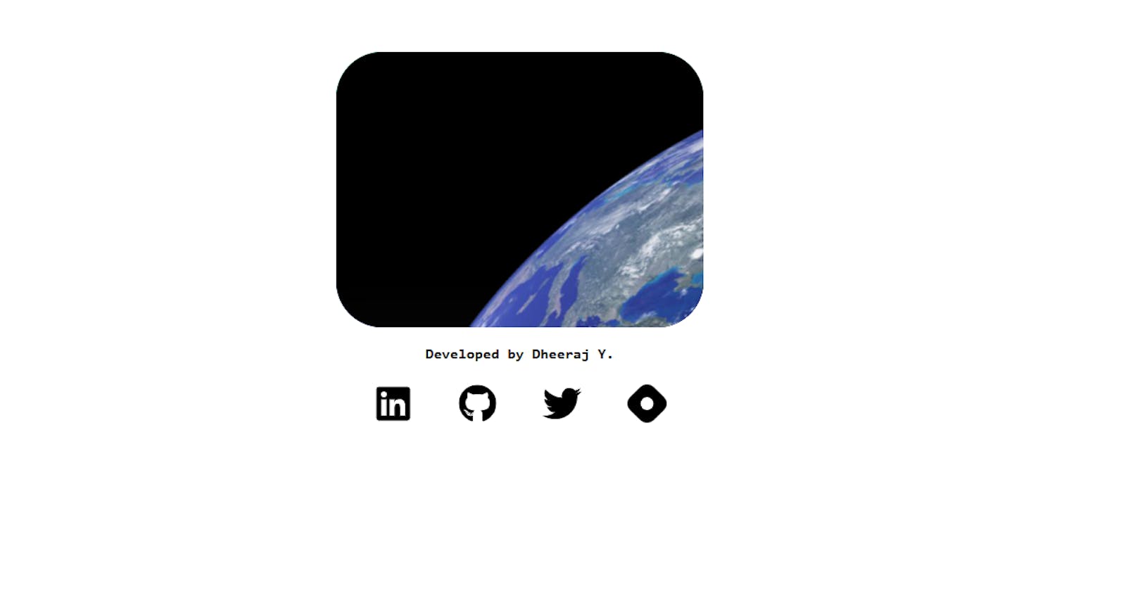
Now, I am going to create a CSS project to display an image and display a text when the mouse hovered.
HTML
Create a Div with a class main container to encapsulate all the other elements,
Then create a div for a gradient background,
Inside this div create a container card by giving a div element,
Now, create a div for the image and another div for the content,
<div class="main-container">
        <div class="grad-card">
            <div class="container-card">
                <div class="image">
                    <img src="/earth.png" alt="">
                </div>
                <div class="card-socials">
                    Dheeraj.Y
                </div>
            </div>
        </div>
</div>
CSS
The CSS code is shown below,
* {
  transition: all 0.6s;
}
body {
  margin: 0;
  height: 100%;
  background-color: rgb(255, 255, 255);
}
.main-container {
  display: flex;
  align-items: center;
  justify-content: center;
  margin-top: 25vh;
}
.grad-card {
  width: 20em;
  height: 15em;
  border-radius: 40px;
  background-image: linear-gradient(163deg, #00ff75 0%, #3700ff 100%);
  overflow: hidden;
  transform: translateX(-180px);
}
.grad-card:hover {
  box-shadow: 0px 0px 30px 1px rgba(0, 255, 117, 0.3);
  transform: scale(1.1);
  height: 20em;
  transform: translateX(-180px);
}
.container-card {
  /* background-color: cornsilk; */
  border-radius: 40px;
  overflow: hidden;
}
.image {
  width: 20em;
  height: 15em;
  background-color: rgb(0, 0, 0);
  transition: all 0.6s;
  overflow: hidden;
}
img {
  animation-name: earthmove;
  animation-duration: 120s;
  transform: rotate(0deg);
  animation-iteration-count: infinite;
}

.card-socials {
  padding: 4%;
  background-color: rgb(255, 255, 255);
  box-shadow: 15px 15px 30px rgba(25, 25, 25, 0.11),
    -15px -15px 30px rgba(60, 60, 60, 0.082);
  height: 3.4em;
}
.container-card:hover {
  transform: scale(0.98);
}
@keyframes earthmove {
  from {
    transform: translateX(0px);
    transform: translateY(0px);
    transform: rotate(0deg);
  }
  to {
    transform: translateX(80px);
    transform: translateY(50px);
    transform: rotate(360deg);
  }
}
Conclusion
I learned JavaScript closure and completed a CSS project.
JS closures
CSS keyframes
CSS animations
CSS Display flex
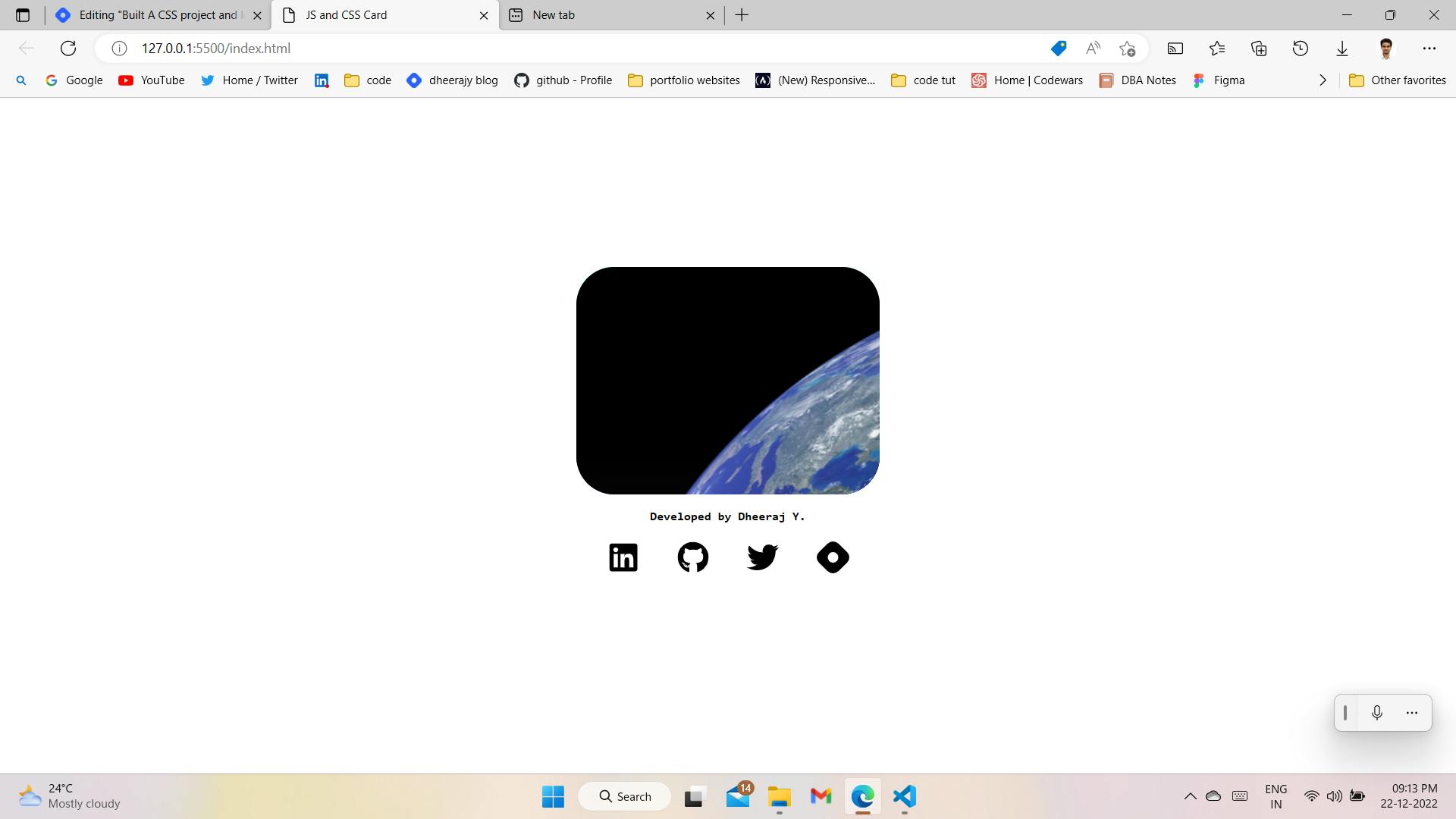
My code:
Code
Preview

Video of project link