


Table of contents
- Overview:
- Skills measured
- I. Module 1 Discover data analysis
- II. Module 2 Get started building with Power BI
- III. Module 3 Get data in Power BI
- 1. Introduction
- 2. Get data from files
- 3. Get data from relational data sources
- 4. Create dynamic reports with parameters
- 5. Create dynamic reports for multiple values
- 6. Get data from a NoSQL database
- 7. Get data from online services
- 8. Select a storage mode
- 9. Get data from Azure Analysis Services
- 10. Fix performance issues
- 11. Resolve data import errors
- 12. Exercise - Prepare data in Power BI Desktop
- 13. Check your knowledge
- 14. Summary
- Learning objectives
- IV. Module 4 Clean, transform, and load data in Power BI
- 1. Introduction
- 2. Shape the initial data
- 3. Simplify the data structure
- 4. Evaluate and change column data types
- 5. Combine multiple tables into a single table
- 6. Profile data in Power BI
- 7. Use Advanced Editor to modify M code
- 8. Exercise - Load data in Power BI Desktop
- i. Configure the Salesperson query
- ii. Configure the SalespersonRegion query
- iii. Configure the Product query
- iv. Configure the Reseller query
- v. Configure the Region query
- vi. Configure the Sales query
- vii. Configure the Targets query
- viii. Configure the ColorFormats query
- ix. Update the Product query
- x. Update the ColorFormats query
- xi. Finish up
- 9. Check your knowledge
- 10. Summary
- Learning objectives
- V. Module 5 Design a semantic model in Power BI
- 1. Introduction
- 2. Work with tables
- 3. Create a date table
- 4. Work with dimensions
- 5. Define data granularity
- 6. Work with relationships and cardinality
- 7. Resolve modeling challenges
- 8. Exercise - Model data in Power BI Desktop
- i. Create model relationships
- ii. Configure Tables
- iii. Configure the Product table
- iv. Configure the Region table
- v. Configure the Reseller table
- vi. Configure the Sales table
- vii. Bulk update properties
- viii. Review the Model Interface
- ix. Review the model interface
- x. Create Quick Measures
- xi. Create quick measures
- xii. Create a many-to-many relationship
- xiii. Relate the Targets table
- 9. Check your knowledge
- 10. Summary
- Learning objectives
- VI. Module 6 Add measures to Power BI Desktop models
- VII. Module 7 Add calculated tables and columns to Power BI Desktop models
- VIII. Module 8 Use DAX time intelligence functions in Power BI Desktop models
- IX. Module 9 Optimize a model for performance in Power BI
- 1. Introduction to performance optimization
- 2. Review performance of measures, relationships, and visuals
- 3. Use variables to improve performance and troubleshooting
- 4. Reduce cardinality
- 5. Optimize DirectQuery models with table level storage
- 6. Create and manage aggregations
- 7. Check your knowledge
- 8. Summary
- Learning objectives
- X. Module 10 Design Power BI reports
- 1. Introduction
- 2. Design the analytical report layout
- 3. Design visually appealing reports
- 4. Report objects
- 5. Select report visuals
- 6. Select report visuals to suit the report layout
- 7. Format and configure visualizations
- 8. Work with key performance indicators
- 9. Exercise - Design a report in Power BI desktop
- 10. Check your knowledge
- 11. Summary
- Learning objectives
- XI. Module 11 Configure Power BI report filters
- 1. Introduction to designing reports for filtering
- 2. Apply filters to the report structure
- 3. Apply filters with slicers
- 4. Design reports with advanced filtering techniques
- 5. Consumption-time filtering
- 6. Select report filter techniques
- 7. Case study - Configure report filters based on feedback
- 8. Check your knowledge
- 9. Summary
- Learning objectives
- XII. Module 12 Enhance Power BI report designs for the user experience
- 1. Design reports to show details
- 2. Design reports to highlight values
- 3. Design reports that behave like apps
- 4. Work with bookmarks
- 5. Design reports for navigation
- 6. Work with visual headers
- 7. Design reports with built-in assistance
- 8. Tune report performance
- 9. Optimize reports for mobile use
- 10. Exercise - Enhance Power BI reports
- i. Lab story
- ii. Get started – Sign in
- iii. Get started – Open report
- iv. Sync slicers
- v. Configure drill through
- vi. Create a drill through page
- vii. Add Conditional Formatting
- viii. Add conditional formatting
- ix. Add Bookmarks and Buttons
- x. Add bookmarks
- xi. Add buttons
- xii. Publish the report
- xiii. Explore the report
- 11. Check your knowledge
- 12. Summary
- Learning objectives
- XIII. Module 13 Perform analytics in Power BI
- 1. Introduction to analytics
- 2. Explore statistical summary
- 3. Identify outliers with Power BI visuals
- 4. Group and bin data for analysis
- 5. Apply clustering techniques
- 6. Conduct time series analysis
- 7. Use the Analyze feature
- 8. Create what-if parameters
- 9. Use specialized visuals
- 10. Exercise - Perform Advanced Analytics with AI Visuals
- 11. Check your knowledge
- 12. Summary
- Learning objectives
- XIV. Module 14 Create and manage workspaces in Power BI
- XV. Module 15 Manage semantic models in Power BI
- 1. Introduction
- 2. Use a Power BI gateway to connect to on-premises data sources
- 3. Configure a semantic model scheduled refresh
- 4. Configure incremental refresh settings
- 5. Manage and promote semantic models
- 6. Troubleshoot service connectivity
- 7. Boost performance with query caching (Premium)
- 8. Check your knowledge
- 9. Summary
- Learning objectives
- XVI. Module 16 Create dashboards in Power BI
- 1. Introduction to dashboards
- 2. Configure data alerts
- 3. Explore data by asking questions
- 4. Review Quick insights
- 5. Add a dashboard theme
- 6. Pin a live report page to a dashboard
- 7. Configure a real-time dashboard
- 8. Set mobile view
- 9. Exercise - Create a Power BI dashboard
- 10. Check your knowledge
- 11. Summary
- Learning objectives
- XVI. Module 17 Implement row-level security
- Conclusion
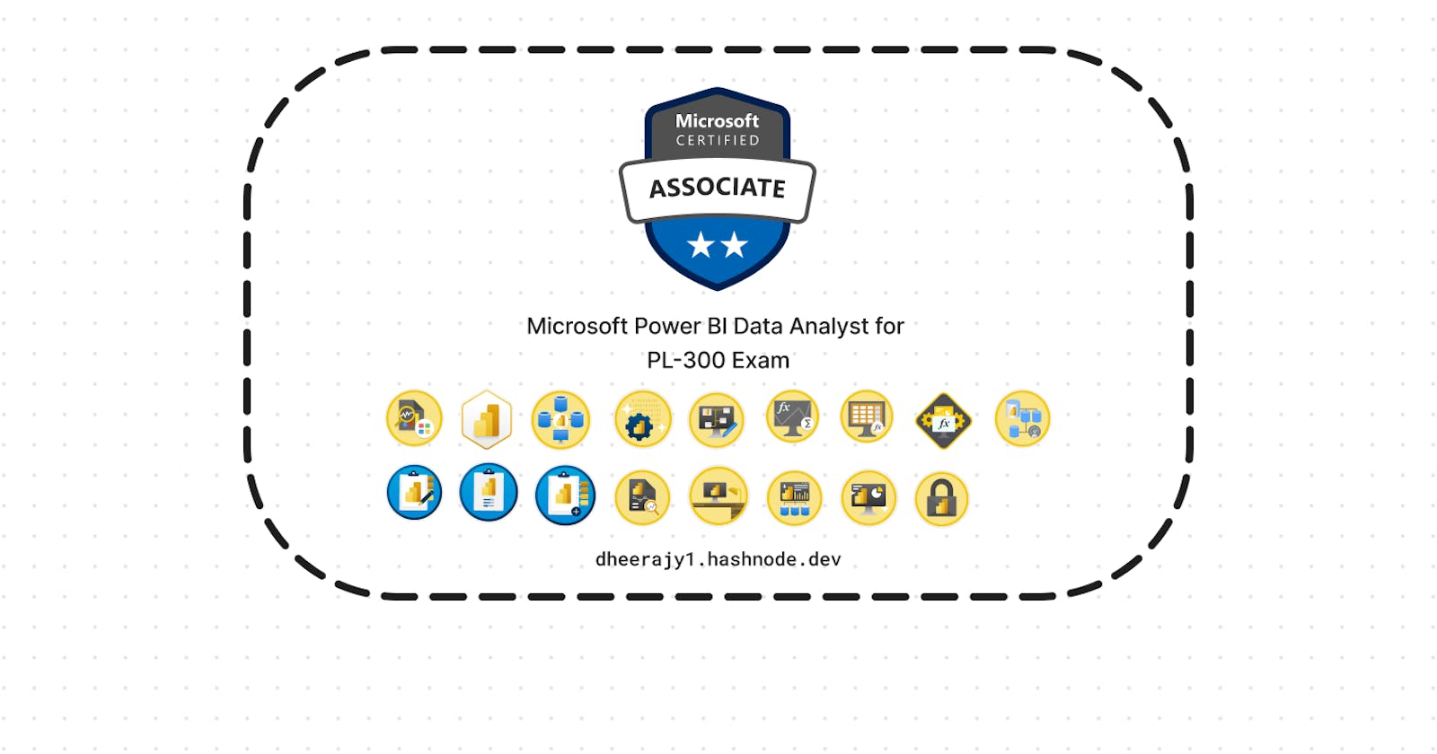
- Source: Microsoft Power BI Data Analyst [Link]
- Author: Dheeraj.Yss
- Connect with me:
In this article, contains info about #MicrosoftPowerBIDataAnalyst and get prepared about for Exam PL-300.
Foreword:
The entire content is owned by Microsoft, and I am logging for practice and it is for educational purposes only.
All presented information is owned by Microsoft and intended solely for learning about the covered products and services in my Microsoft Learn AI Skills Challenge: Fabric Analytics Engineer Journey.
Overview:
This course covers the various methods and best practices that are in line with business and technical requirements for
modeling,
visualizing, and
analyzing data with Power BI.
The course will show how to access and process data from a range of data sources including both relational and non-relational sources.
Finally, this course will also discuss how to manage and deploy reports and dashboards for sharing and content distribution.
As a candidate for this "Microsoft Power BI Data Analyst" certification, you should deliver actionable insights by working with available data and applying domain expertise.
You should:
Provide meaningful business value through easy-to-comprehend data visualizations.
Enable others to perform self-service analytics.
Deploy and configure solutions for consumption.
As a Power BI data analyst, you work closely with business stakeholders to identify business requirements.
You collaborate with enterprise data analysts and data engineers to identify and acquire data.
You use Power BI to:
Transform the data.
Create data models.
Visualize data.
Share assets.
You should be proficient at using Power Query and writing expressions by using Data Analysis Expressions (DAX).
You know how to assess data quality. Plus, you understand data security, including row-level security and data sensitivity.
Skills measured
Prepare the data
Model the data
Visualize and analyze the data
Deploy and maintain assets
| Course | Microsoft Power BI Data Analyst |
| Module 17 |
I. Module 1 Discover data analysis

| Course | Microsoft Power BI Data Analyst |
| Module 1/17 | Discover data analysis |
Would you like to explore the journey of a data analyst and learn how a data analyst tells a story with data?
1. Introduction
As a data analyst, you are on a journey.
With data and information as the most strategic asset of a business, the underlying challenge that organizations have today is understanding and using their data to positively effect change within the business.
Businesses continue to struggle to use their data in a meaningful and productive way, which impacts their ability to act.
You need to be able to look at the data and facilitate trusted business decisions. Then, you need the ability to look at metrics and clearly understand the meaning behind those metrics.
Data analysis exists to help overcome these challenges and pain points, ultimately assisting businesses in finding insights and uncovering hidden value in troves of data through storytelling.
As you read on, you will learn how to use and apply analytical skills to go beyond a single report and help impact and influence your organization by telling stories with data and driving that data culture.
2. Overview of data analysis
Data analysis is the process of identifying, cleaning, transforming, and modeling data to discover meaningful and useful information.
The data is then crafted into a story through reports for analysis to support the critical decision-making process.
While the process of data analysis focuses on the tasks of cleaning, modeling, and visualizing data, the concept of data analysis and its importance to business should not be understated. To analyze data, core components of analytics are divided into the following categories:
Descriptive - key performance indicators (KPIs) - return on investment (ROI), organization's sales and financial data.
Diagnostic - questions about why events happened
Predictive - questions about what will happen in the future
Prescriptive - questions about which actions should be taken to achieve a goal or target.
Cognitive - a self-learning feedback loop.
As the amount of data grows, so does the need for data analysts. A data analyst knows how to organize information and distill it into something relevant and comprehensible. A data analyst knows how to gather the right data and what to do with it, in other words, making sense of the data in your data overload.
3. Roles in data
Business analyst
Data analyst
Data engineer
Data scientist
Database administrator
4. Tasks of a data analyst
Data preparation - profiling, cleaning, and transforming your data to get it ready to model and visualize.
Data modeling - determining how your tables are related to each other.
visualization - report should tell a compelling story about that data.
Analyze - find insights, identify patterns and trends, predict outcomes, and then communicate those insights.
Manage - management of Power BI
5. Answers:
A data analyst uses appropriate visuals to help business decision makers gain deep and meaningful insights from data.
An optimized and tuned semantic model performs better and provides a better data analysis experience.
A key benefit of data analysis is the ability to gain valuable insights from a business's data assets to make timely and optimal business decisions.
Learning objectives
In this module, you'll:
Learn about the roles in data.
Learn about the tasks of a data analyst.
II. Module 2 Get started building with Power BI
| Course | Microsoft Power BI Data Analyst |
| Module 2/17 | Get started building with Power BI |

1. Introduction
Microsoft Power BI is a complete reporting solution that offers data preparation, data visualization, distribution, and management through development tools and an online platform.
Use Power BI to create visually stunning, interactive reports requiring complex data modeling & to serve as the analytics and decision engine.
2. Use Power BI
Power BI Desktop - development tool available to data analysts and other report creators.
Power BI service - allows you to organize, manage, and distribute your reports and other Power BI items, create high-level dashboards that drill down to reports.
The flow of Power BI is:
Connect to data with Power BI Desktop.
Transform in Power Query and model data with Power BI Desktop.
Create visualizations and reports with Power BI Desktop.
Publish report to Power BI service.
Distribute and manage reports in the Power BI service.
3. Building blocks of Power BI
The building blocks of Power BI are semantic models and visualizations.
semantic model - consists of all connected data, transformations, relationships, and calculations.
4. Tour and use the Power BI service
Workspaces are the foundation of the Power BI service.
Distribute content - Apps are the ideal sharing solution within any organization.
Refresh a semantic model - configure scheduled refreshes of your semantic models in the Power BI service.
5. Answers:
The Power BI service lets you view and interact with reports and dashboards, but doesn't let you shape data.
Without a semantic model, you can't create visualizations, and reports are made up of visualizations.
An app is a collection of ready-made visuals, pre-arranged in dashboards and reports. You can get apps that connect to many online services from the AppSource.
6. Summary
Microsoft Power BI offers a complete data analytics solution that includes data preparation, visualization, and distribution.
Semantic models and visualizations are the building blocks of Power BI.
The flow and components of Power BI include:
Power BI Desktop for creating semantic models and reports with visualizations.
Power BI service for creating dashboards from published reports and distributing content with apps.
Power BI Mobile for on-the-go access to the Power BI service content, designed for mobile.
By using Power BI, you can make data-informed decisions across your organization.
Learning objectives
In this module, you'll learn:
How Power BI services and applications work together.
Explore how Power BI can make your business more efficient.
How to create compelling visuals and reports.
III. Module 3 Get data in Power BI
| Course | Microsoft Power BI Data Analyst |
| Module 3/17 | Get data in Power BI |

You'll learn how to retrieve data from a variety of data sources, including Microsoft Excel, relational databases, and NoSQL data stores.
You'll also learn how to improve performance while retrieving data.
1. Introduction
create a suite of reports that are dependent on data in several different locations.
This module will focus on the first step of getting the data from the different data sources and importing it into Power BI by using Power Query.

2. Get data from files
A flat file is a type of file that has only one data table and every row of data is in the same structure.
The file doesn't contain hierarchies. Likely, you're familiar with the most common types of flat files, which are comma-separated values (.csv) files, delimited text (.txt) files, and fixed width files.
Another type of file would be the output files from different applications, like Microsoft Excel workbooks (.xlsx).
Change the source file - Data source settings.
3. Get data from relational data sources
SQL Server.
Change data source settings - Power BI /Home tab, select Transform data, and then select the Data source settings option.
Write an SQL statement - SQL is beneficial because it allows you to load only the required set of data by specifying exact columns and rows in your SQL statement and then importing them into your semantic model. You can also join different tables, run specific calculations, create logical statements, and filter data in your SQL query.
It's a best practice to avoid doing this directly in Power BI. Instead, consider writing a query like this in a view.
A view is an object in a relational database, similar to a table. Views have rows and columns, and can contain almost every operator in the SQL language.
If Power BI uses a view, when it retrieves data, it participates in query folding, a feature of Power Query. Query folding will be explained later, but in short, Power Query will optimize data retrieval according to how the data is being used later.
4. Create dynamic reports with parameters
Creating dynamic reports allows you to give users more power over the data that is displayed in your reports; they can change the data source and filter the data by themselves.
Power Query Editor / Home tab, select Manage parameters > New parameter.
5. Create dynamic reports for multiple values
To accommodate multiple values at a time, you first need to create a Microsoft Excel worksheet that has a table consisting of one column that contains the list of values.
6. Get data from a NoSQL database
A NoSQL database (also referred to as non-SQL, not only SQL or non-relational) is a flexible type of database that doesn't use tables to store data.
If you're working with data stored in JSON format, it's often necessary to extract and normalize the data first. This is because JSON data is often stored in a nested or unstructured format, which makes it difficult to analyze or report on directly.
7. Get data from online services
To support their daily operations, organizations frequently use a range of software applications, such as SharePoint, OneDrive, Dynamics 365, Google Analytics and so on. These applications produce their own data. Power BI can combine the data from multiple applications to produce more meaningful insights and reports.
8. Select a storage mode
business requirements are satisfied when you're importing data into Power BI.
However, sometimes there may be security requirements around your data that make it impossible to directly import a copy. Or your semantic models may simply be too large and would take too long to load into Power BI, and you want to avoid creating a performance bottleneck.
Power BI solves these problems by using the DirectQuery storage mode, which allows you to query the data in the data source directly and not import a copy into Power BI. DirectQuery is useful because it ensures you're always viewing the most recent version of the data.
The three different types of storage modes you can choose from:
Import -
create a local Power BI copy of your semantic models from your data source, use all Power BI service features with this storage mode,
including Q&A and Quick Insights,
Data refreshes can be scheduled or on-demand.
DirectQuery
useful when you don't want to save local copies of your data because your data won't be cached,
you can query the specific tables that you'll need by using native Power BI queries,
Essentially, you're creating a direct connection to the data source,
ensures that you're always viewing the most up-to-date data, and that all security requirements are satisfied,
Additionally, this mode is suited for when you have large semantic models to pull data from. Instead of slowing down performance by having to load large amounts of data into Power BI, you can use DirectQuery to create a connection to the source, solving data latency issues as well.
Dual (Composite)
In Dual mode, you can identify some data to be directly imported and other data that must be queried. Any table that is brought in to your report is a product of both Import and DirectQuery modes.
Using the Dual mode allows Power BI to choose the most efficient form of data retrieval.
9. Get data from Azure Analysis Services
Azure Analysis Services is a fully managed platform as a service (PaaS) that provides enterprise-grade semantic models in the cloud.
You can use advanced mashup and modeling features to combine data from multiple data sources, define metrics, and secure your data in a single, trusted tabular semantic model.
The semantic model provides an easier and faster way for users to perform ad hoc data analysis using tools like Power BI.
Notable differences between Azure Analysis Services and SQL Server are:
Analysis Services models have calculations already created.
If you don’t need an entire table, you can query the data directly. Instead of using Transact-SQL (T-SQL) to query the data, like you would in SQL Server, you can use multi-dimensional expressions (MDX) or data analysis expressions (DAX).
10. Fix performance issues
Occasionally, organizations will need to address performance issues when running reports.
Power BI provides the Performance Analyzer tool to help fix problems and streamline the process.
i. Optimize performance in Power Query
The performance in Power Query depends on the performance at the data source level.
The variety of data sources that Power Query offers is wide, and the performance tuning techniques for each source are equally wide.
For instance, if you extract data from a Microsoft SQL Server, you should follow the performance tuning guidelines for the product. Good SQL Server performance tuning techniques include index creation, hardware upgrades, execution plan tuning, and data compression.
These topics are beyond the scope here, and are covered only as an example to build familiarity with your data source and reap the benefits when using Power BI and Power Query.
Power Query takes advantage of good performance at the data source through a technique called Query Folding.
a. Query folding
Query folding is the process by which the transformations and edits that you make in Power Query Editor are simultaneously tracked as native queries, or simple Select SQL statements, while you're actively making transformations.
The reason for implementing this process is to ensure that these transformations can take place in the original data source server and don't overwhelm Power BI computing resources.
You can use Power Query to load data into Power BI. Then use Power Query Editor to transform your data, such as renaming or deleting columns, appending, parsing, filtering, or grouping your data.
Consider a scenario where you’ve renamed a few columns in the Sales data and merged a city and state column together in the “city state” format. Meanwhile, the query folding feature tracks those changes in native queries. Then, when you load your data, the transformations take place independently in the original source, this ensures that performance is optimized in Power BI.
The benefits to query folding include:
More efficiency in data refreshes and incremental refreshes. When you import data tables by using query folding, Power BI is better able to allocate resources and refresh the data faster because Power BI doesn't have to run through each transformation locally.
Automatic compatibility with DirectQuery and Dual storage modes. All DirectQuery and Dual storage mode data sources must have the back-end server processing abilities to create a direct connection, which means that query folding is an automatic capability that you can use. If all transformations can be reduced to a single Select statement, then query folding can occur.
If all transformations can be reduced to a single Select statement, then query folding can occur.
Native queries aren't possible for the following transformations:
Adding an index column
Merging and appending columns of different tables with two different sources
Changing the data type of a column
A good guideline to remember is that if you can translate a transformation into a Select SQL statement, which includes operators and clauses such as GROUP BY, SORT BY, WHERE, UNION ALL, and JOIN, you can use query folding.
While query folding is one option to optimize performance when retrieving, importing, and preparing data, another option is query diagnostics.
ii. Query diagnostics
Another tool that you can use to study query performance is query diagnostics. You can determine what bottlenecks may exist while loading and transforming your data, refreshing your data in Power Query, running SQL statements in Query Editor, and so on.
This tool is useful when you want to analyze performance on the Power Query side for tasks such as loading semantic models, running data refreshes, or running other transformative tasks.
iii. Other techniques to optimize performance
Other ways to optimize query performance in Power BI include:
Process as much data as possible in the original data source. Power Query and Power Query Editor allow you to process the data; however, the processing power that is required to complete this task might lower performance in other areas of your reports. Generally, a good practice is to process, as much as possible, in the native data source.
Use native SQL queries. When using DirectQuery for SQL databases, such as the case for our scenario, make sure that you aren't pulling data from stored procedures or common table expressions (CTEs).
Separate date and time, if bound together. If any of your tables have columns that combine date and time, make sure that you separate them into distinct columns before importing them into Power BI. This approach will increase compression abilities.
11. Resolve data import errors
While importing data into Power BI, you may encounter errors resulting from factors such as:
Power BI imports from numerous data sources.
Each data source might have dozens (and sometimes hundreds) of different error messages.
Other components can cause errors, such as hard drives, networks, software services, and operating systems.
Data often can't comply with any specific schema.
The following sections cover some of the more common error messages that you might encounter in Power BI.
i. Query timeout expired
Relational source systems often have many people who are concurrently using the same data in the same database. Some relational systems and their administrators seek to limit a user from monopolizing all hardware resources by setting a query timeout. These timeouts can be configured for any timespan, from as little as five seconds to as much as 30 minutes or more.
For instance, if you’re pulling data from your organization’s SQL Server, you might see the error shown in the following figure.

ii. Power BI Query Error: Timeout expired
This error indicates that you’ve pulled too much data according to your organization’s policies. Administrators incorporate this policy to avoid slowing down a different application or suite of applications that might also be using that database.
You can resolve this error by pulling fewer columns or rows from a single table. While you're writing SQL statements, it might be a common practice to include groupings and aggregations. You can also join multiple tables in a single SQL statement. Additionally, you can perform complicated subqueries and nested queries in a single statement. These complexities add to the query processing requirements of the relational system and can greatly elongate the time of implementation.
If you need the rows, columns, and complexity, consider taking small chunks of data and then bringing them back together by using Power Query. For instance, you can combine half the columns in one query and the other half in a different query. Power Query can merge those two queries back together after you're finished.
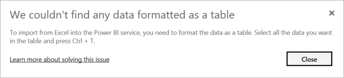
iii. We couldn't find any data formatted as a table
Occasionally, you may encounter the “We couldn’t find any data formatted as a table” error while importing data from Microsoft Excel. Fortunately, this error is self-explanatory. Power BI expects to find data formatted as a table from Excel. The error even tells you the resolution. Perform the following steps to resolve the issue:
Open your Excel workbook, and highlight the data that you want to import.
Press the Ctrl-T keyboard shortcut. The first row will likely be your column headers.
Verify that the column headers reflect how you want to name your columns. Then, try to import data from Excel again. This time, it should work.

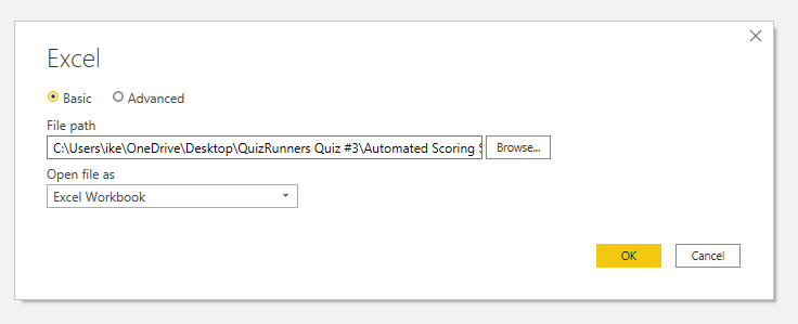
iv. Couldn't find file
While importing data from a file, you may get the "Couldn't find file" error.

Usually, this error is caused by the file moving locations or the permissions to the file changing. If the cause is the former, you need to find the file and change the source settings.
Open Power Query by selecting the Transform Data button in Power BI.
Highlight the query that is creating the error.
On the left, under Query Settings, select the gear icon next to Source.
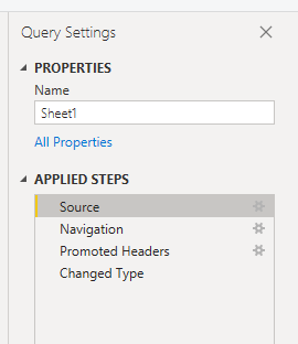
Change the file location to the new location.


iv. Data type errors
Sometimes, when you import data into Power BI, the columns appear blank. This situation happens because of an error in interpreting the data type in Power BI. The resolution to this error is unique to the data source. For instance, if you're importing data from SQL Server and see blank columns, you could try to convert to the correct data type in the query.
Instead of using this query:
SELECT CustomerPostalCode FROM Sales.Customers
Use this query:
SELECT CAST(CustomerPostalCode as varchar(10)) FROM Sales.Customers
By specifying the correct type at the data source, you eliminate many of these common data source errors.
You may encounter different types of errors in Power BI that are caused by the diverse data source systems where your data resides.
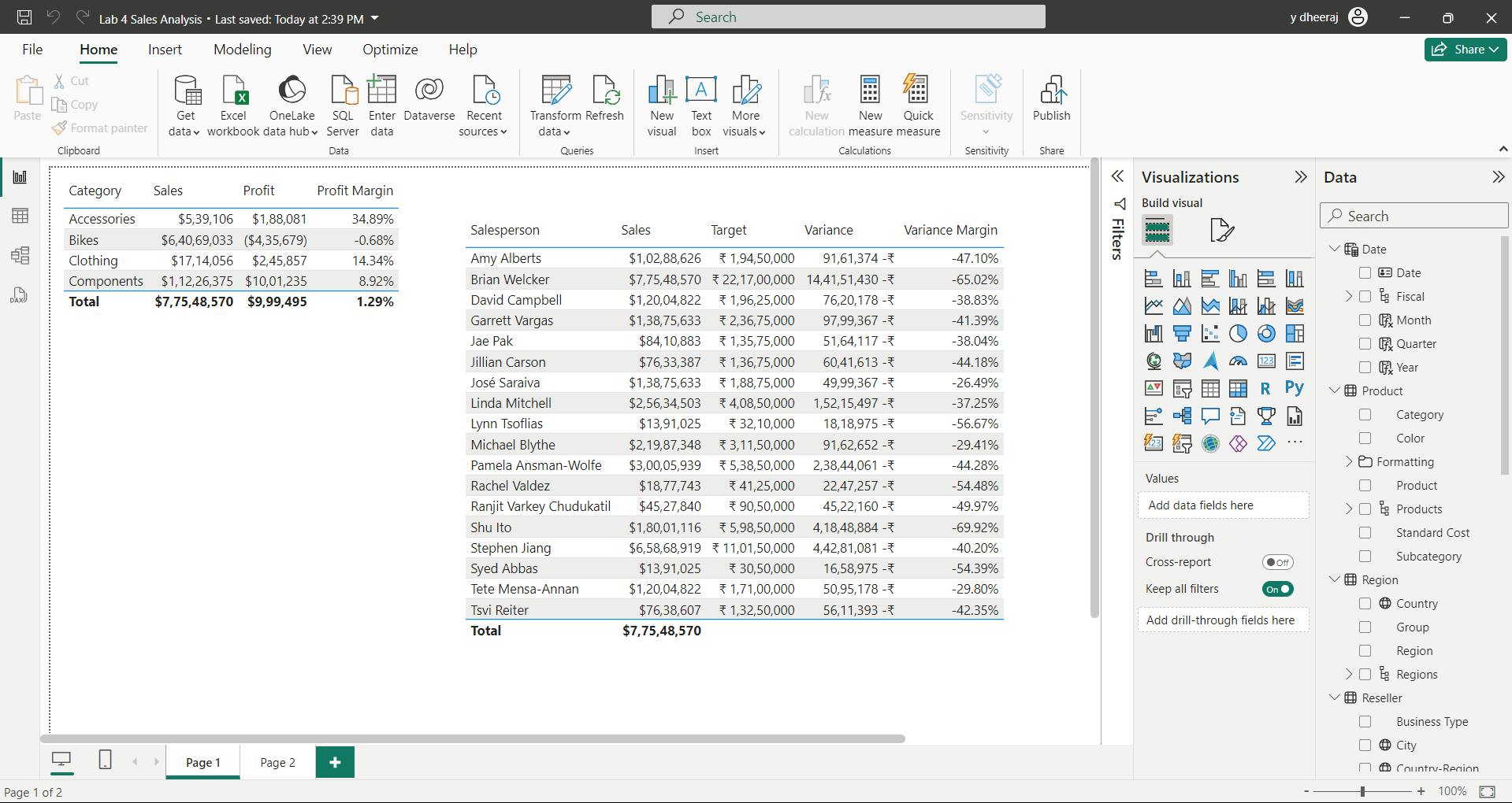
12. Exercise - Prepare data in Power BI Desktop
Get Data in Power BI Desktop
Lab story
This lab is designed to introduce you to Power BI Desktop application and how to connect to data and how to use data preview techniques to understand the characteristics and quality of the source data. The learning objectives are:
Open Power BI Desktop
Connect to different data sources
Preview source data with Power Query
Use data profiling features in Power Query
i. Get data from SQL Server
ii. Preview Data in Power Query Editor
Observed:
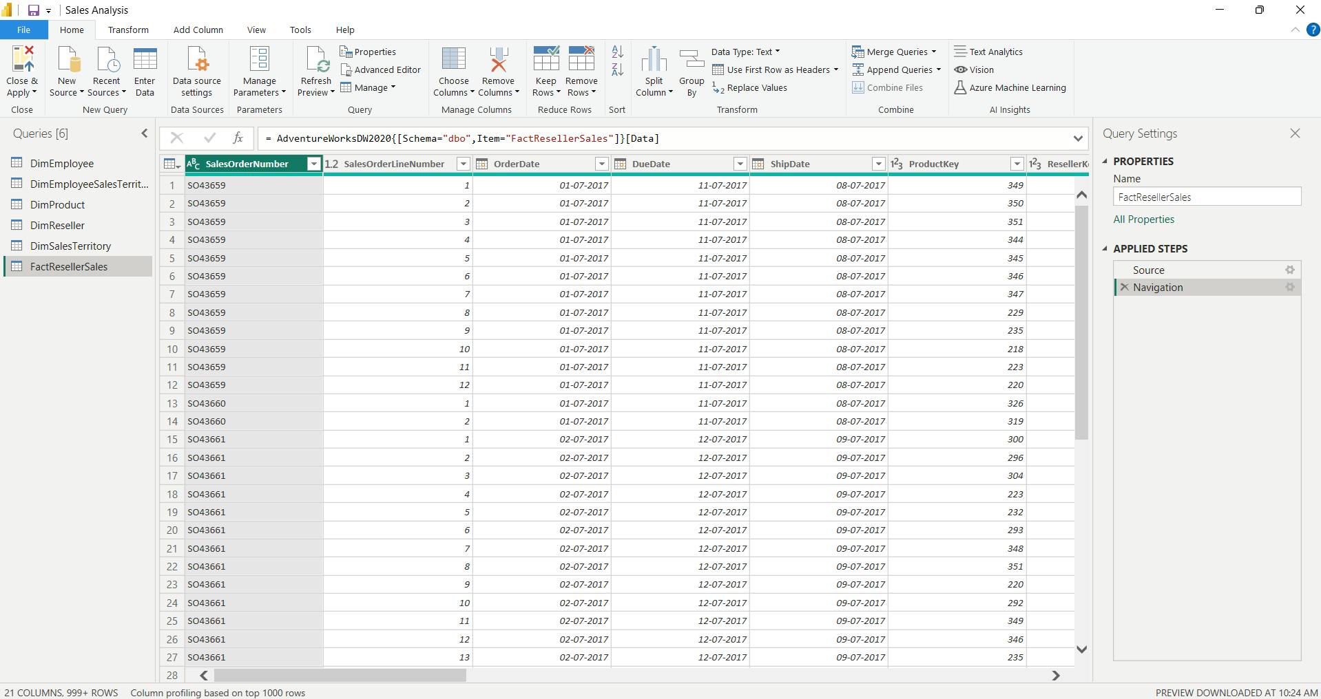
a. DimEmployee Query
table - Notice that the last five columns contain Table or Value links.
These five columns represent relationships to other tables in the database.
They can be used to join tables together. You’ll join tables in the Load Transformed Data in Power BI Desktop lab.
Column Quality for Position column - shows 94% empty.
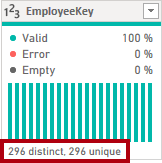
Column Distribution for EmployeeKey column
When the distinct and unique counts are the same, it means the column contains unique values.
When modeling, it’s important that some model tables have unique columns. These unique columns can be used to create one-to-many relationships, which you’ll do in theModel Data in Power BI Desktoplab.
b. DimReseller query
Column Profile for BusinessType column header - Notice the data quality issue: there are two labels for warehouse (Warehouse, and the misspelled Ware House) - You’ll apply a transformation to relabel these five rows in the Load Transformed Data in Power BI Desktop lab.
c. DimSalesTerritory query
In the Model Data in Power BI Desktop lab, you’ll create a hierarchy to support analysis at region, country, or group level.
d. FactResellerSales query
column quality for the TotalProductCost column, and notice that 8% of the rows are empty - Missing TotalProductCost column values is a data quality issue. To address the issue, in the Load Transformed Data in Power BI Desktop lab, you’ll apply transformations to fill in missing values by using the product standard cost, which is stored in the related DimProduct table.
iii. Get data from a CSV file
ResellerSalesTargets query
Repeat the steps to create a query based on the D:\Allfiles\Resources\ColorFormats.csv file.
Save / apply later.
13. Check your knowledge
T-SQL is the query language that you would use for SQL Server.
You're creating a Power BI report with data from an Azure Analysis Services MDX Cube. When the data refreshes in the cube, you would like to see it immediately in the Power BI report. How should you connect? - Live connection.
What can you do to improve performance when you're getting data in Power BI?Always use the least amount of data needed for your project.
14. Summary
In this module, you learned about pulling data from many different data sources and into Power BI.
You can pull data from files, relational databases, Azure Analysis Services, cloud-based applications, websites, and more.
Retrieving data from different data sources requires treating each data source differently. For instance, Microsoft Excel data should be pulled in from an Excel table. Relational databases often have query timeouts.
You can connect to SQL Server Analysis Services with Connect live, which allows you to see data changes in real-time.
It's important to select the correct storage mode for your data.
Do you require that visuals interact quickly but don’t mind possibly refreshing the data when the underlying data source changes?
If so, select Import to import data into Power BI.
If you prefer to see updates to data as soon as they happen at the cost of interactivity performance, then choose Direct Query for your data instead.
In addition, you learned how to solve performance problems and data import errors.
You learned that Power BI gives you tooling to identify where performance problems may exist. Data import errors can be alarming at first, but you can see that the resolution is easily implemented.
Learning objectives
By the end of this module, you'll be able to:
Identify and connect to a data source
Get data from a relational database, like Microsoft SQL Server
Get data from a file, like Microsoft Excel
Get data from applications
Get data from Azure Analysis Services
Select a storage mode
Fix performance issues
Resolve data import errors
IV. Module 4 Clean, transform, and load data in Power BI
| Course | Microsoft Power BI Data Analyst |
| Module 4/17 | Clean, transform, and load data in Power BI |
![]()
Power Query has an incredible number of features that are dedicated to helping you clean and prepare your data for analysis.
You'll learn how to simplify a complicated model, change data types, rename objects, and pivot data.
You'll also learn how to profile columns so that you know which columns have the valuable data that you’re seeking for deeper analytics.
1. Introduction
When examining the data, you discover several issues, including:
A column called Employment status only contains numerals.
Several columns contain errors.
Some columns contain null values.
The customer ID in some columns appears as if it was duplicated repeatedly.
A single address column has combined street address, city, state, and zip code.
Clean data has the following advantages:
Measures and columns produce more accurate results when they perform aggregations and calculations.
Tables are organized, where users can find the data in an intuitive manner.
Duplicates are removed, making data navigation simpler. It will also produce columns that can be used in slicers and filters.
A complicated column can be split into two, simpler columns. Multiple columns can be combined into one column for readability.
Codes and integers can be replaced with human readable values.
2. Shape the initial data
Power Query Editor in Power BI Desktop allows you to shape (transform) your imported data.
You can accomplish actions such as
renaming columns or tables,
changing text to numbers,
removing rows,
setting the first row as headers,
and much more.
It is important to shape your data to ensure that it meets your needs and is suitable for use in reports.
i. Get started with Power Query Editor
Removing columns at an early stage in the process rather than later is best, especially when you have established relationships between your tables. Removing unnecessary columns will help you to focus on the data that you need and help improve the overall performance of your Power BI Desktop semantic models and reports.
3. Simplify the data structure
Rename a query
Replace values
Replace null values
Remove duplicates
4. Evaluate and change column data types
Implications of incorrect data types
Incorrect data types will prevent you from creating certain calculations, deriving hierarchies, or creating proper relationships with other tables.
For example, if you try to calculate the Quantity of Orders YTD, you'll get the following error stating that the OrderDate column data type isn't Date, which is required in time-based calculations.
Another issue with having an incorrect data type applied on a date field is the inability to create a date hierarchy, which would allow you to analyze your data on a yearly, monthly, or weekly basis.
Change the column data type in Power Query Editor
the change that you make to the column data type is saved as a programmed step. This step is called Changed Type
5. Combine multiple tables into a single table
You can combine tables into a single table in the following circumstances:
Too many tables exist, making it difficult to navigate an overly complicated semantic model.
Several tables have a similar role.
A table has only a column or two that can fit into a different table.
You want to use several columns from different tables in a custom column.
You can combine the tables in two different ways: merging and appending.
i. Append queries
When you append queries, you'll be adding rows of data to another table or query.
For example, you could have two tables, one with 300 rows and another with 100 rows, and when you append queries, you'll end up with 400 rows.
ii. Merge queries
When you merge queries, you'll be adding columns from one table (or query) into another. To merge two tables, you must have a column that is the key between the two tables.
This process is similar to the JOIN clause in SQL.
6. Profile data in Power BI
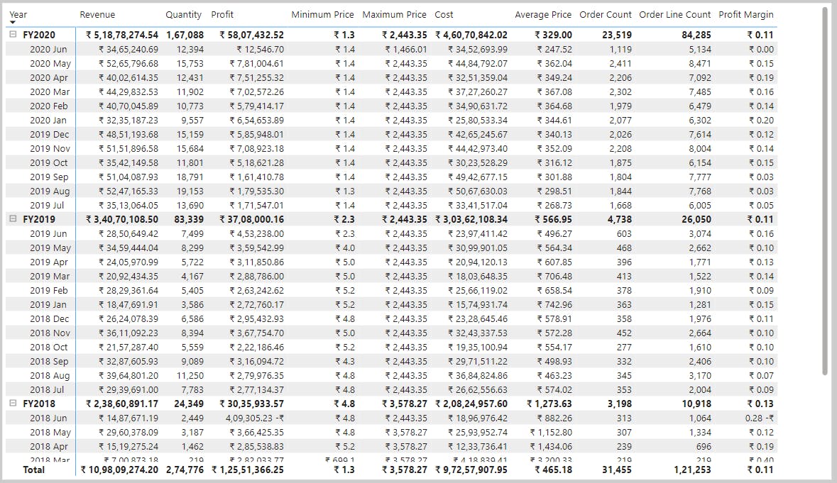
Profiling data is about studying the nuances of the data: determining anomalies, examining and developing the underlying data structures, and querying data statistics such as row counts, value distributions, minimum and maximum values, averages, and so on.
i. Find data anomalies and data statistics
Column quality shows you the percentages of data that is valid, in error, and empty.
Column profile gives you a more in-depth look into the statistics within the columns for the first 1,000 rows of data.
Column distribution shows you the distribution of the data within the column and the counts of distinct and unique values, both of which can tell you details about the data counts.
7. Use Advanced Editor to modify M code
Each time you shape data in Power Query, you create a step in the Power Query process. Those steps can be reordered, deleted, and modified where it makes sense.
8. Exercise - Load data in Power BI Desktop
Load Transformed Data in Power BI Desktop
Lab story
In this lab, you’ll use data cleansing and transformation techniques to start shaping your data model.
You’ll then apply the queries to load each as a table to the data model.
In this lab you learn how to:
Apply various transformations
Load queries to the data model
i. Configure the Salesperson query
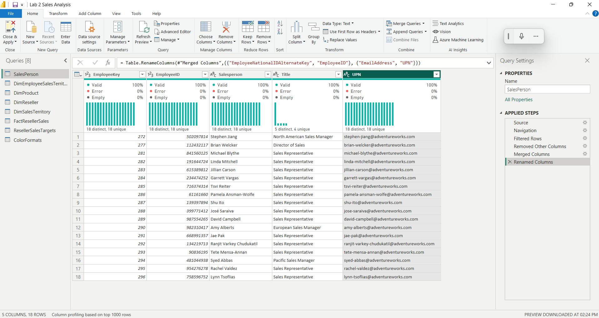
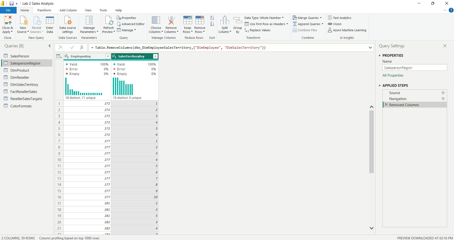
ii. Configure the SalespersonRegion query
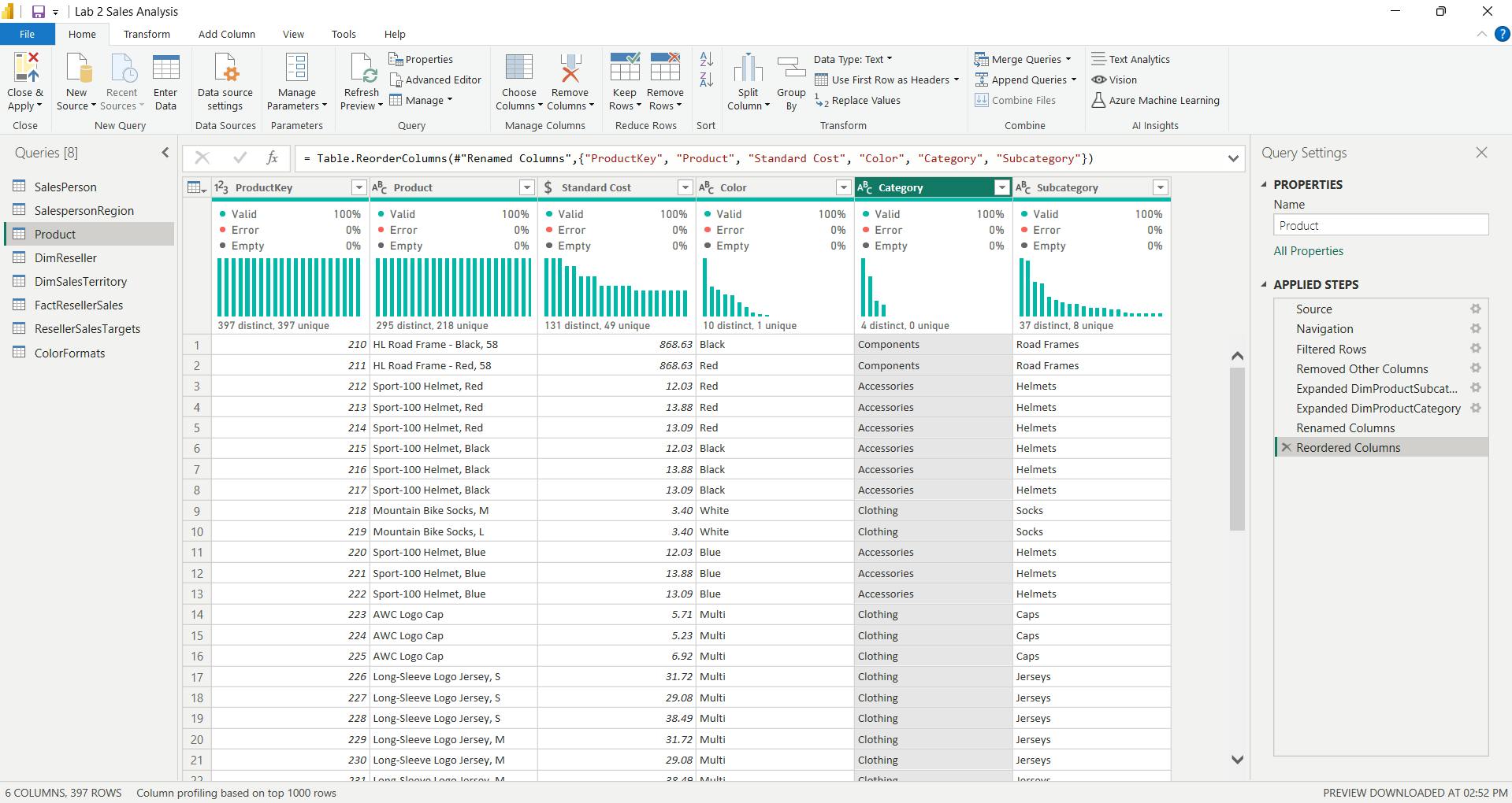
iii. Configure the Product query
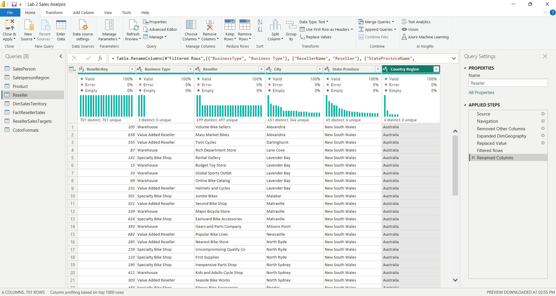
iv. Configure the Reseller query
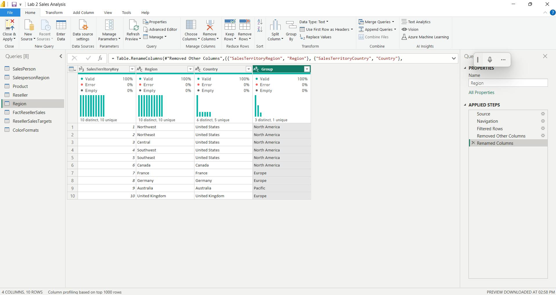
v. Configure the Region query
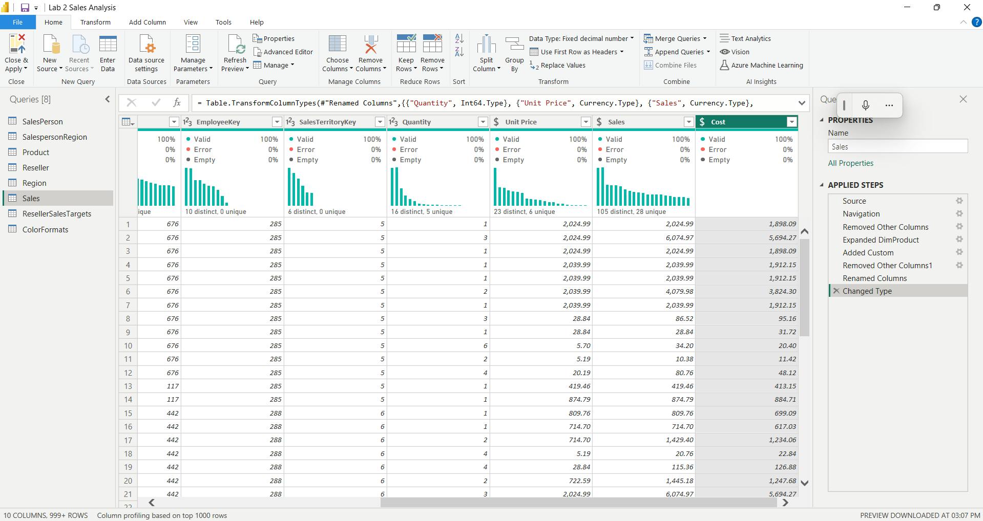
vi. Configure the Sales query
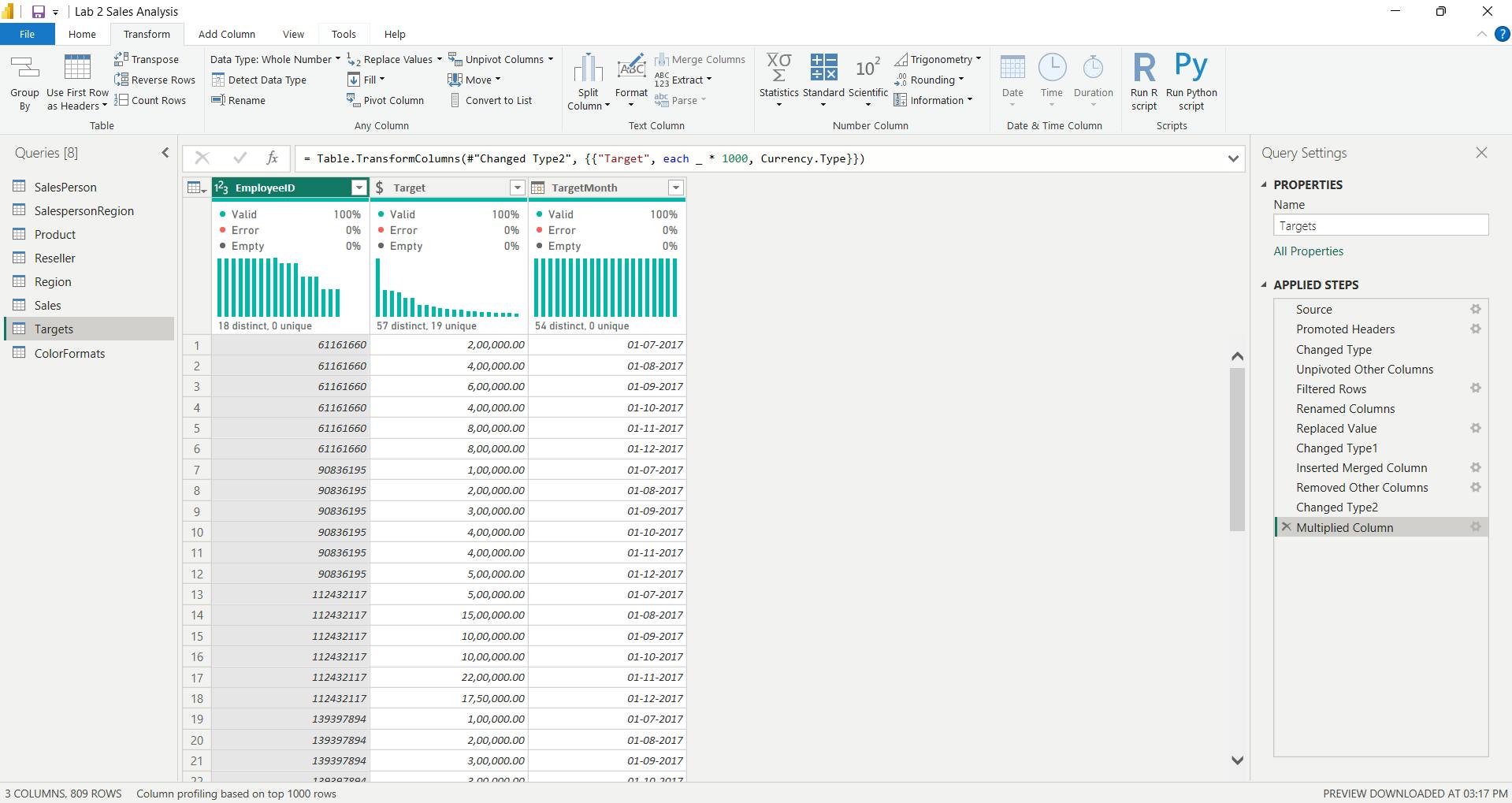
vii. Configure the Targets query
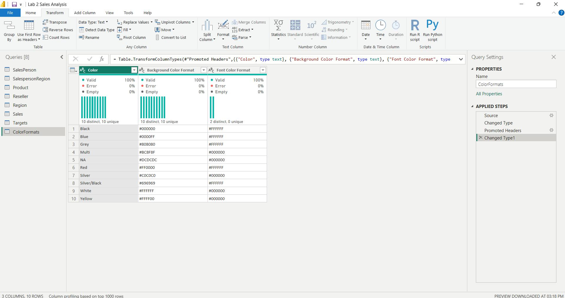
viii. Configure the ColorFormats query
ix. Update the Product query
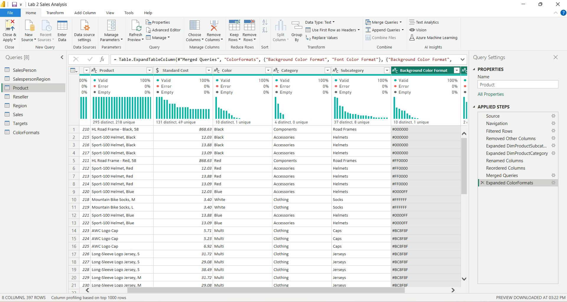
x. Update the ColorFormats query
In the Query Properties window, uncheck the Enable Load To Report checkbox.
Disabling the load means it will not load as a table to the data model. This is done because the query was merged with theProductquery, which is enabled to load to the data model.
xi. Finish up
9. Check your knowledge
What is a risk of having null values in a numeric column?
AVERAGE takes the total and divides by the number of non-null values. If NULL is synonymous with zero in the data, the average will be different from the accurate average.
If you have two queries that have different data but the same column headers, and you want to combine both tables into one query with all the combined rows, which operation should you perform?
Append will take two tables and combine it into one query. The combined query will have more rows while keeping the same number of columns.
Which of the following selections aren't best practices for naming conventions in Power BI?
Abbreviations lead to confusion because they're often overused or not universally agreed on.
10. Summary
This module explained how you can take data that is difficult to read, build calculations on, and discover and make it simpler for report authors and others to use.
Additionally, you learned how to combine queries so that they were fewer in number, which makes data navigation more streamlined.
You also replaced renamed columns into a human readable form and reviewed good naming conventions for objects in Power BI.
Learning objectives
By the end of this module, you’ll be able to:
Resolve inconsistencies, unexpected or null values, and data quality issues.
Apply user-friendly value replacements.
Profile data so you can learn more about a specific column before using it.
Evaluate and transform column data types.
Apply data shape transformations to table structures.
Combine queries.
Apply user-friendly naming conventions to columns and queries.
Edit M code in the Advanced Editor.
V. Module 5 Design a semantic model in Power BI
| Course | Microsoft Power BI Data Analyst |
| Module 5/17 | Design a semantic model in Power BI |

Building a great semantic model is about simplifying the disarray.
A star schema is one way to simplify a semantic model.
You will also learn about why choosing the correct data granularity is important for performance and usability of your Power BI reports.
Finally, you learn about improving performance with your Power BI semantic models.
1. Introduction
A good semantic model offers the following benefits:
Data exploration is faster.
Aggregations are simpler to build.
Reports are more accurate.
Writing reports takes less time.
Reports are easier to maintain in the future.
Typically, a smaller semantic model is composed of fewer tables and fewer columns in each table that the user can see.
To summarize, you should aim for simplicity when designing your semantic models.
i. Star schemas
Now that you have learned about the relationships that make up the data schema, you are able to explore a specific type of schema design, the star schema, which is optimized for high performance and usability.
ii. Fact tables
Fact tables contain observational or event data values: sales orders, product counts, prices, transactional dates and times, and quantities.
Fact tables can contain several repeated values.
For example, one product can appear multiple times in multiple rows, for different customers on different dates. These values can be aggregated to create visuals.
For instance, a visual of the total sales orders is an aggregation of all sales orders in the fact table.
With fact tables, it is common to see columns that are filled with numbers and dates. The numbers can be units of measurement, such as sale amount, or they can be keys, such as a customer ID. The dates represent time that is being recorded, like order date or shipped date.
The Sales table contains the sales order values, which can be aggregated, it is considered a fact table.
iii. Dimension tables
Dimension tables contain the details about the data in fact tables: products, locations, employees, and order types.
These tables are connected to the fact table through key columns.
Dimension tables are used to filter and group the data in fact tables.
The fact tables, on the other hand, contain the measurable data, such as sales and revenue, and each row represents a unique combination of values from the dimension tables.
For the total sales orders visual, you could group the data so that you see total sales orders by product, in which product is data in the dimension table.
Fact tables are much larger than dimension tables because numerous events occur in fact tables, such as individual sales.
Dimension tables are typically smaller because you are limited to the number of items that you can filter and group on.
For instance, a year contains only so many months, and the United States are composed of only a certain number of states.
The Employee table contains the specific employee name, which filters the sales orders, so it would be a dimension table.
Note:
The Sales table contains the sales order values, which can be aggregated, it is considered a fact table.
The Employee table contains the specific employee name, which filters the sales orders, so it would be a dimension table
Star schemas and the underlying semantic model are the foundation of organized reports; the more time you spend creating these connections and design, the easier it will be to create and maintain reports.
2. Work with tables
This process of formatting and configuring tables can also be done in Power Query.
3. Create a date table
During report creation in Power BI, a common business requirement is to make calculations based on date and time. Organizations want to know how their business is doing over months, quarters, fiscal years, and so on.
You can create a common date table that can be used by multiple tables.
i. Create a common date table
Ways that you can build a common date table are:
Source data
DAX
Power Query
ii. DAX
You can use the Data Analysis Expression (DAX) functions CALENDARAUTO() or CALENDAR() to build your common date table.
The CALENDARAUTO() function returns a contiguous, complete range of dates that are automatically determined from your semantic model.
The starting date is chosen as the earliest date that exists in your semantic model, and the ending date is the latest date that exists in your semantic model plus data that has been populated to the fiscal month that you can choose to include as an argument in the CALENDARAUTO() function.
Dates = CALENDAR(DATE(2011, 5, 31), DATE(2022, 12, 31))
Year = YEAR(Dates[Date])
iii. Power Query
You can use M-language, the development language that is used to build queries in Power Query, to define a common date table.
= List.Dates(
#date(2011,05,31), // start date
365*10, //Dates for everyday for the next 10 years
#duration(1,0,0,0) //Specifies duration of the period 1 = days, 0 = hours, 0 = minutes, 0 = seconds
)
4. Work with dimensions
When building a star schema, you will have dimension and fact tables.
Fact tables contain information about events such as sales orders, shipping dates, resellers, and suppliers.
Dimension tables store details about business entities, such as products or time, and are connected back to fact tables through a relationship.
You can use hierarchies as one source to help you find detail in dimension tables. These hierarchies form through natural segments in your data.
For instance, you can have a hierarchy of dates in which your dates can be segmented into years, months, weeks, and days.
Hierarchies are useful because they allow you to drill down into the specifics of your data instead of only seeing the data at a high level.
i. Hierarchies
To create a hierarchy, go to the Fields pane on Power BI and then right-click the column that you want the hierarchy for. Select New hierarchy,
Parent-child hierarchy
Flatten parent-child hierarchy
The process of viewing multiple child levels based on a top-level parent is known as flattening the hierarchy.
In this process, you are creating multiple columns in a table to show the hierarchical path of the parent to the child in the same record. You will use PATH(), a simple DAX function that returns a text version of the managerial path for each employee, and PATHITEM() to separate this path into each level of managerial hierarchy.
Path = PATH(Employee[Employee ID], Employee[Manager ID])
To flatten the hierarchy, you can separate each level by using the PATHITEM function.
To view all three levels of the hierarchy separately, you can create four columns in the same way that you did previously, by entering the following equations. You will use the PATHITEM function to retrieve the value that resides in the corresponding level of your hierarchy.
Level 1 = PATHITEM(Employee[Path],1)
Level 2 = PATHITEM(Employee[Path],2)
Level 3 = PATHITEM(Employee[Path],3)
ii. Role-playing dimensions
Role-playing dimensions have multiple valid relationships with fact tables, meaning that the same dimension can be used to filter multiple columns or tables of data. As a result, you can filter data differently depending on what information you need to retrieve.
Calendar is the dimension table, while Sales and Order are fact tables.
The dimension table has two relationships: one with Sales and one with Order.
This example is of a role-playing dimension because the Calendar table can be used to group data in both Sales and Order.
If you wanted to build a visual in which the Calendar table references the Order and the Sales tables, the Calendar table would act as a role-playing dimension.
5. Define data granularity
Data granularity is the detail that is represented within your data, meaning that the more granularity your data has, the greater the level of detail within your data.
6. Work with relationships and cardinality
Power BI has the concept of directionality to a relationship.
This directionality plays an important role in filtering data between multiple tables.
i. Relationships
The following are different types of relationships that you'll find in Power BI.
Many-to-one (*:1) or one-to-many (1: *) relationship
Describes a relationship in which you have many instances of a value in one column that are related to only one unique corresponding instance in another column.
Describes the directionality between fact and dimension tables.
Is the most common type of directionality and is the Power BI default when you are automatically creating relationships.
One-to-one (1:1) relationship:
Describes a relationship in which only one instance of a value is common between two tables.
Requires unique values in both tables.
Is not recommended because this relationship stores redundant information and suggests that the model is not designed correctly. It is better practice to combine the tables.
Many-to-many (.) relationship:
Describes a relationship where many values are in common between two tables.
Does not require unique values in either table in a relationship.
Is not recommended; a lack of unique values introduces ambiguity and your users might not know which column of values is referring to what.
ii. Cross-filter direction
Data can be filtered on one or both sides of a relationship.
With a single cross-filter direction:
- Only one table in a relationship can be used to filter the data. For instance, Table 1 can be filtered by Table 2, but Table 2 cannot be filtered by Table 1.
Note: **
Follow the direction of the arrow on the relationship between your tables to know which direction the filter will flow. You typically want these arrows to point to your fact table.
- For a one-to-many or many-to-one relationship, the cross-filter direction will be from the "one" side, meaning that the filtering will occur in the table that has many values.
With both cross-filter directions or bi-directional cross-filtering:
One table in a relationship can be used to filter the other. For instance, a dimension table can be filtered through the fact table, and the fact tables can be filtered through the dimension table.
You might have lower performance when using bi-directional cross-filtering with many-to-many relationships.
iii. Cardinality and cross-filter direction
For one-to-one relationships, the only option that is available is bi-directional cross-filtering.
For many-to-many relationships, you can choose to filter in a single direction or in both directions by using bi-directional cross-filtering.
iv. Create many-to-many relationships
7. Resolve modeling challenges
When you are creating these relationships, a common pitfall that you might encounter are circular relationships.
i. Relationship dependencies
8. Exercise - Model data in Power BI Desktop
Design a Data Model in Power BI
Lab story
It will involve creating relationships between tables, and then configuring table and column properties to improve the friendliness and usability of the data model.
You’ll also create hierarchies and create quick measures.
In this lab you learn how to:
Create model relationships
Configure table and column properties
Create hierarchies
i. Create model relationships
You can interpret the cardinality that is represented by the 1 and (*) indicators.
Filter direction is represented by the arrow head.
A solid line represents an active relationship; a dashed line represents an inactive relationship.
Hover the cursor over the relationship to highlight the related columns.
ii. Configure Tables
iii. Configure the Product table
To organize columns into a display folder, in the Data pane, first select the Background Color Format column.
While pressing the Ctrl key, select the Font Color Format column.
In the Properties pane, in the Display Folder box, enter Formatting.
Display folders are a great way to declutter tables—especially for tables that comprise many fields. They’re logical presentation only.
iv. Configure the Region table
In the Properties pane, expand the Advanced section (at the bottom of the pane), and then in the Data Category dropdown list, select Country/Region.
Data categorization can provide hints to the report designer. In this case, categorizing the column as country or region provides more accurate information to Power BI when it renders a map visualization.
v. Configure the Reseller table
vi. Configure the Sales table
vii. Bulk update properties
In the Properties pane, slide the Is Hidden property to Yes.
The columns were hidden because they’re either used by relationships or will be used in row-level security configuration or calculation logic.
viii. Review the Model Interface
In the Data pane, notice the following:
Columns, hierarchies and their levels are fields, which can be used to configure report visuals
Only fields relevant to report authoring are visible
The SalespersonRegion table isn’t visible—because all of its fields are hidden
Spatial fields in the Region and Reseller table are adorned with a spatial icon
Fields adorned with the sigma symbol (Ʃ) will summarize, by default
A tooltip appears when hovering the cursor over the Sales | Cost field
ix. Review the model interface
To turn off auto/date time, Navigate to File > Options and Settings > Options > Current File group, and select Data Load. In the Time Intelligence section, uncheck Auto Date/Time.
x. Create Quick Measures
xi. Create quick measures
Profit =
SUM('Sales'[Sales]) - SUM('Sales'[Cost])
Profit Margin =
DIVIDE([Profit], SUM('Sales'[Sales]))
xii. Create a many-to-many relationship
xiii. Relate the Targets table
9. Check your knowledge
What does data granularity mean?
The level of detail in your data, meaning that higher granularity means more detailed data.
Data granularity refers to how finely or coarsely your data is divided or aggregated.
What is the difference between a fact table and a dimension table?
Fact tables contain observational data such as sales orders, employees, shipping dates, and so on, while dimension tables contain information about specific entities such as product IDs and dates.
Choose the best answer to explain relationship cardinality?
Cardinality is the measure of unique values in a table.
An example of high cardinality would be a Sales table as it has a high number of unique values.
10. Summary
You have learned about modeling data in Power BI, which includes such topics as creating common date tables, learning about and configuring many-to-many relationships, resolving circular relationships, designing star schemas, and much more.
These skills are crucial to the Power BI practitioner's toolkit so that it is easier to build visuals and hand off your report elements to other teams. With this foundation, you now have the ability to explore the many nuances of the semantic model.
Learning objectives
In this module, you will:
Create common date tables
Configure many-to-many relationships
Resolve circular relationships
Design star schemas
VI. Module 6 Add measures to Power BI Desktop models
| Course | Microsoft Power BI Data Analyst |
| Module 6/17 |

In this module,
you'll learn how to work with implicit and explicit measures.
You'll start by creating simple measures, which summarize a single column or table.
Then, you'll create more complex measures based on other measures in the model.
Additionally, you'll learn about the similarities of, and differences between, a calculated column and a measure.
1. Introduction
Implicit measures are automatic behaviors that allow visuals to summarize model column data.
Explicit measures, also known simply as measures, are calculations that you can add to your model.
a column that's shown with the sigma symbol ( ∑ ) indicates two facts:
It's a numeric column.
It will summarize column values when it is used in a visual (when added to a field well that supports summarization).
Implicit measures allow the report author to start with a default summarization technique and lets them modify it to suit their visual requirements.
i. Summarize non-numeric columns
Non-numeric columns can be summarized.
However, the sigma symbol does not show next to non-numeric columns in the Fields pane because they don't summarize by default.
Text columns allow the following aggregations:
First (alphabetically) Last (alphabetically) Count (Distinct) Count
Date columns allow the following aggregations:
Earliest Latest Count (Distinct) Count
Boolean columns allow the following aggregations:
Count (Distinct) Count
ii. Benefits of implicit measures
Several benefits are associated with implicit measures. Implicit measures are simple concepts to learn and use, and they provide flexibility in the way that report authors visualize model data.
Additionally, they mean less work for you as a data modeler because you don't have to create explicit calculations.
iii. Limitations of implicit measures
The most significant limitation of implicit measures is that they only work for simple scenarios, meaning that they can only summarize column values that use a specific aggregation function. Therefore, in situations when you need to calculate the ratio of each month's sales amount over the yearly sales amount, you'll need to produce an explicit measure by writing a Data Analysis Expressions (DAX) formula to achieve that more sophisticated requirement.
Implicit measures don't work when the model is queried by using Multidimensional Expressions (MDX). This language expects explicit measures and can't summarize column data. It's used when a Power BI semantic model is queried by using Analyze in Excel or when a Power BI paginated report uses a query that is generated by the MDX graphical query designer.
2. Create simple measures
A measure formula must return a scalar or single value.
In tabular modeling, no such concept as a calculated measure exists. The word calculated is used to describe calculated tables and calculated columns. It distinguishes them from tables and columns that originate from Power Query, which doesn't have the concept of an explicit measure.
Measures don't store values in the model. Instead, they're used at query time to return summarizations of model data. Additionally, measures can't reference a table or column directly; they must pass the table or column into a function to produce a summarization.
A simple measure is one that aggregates the values of a single column; it does what implicit measures do automatically.
Measures:
Revenue =
SUM(Sales[Sales Amount])
Cost =
SUM(Sales[Total Product Cost])
Profit =
SUM(Sales[Profit Amount])
Quantity =
SUM(Sales[Order Quantity])
Minimum Price =
MIN(Sales[Unit Price])
Maximum Price =
MAX(Sales[Unit Price])
Average Price =
AVERAGE(Sales[Unit Price])
Order Line Count =
COUNT(Sales[SalesOrderLineKey])
Order Count =
DISTINCTCOUNT('Sales Order'[Sales Order])
Order Line Count =
COUNTROWS(Sales)
3. Create compound measures
When a measure references one or more measures, it's known as a compound measure.
Profit =
[Revenue] - [Cost]
By removing this calculated column, you've optimized the semantic model. Removing this columns results in a decreased semantic model size and shorter data refresh times.
4. Create quick measures
a feature named Quick Measures. This feature helps you to quickly perform common, powerful calculations by generating the DAX expression for you.
5. Compare calculated columns with measures
Regarding similarities between calculated columns and measures, both are:
Calculations that you can add to your semantic model. Defined by using a DAX formula. Referenced in DAX formulas by enclosing their names within square brackets.
The areas where calculated columns and measures differ include:
Purpose - Calculated columns extend a table with a new column, while measures define how to summarize model data.
Evaluation - Calculated columns are evaluated by using row context at data refresh time, while measures are evaluated by using filter context at query time. Filter context is introduced in a later module; it's an important topic to understand and master so that you can achieve complex summarizations.
Storage - Calculated columns (in Import storage mode tables) store a value for each row in the table, but a measure never stores values in the model.
Visual use - Calculated columns (like any column) can be used to filter, group, or summarize (as an implicit measure), whereas measures are designed to summarize.
6. Check your knowledge
Which statement about measures is correct?
Measures can reference other measures. It's known as a compound measure.
- Measures don't need to be added to the semantic model. The concept of an implicit measure allows visuals to summarize column values.
Which DAX function can summarize a table?
The COUNTROWS function summarizes a table by returning the number of rows.
- The SUM function can only summarize a column.
Which of the following statements describing similarity of measures and calculated columns in an Import model is true?
They can achieve summarization of model data. A calculated column can be summarized (implicit measure) and a measure always achieves summarization.
- While measures can be quickly created by using the Quick measures feature, no equivalent feature exists to create calculated columns.
7. Exercise - Create DAX Calculations in Power BI Desktop
In this exercise, you’ll create calculated tables, calculated columns, and simple measures using Data Analysis Expressions (DAX).
In this exercise you'll learn how to:
Create calculated tables
Create calculated columns
Create measures
i. Create Calculated Tables
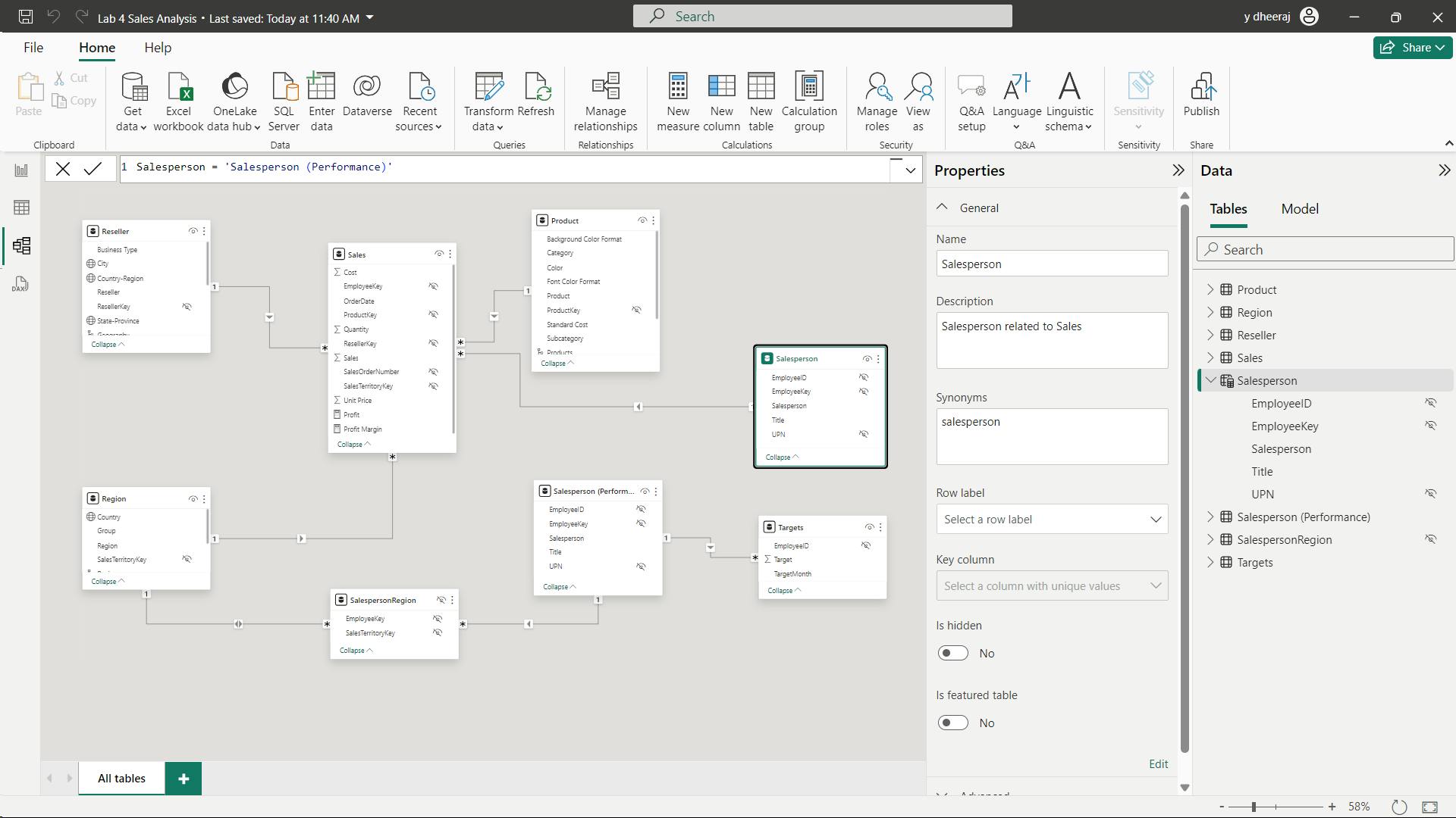
In the formula bar (which opens directly beneath the ribbon when creating or editing calculations), type Salesperson =, press Shift+Enter, type ‘Salesperson (Performance)’, and then press Enter.
Note: Calculated tables are defined by using a DAX formula that returns a table. It’s important to understand that calculated tables increase the size of the data model because they materialize and store values. They’re recomputed whenever formula dependencies are refreshed, as will be the case for this data model when new (future) date values are loaded into tables.
Unlike Power Query-sourced tables, calculated tables can’t be used to load data from external data sources. They can only transform data based on what has already been loaded into the data model.
ii. Create the Salesperson table
Salesperson = 'Salesperson (Performance)'
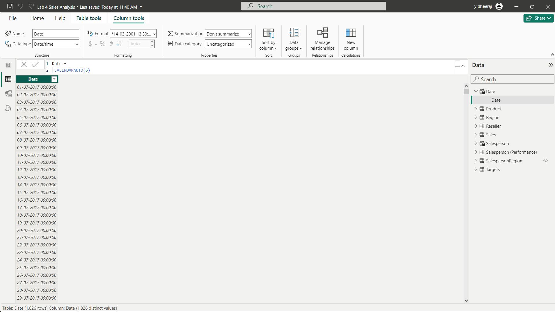
iii. Create the Date table
 Date =
 CALENDARAUTO(6)
The CALENDARAUTO() function returns a single-column table consisting of date values. The “auto” behavior scans all data model date columns to determine the earliest and latest date values stored in the data model. It then creates one row for each date within this range, extending the range in either direction to ensure full years of data is stored.
This function can take a single optional argument that is the last month number of a year. When omitted, the value is 12, meaning that December is the last month of the year. In this case, 6 is entered, meaning that June is the last month of the year.
iv. Create calculated columns
In this task, you’ll add more columns to enable filtering and grouping by different time periods. You’ll also create a calculated column to control the sort order of other columns.
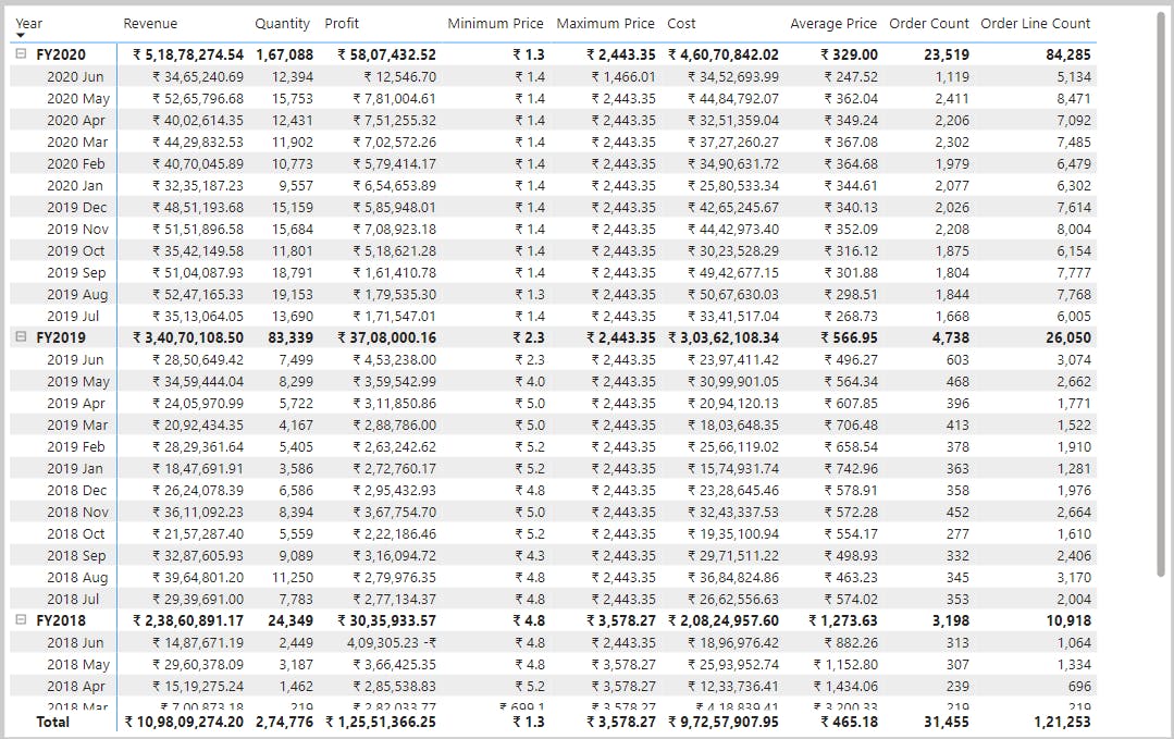
 Year =
 "FY" & YEAR('Date'[Date]) + IF(MONTH('Date'[Date]) > 6, 1)
A calculated column is created by first entering the column name, followed by the equals symbol (=), followed by a DAX formula that returns a single-value result. The column name can’t already exist in the table.
The formula uses the date’s year value but adds one to the year value when the month is after June. It’s how fiscal years at Adventure Works are calculated.
Quarter =
 'Date'[Year] & " Q"
 & IF(
        MONTH('Date'[Date]) IN {7,8,9},1,
        IF(
            MONTH('Date'[Date]) IN {10,11,12},2,
            IF(
                MONTH('Date'[Date]) IN {1,2,3},3,
                IF(
                    MONTH('Date'[Date]) IN {4,5,6},4
                )
            )
        )
    )
simpler:
Quarter =
 'Date'[Year] & " Q"
 & SWITCH(
    TRUE(),
    MONTH('Date'[Date]) IN {7,8,9}, 1,
    MONTH('Date'[Date]) IN {10,11,12}, 2,
    MONTH('Date'[Date]) IN {1,2,3}, 3,
    MONTH('Date'[Date]) IN {4,5,6}, 4
 )
Month =
FORMAT('Date'[Date],"yyyy mmm")
By default, text values sort alphabetically, numbers sort from smallest to largest, and dates sort from earliest to latest.
 MonthKey =
 (YEAR('Date'[Date]) * 100) + MONTH('Date'[Date])
On the Column Tools contextual ribbon, from inside the Sort group, select Sort by Column, and then select MonthKey.
v. Complete the Date table
In this task, you’ll complete the design of the Date table by hiding a column and creating a hierarchy. You’ll then create relationships to the Sales and Targets tables.
vi. Mark the Date table
On the Table Tools contextual ribbon, from inside the Calendars group, select Mark as Date Table, and then select Mark as Date Table.
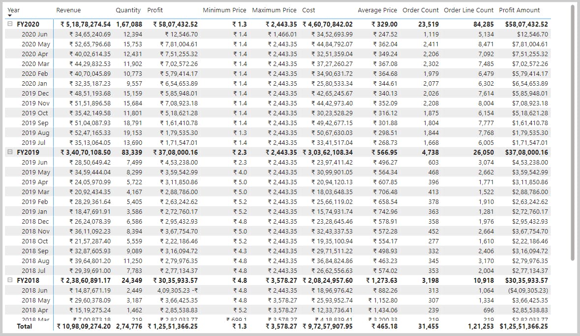
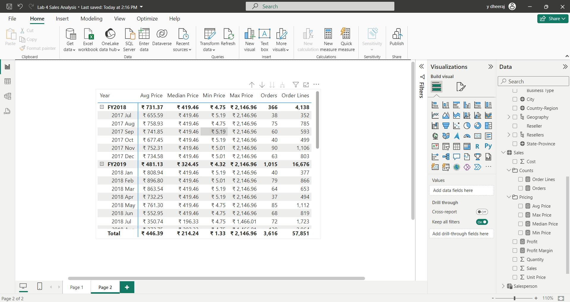
vii. Create simple measures
Visible numeric columns allow report authors at report design time to decide how column values will summarize (or not). It can result in inappropriate reporting. Some data modelers don’t like leaving things to chance, however, and choose to hide these columns and instead expose aggregation logic defined in measures. It’s the approach you’ll now take in this lab.
 Avg Price =
 AVERAGE(Sales[Unit Price])
Note:
It’s not possible to modify the aggregation behavior of a measure.
Median Price =
MEDIAN(Sales[Unit Price])
Min Price =
MIN(Sales[Unit Price])
Max Price =
MAX(Sales[Unit Price])
Orders =
DISTINCTCOUNT(Sales[SalesOrderNumber])
Order Lines =
COUNTROWS(Sales)
viii. Create additional measures
The HASONEVALUE() function tests whether a single value in the Salesperson column is filtered. When true, the expression returns the sum of target amounts (for just that salesperson). When false, BLANK is returned.
 Target =
 IF(
 HASONEVALUE('Salesperson (Performance)'[Salesperson]),
 SUM(Targets[TargetAmount])
 )
8. Summary
In this module, you learned that Power BI measures are either implicit or explicit. Implicit measures are automatic behaviors that are supported by visuals, while explicit measures use DAX formulas that summarize model data.
Explicit measures are important because they allow you to create complex DAX formulas to achieve the precise calculations that your report visuals need. While you learned to create simple and compound measures in this module, in later modules you'll learn to create more powerful measures by using filter modification functions and iterator functions.
Learning objectives
By the end of this module, you'll be able to:
Determine when to use implicit and explicit measures.
Create simple measures.
Create compound measures.
Create quick measures.
Describe similarities of, and differences between, a calculated column and a measure.
VII. Module 7 Add calculated tables and columns to Power BI Desktop models
| Course | Microsoft Power BI Data Analyst |
| Module 7/17 | Add calculated tables and columns to Power BI Desktop models |

By the end of this module,
you'll be able to add calculated tables and calculated columns to your semantic model.
You'll also be able to describe row context, which is used to evaluated calculated column formulas. Because it's possible to add columns to a table using Power Query,
you'll also learn when it's best to create calculated columns instead of Power Query custom columns.
1. Introduction
You can write a Data Analysis Expressions (DAX) formula to add a calculated table to your model. The formula can duplicate or transform existing model data to produce a new table
A calculated table can't connect to external data; you must use Power Query to accomplish that task.
A calculated table formula must return a table object. The simplest formula can duplicate an existing model table.
Calculated tables have a cost: They increase the model storage size and they can prolong the data refresh time. The reason is because calculated tables recalculate when they have formula dependencies to refreshed tables.
i. Duplicate a table
Data:
Download and open the Adventure Works DW 2020 M03.pbix
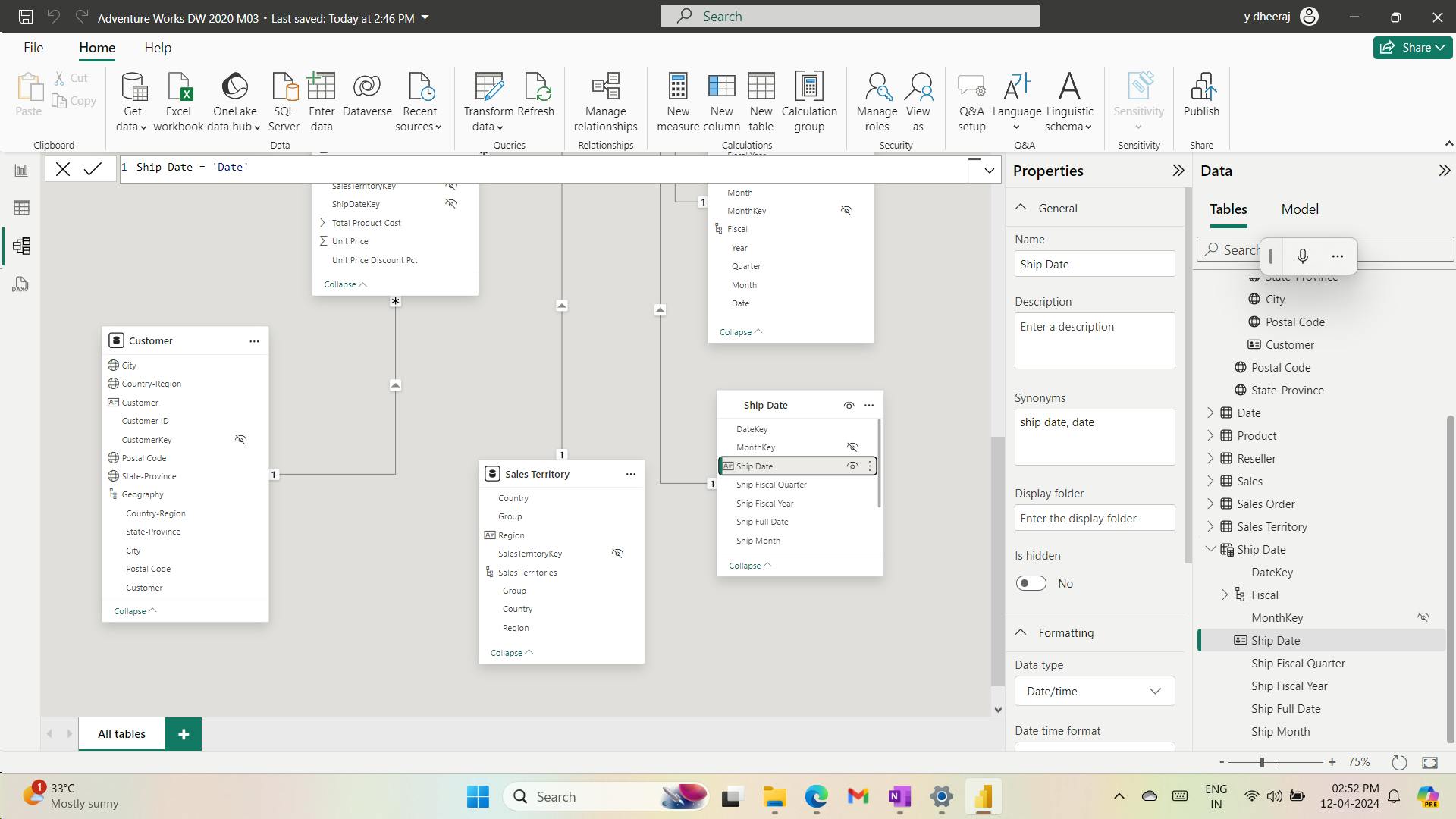
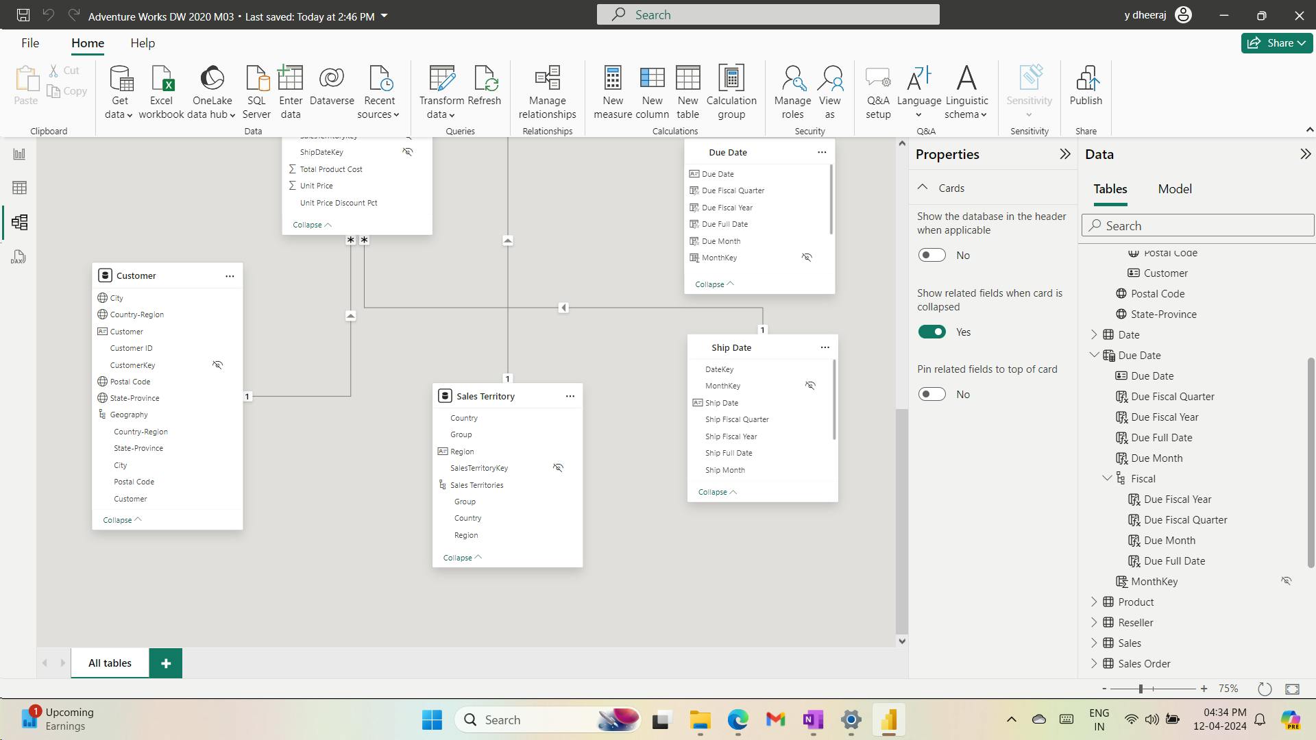
Ship Date = 'Date'
Mark the Ship Date table as a date table by using the Ship Date column.
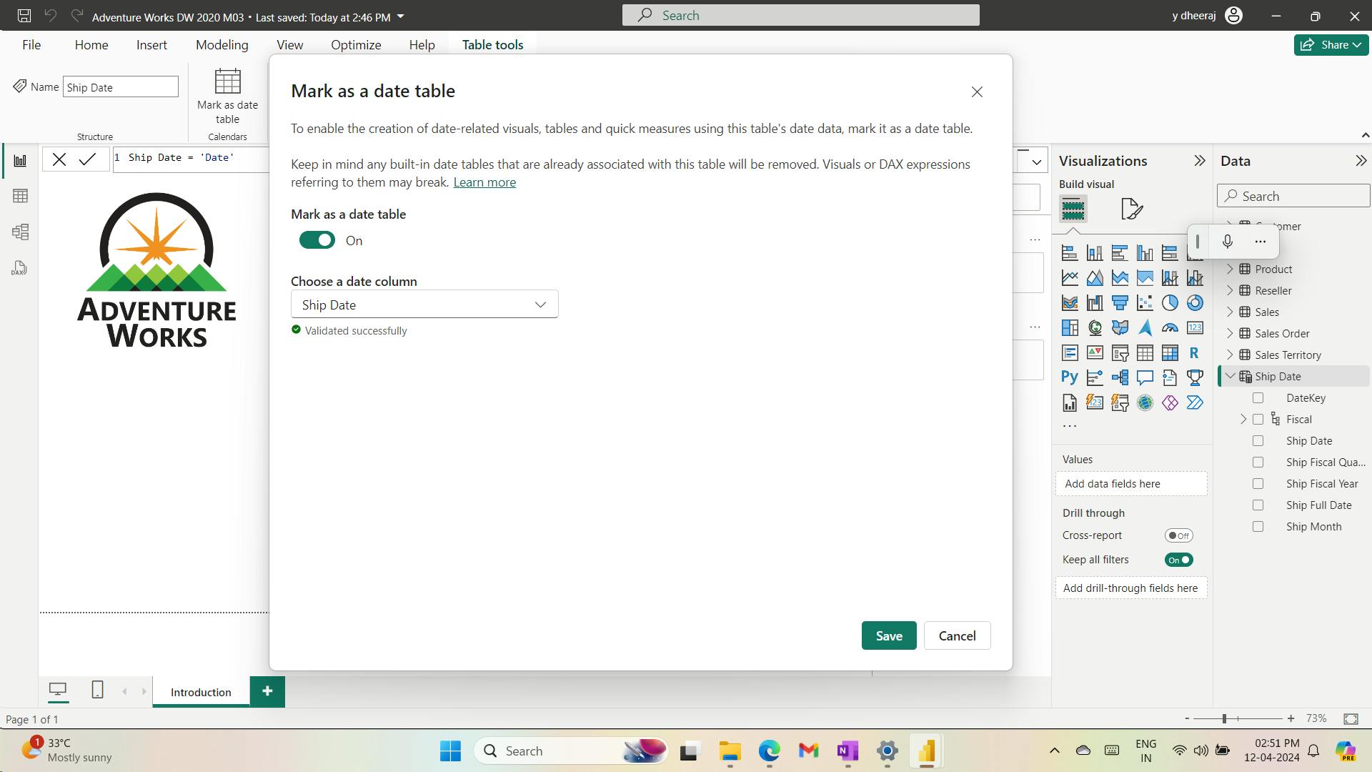
Calculated tables are useful to work in scenarios when multiple relationships between two tables exist, as previously described.
They can also be used to add a date table to your model. Date tables are required to apply special time filters known as time intelligence.
ii. Create a date table
Due Date = CALENDARAUTO(6)
When the table rows and distinct values are the same, it means that the column contains unique values. That factor is important for two reasons: It satisfies the requirements to mark a date table, and it allows this column to be used in a model relationship as the one-side.
2. Create calculated columns
Due Fiscal Year =
"FY"
    & YEAR('Due Date'[Due Date])
        + IF(
            MONTH('Due Date'[Due Date]) > 6,
            1
        )
The calculated column definition adds the Due Fiscal Year column to the Due Date table.
The following steps describe how Microsoft Power BI evaluates the calculated column formula:
The addition operator (+) is evaluated before the text concatenation operator (&).
The
YEARDAX function returns the whole number value of the due date year.The
IFDAX function returns the value when the due date month number is 7-12 (July to December); otherwise, it returns BLANK. (For example, because the Adventure Works financial year is July-June, the last six months of the calendar year will use the next calendar year as their financial year.)The year value is added to the value that is returned by the
IFfunction, which is the value one or BLANK. If the value is BLANK, it's implicitly converted to zero (0) to allow the addition to produce the fiscal year value.The literal text value
"FY"concatenated with the fiscal year value, which is implicitly converted to text.
Due Fiscal Quarter =
'Due Date'[Due Fiscal Year] & " Q"
    & SWITCH(
        TRUE(),
        MONTH('Due Date'[Due Date]) IN {1, 2, 3}, 3,
        MONTH('Due Date'[Due Date]) IN {4, 5, 6}, 4,
        MONTH('Due Date'[Due Date]) IN {7, 8, 9}, 1,
        MONTH('Due Date'[Due Date]) IN {10, 11, 12}, 2
    )
The calculated column definition adds the Due Fiscal Quarter column to the Due Date table. The IF function returns the quarter number (Quarter 1 is July-September), and the result is concatenated to the Due Fiscal Year column value and the literal text Q.
Due Month =
FORMAT('Due Date'[Due Date], "yyyy mmm")
The calculated column definition adds the Due Month column to the Due Date table. The FORMATDAX function converts the Due Date column value to text by using a format string. In this case, the format string produces a label that describes the year and abbreviated month name.
Due Full Date =
FORMAT('Due Date'[Due Date], "yyyy mmm, dd")
MonthKey =
(YEAR('Due Date'[Due Date]) * 100) + MONTH('Due Date'[Due Date])
The MonthKey calculated column multiplies the due date year by the value 100 and then adds the month number of the due date. It produces a numeric value that can be used to sort the Due Month text values in chronological order.
3. Learn about row context
The formula for a calculated column is evaluated for each table row. Furthermore, it's evaluated within row context, which means the current row.
However, row context doesn't extend beyond the table. If your formula needs to reference columns in other tables, you have two options:
If the tables are related, directly or indirectly, you can use the
RELATEDorRELATEDTABLEDAX function. TheRELATEDfunction retrieves the value at the one-side of the relationship, while theRELATEDretrieves values on the many-side. TheRELATEDTABLEfunction returns a table object.When the tables aren't related, you can use the
LOOKUPVALUEDAX function.
Sales table:
Discount Amount =
(
    Sales[Order Quantity]
        * RELATED('Product'[List Price])
) - Sales[Sales Amount]
The calculated column definition adds the Discount Amount column to the Sales table. Power BI evaluates the calculated column formula for each row of the Sales table. The values for the Order Quantity and Sales Amount columns are retrieved within row context. However, because the List Price column belongs to the Product table, the RELATED function is required to retrieve the list price value for the sale product.
Row context is used when calculated column formulas are evaluated. It's also used when a class of functions, known as iterator functions, are used. Iterator functions provide you with flexibility to create sophisticated summarizations. Iterator functions are described in a later module.
4. Choose a technique to add a column
There are three techniques that you can use to add columns to a model table:
Add columns to a view or table (as a persisted column), and then source them in Power Query. This option only makes sense when your data source is a relational database and if you have the skills and permissions to do so. However, it's a good option because it supports ease of maintenance and allows reuse of the column logic in other models or reports.
Add custom columns (using M) to Power Query queries.
Add calculated columns (using DAX) to model tables.
When you need to add a column to a calculated table, make sure that you create a calculated column. Otherwise, we recommend that you only use a calculated column when the calculated column formula:
Depends on summarized model data.
Needs to use specialized modeling functions that are only available in DAX, such as the
RELATEDandRELATEDTABLEfunctions. Specialized functions can also include the DAX parent and child hierarchies, which are designed to naturalize a recursive relationship into columns, for example, in an employee table where each row stores a reference to the row of the manager (who is also an employee).
5. Check your knowledge
Which statement about calculated tables is true?
Calculated tables increase the size of the semantic model.'
Calculated tables store data inside the model, and adding them results in a larger model size.
Which statement about calculated columns is true?
Calculated column formulas are evaluated by using row context.
You're developing a Power BI desktop model that sources data from an Excel workbook. The workbook has an employee table that stores one row for each employee. Each row has a reference to the employee's manager, which is also a row in the employee table. You need to add several columns to the Employee table in your model to analyze payroll data within the organization hierarchy (like, executive level, manager level, and so on). Which technique will you use to add the columns?
Add calculated columns by using DAX.
You can use the DAX parent-child functions to naturalize the recursive (employee-manager) relationship into columns.
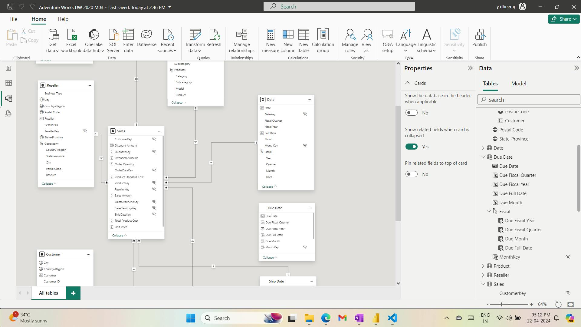
6. Summary
In this module,
you learned how to use DAX to extend your model designs with calculated tables and calculated columns.
You also learned that calculated columns are evaluated within row context, and you learned how to correctly reference columns that belong to different tables.
Finally, you learned that while many ways are available for adding new columns to your model, it's best to create Power Query custom columns whenever possible.
A calculated table can't connect to external data; you must use Power Query to accomplish that task.
increase the model storage size and prolong the data refresh time
Calculated tables are useful to work in scenarios when multiple relationships between two tables exist, as previously described.
When the table rows and distinct values are the same, it means that the column contains unique values. That factor is important for two reasons: It satisfies the requirements to mark a date table, and it allows this column to be used in a model relationship as the one-side.
The formula for a calculated column is evaluated for each table row. Furthermore, it's evaluated within row context, which means the current row.
row context doesn't extend beyond the table - RELATED() , RELATEDTABLE() , LOOKUPVALUE().
Learning objectives
By the end of this module, you'll be able to:
Create calculated tables.
Create calculated columns.
Identify row context.
Determine when to use a calculated column in place of a Power Query custom column.
Add a date table to your model by using DAX calculations.
VIII. Module 8 Use DAX time intelligence functions in Power BI Desktop models
| Course | Microsoft Power BI Data Analyst |
| Module 8/17 | Use DAX time intelligence functions in Power BI Desktop models |

By the end of this module,
you'll learn the meaning of time intelligence and
how to add time intelligence DAX calculations to your model.
1. Introduction
Time intelligence relates to calculations over time.
Specifically, it relates to calculations over dates, months, quarters, or years, and possibly time.
In Data Analysis Expressions (DAX) calculations, time intelligence means modifying the filter context for date filters.
For example, at the Adventure Works company, their financial year begins on July 1 and ends on June 30 of the following year. They produce a table visual that displays monthly revenue and year-to-date (YTD) revenue.

The filter context for 2017 August contains each of the 31 dates of August, which are stored in the Date table.
However, the calculated year-to-date revenue for 2017 August applies a different filter context.
It's the first date of the year through to the last date in filter context. In this example, that's July 1, 2017 through to August 31, 2017.
Time intelligence calculations modify date filter contexts. They can help you answer these time-related questions:
What's the accumulation of revenue for the year, quarter, or month?
What revenue was produced for the same period last year?
What growth in revenue has been achieved over the same period last year?
How many new customers made their first order in each month?
What's the inventory stock on-hand value for the company's products?
This module describes how to create time intelligence measures to answer these questions.
2. Use DAX time intelligence functions
i. Date table requirement
To work with time intelligence DAX functions, you need to meet the prerequisite model requirement of having at least one date table in your model. A date table is a table that meets the following requirements:
It must have a column of data type Date (or date/time), known as the date column.
The date column must contain unique values.
The date column must not contain BLANKs.
The date column must not have any missing dates.
The date column must span full years. A year isn't necessarily a calendar year (January-December).
The date table must be indicated as a date table.
Download and open the Adventure Works DW 2020 M07.pbix file.
measure definition to the Sales table that calculates YTD revenue:
Revenue YTD =
TOTALYTD([Revenue], 'Date'[Date], "6-30")
The year-end date value of "6-30" represents June 30.
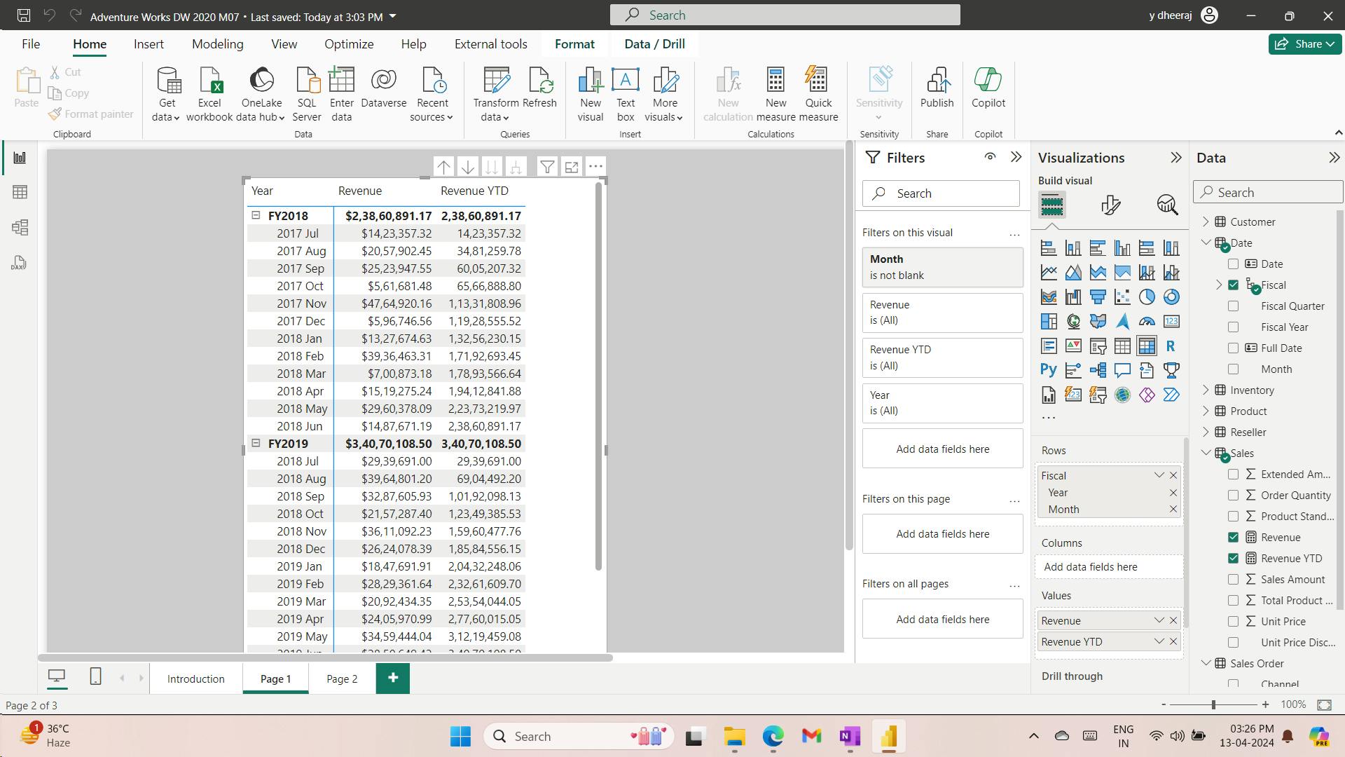
ii. Summarizations over time
One group of DAX time intelligence functions is concerned with summarizations over time:
Revenue YTD =
TOTALYTD([Revenue], 'Date'[Date], "6-30")
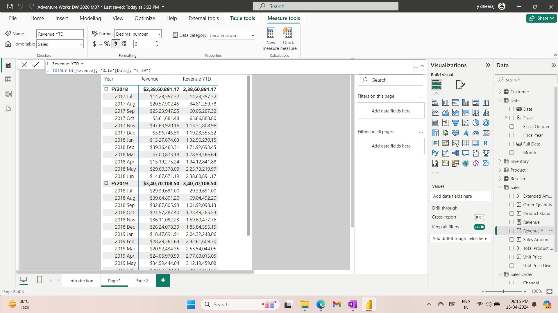
iii. Comparisons over time
Another group of DAX time intelligence functions is concerned with shifting time periods:
you will add a measure to the Sales table that calculates revenue for the prior year by using the SAMEPERIODLASTYEAR function. Format the measure as currency with two decimal places.
Revenue PY =
VAR RevenuePriorYear = CALCULATE([Revenue], SAMEPERIODLASTYEAR('Date'[Date]))
RETURN
    RevenuePriorYear
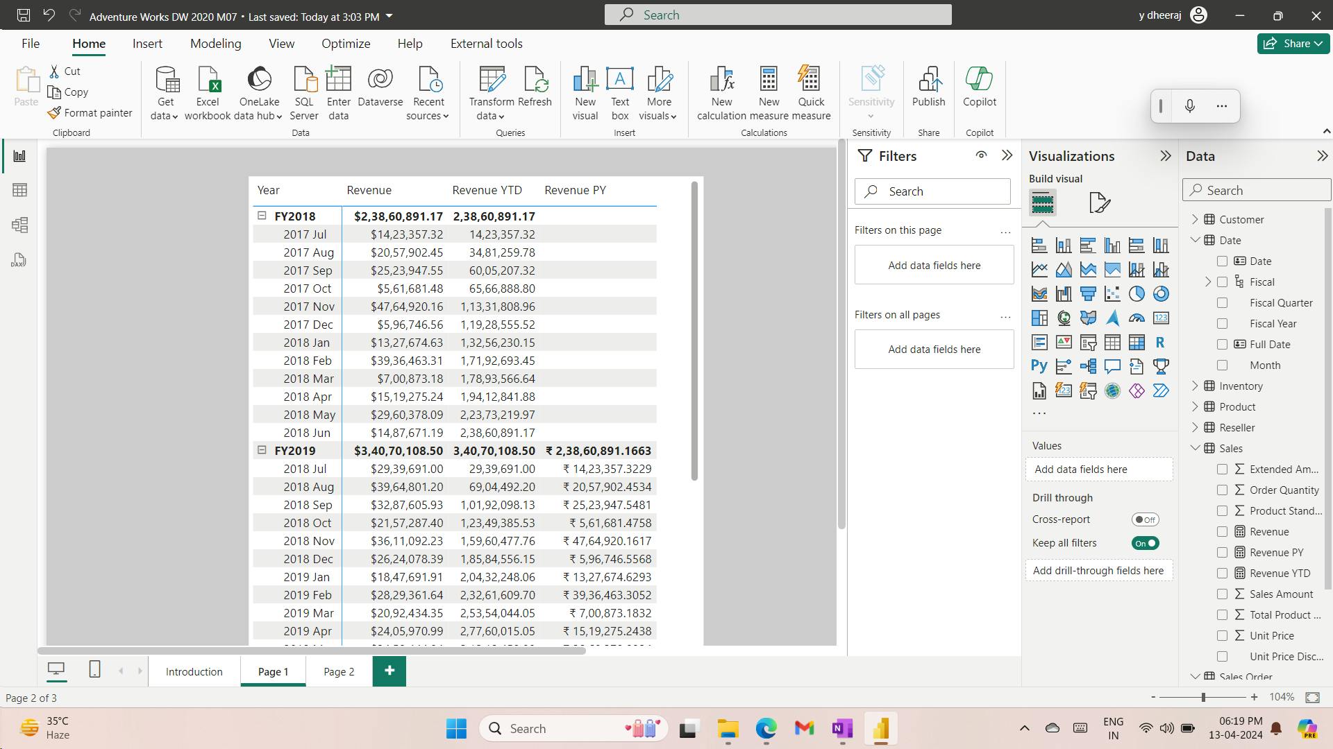
Next, you will modify the measure by renaming it to Revenue YoY % and then updating the RETURN clause to calculate the change ratio. Be sure to change the format to a percentage with two decimals places.
Revenue YoY % =
VAR RevenuePriorYear = CALCULATE([Revenue], SAMEPERIODLASTYEAR('Date'[Date]))
RETURN
    DIVIDE(
        [Revenue] - RevenuePriorYear,
        RevenuePriorYear
    )
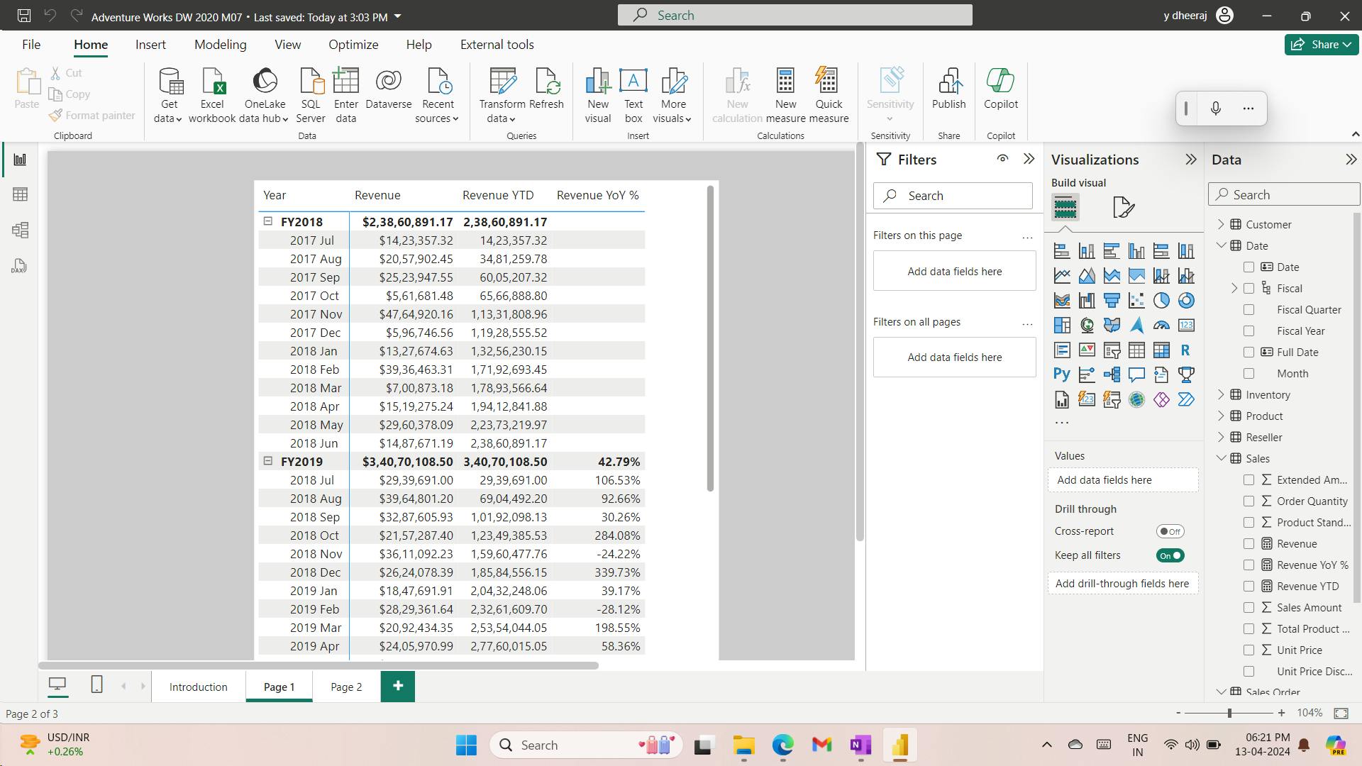
3. Additional time intelligence calculations
i. Calculate new occurrences
Another use of time intelligence functions is to count new occurrences.
The following example shows how you can calculate the number of new customers for a time period. A new customer is counted in the time period in which they made their first purchase.
Your first task is to add the following measure to the Sales table that counts the number of distinct customers life-to-date (LTD).
Life-to-date means from the beginning of time until the last date in filter context. Format the measure as a whole number by using the thousands separator.
Customers LTD =
VAR CustomersLTD =
    CALCULATE(
        DISTINCTCOUNT(Sales[CustomerKey]),
        DATESBETWEEN(
            'Date'[Date],
            BLANK(),
            MAX('Date'[Date])
        ),
        'Sales Order'[Channel] = "Internet"
    )
RETURN
    CustomersLTD
produces a result of distinct customers LTD until the end of each month.
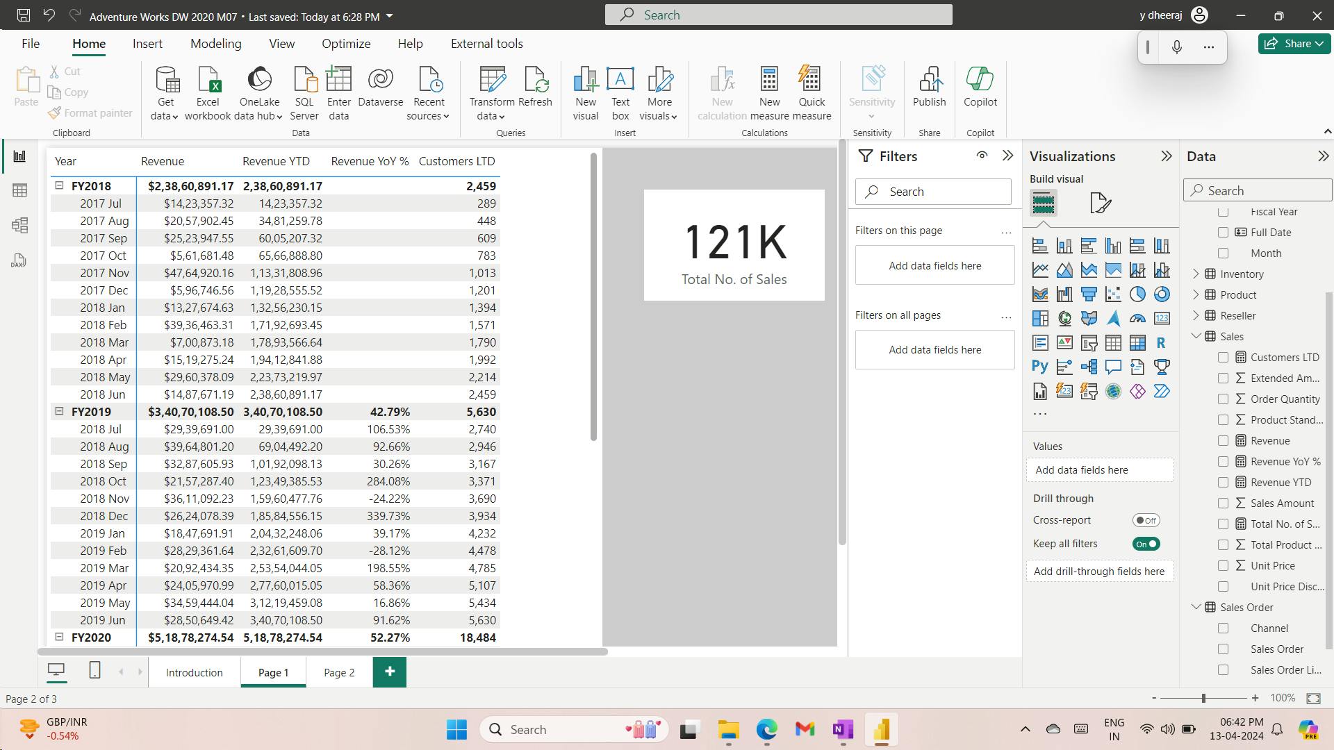
The DATESBETWEEN function returns a table that contains a column of dates that begins with a given start date and continues until a given end date.
When the start date is BLANK, it will use the first date in the date column (Conversely, when the end date is BLANK, it will use the last date in the date column.) In this case, the end date is determined by the MAX function, which returns the last date in filter context.
Therefore, if the month of August 2017 is in filter context, then the MAX function will return August 31, 2017 and the DATESBETWEEN function will return all dates through to August 31, 2017.
Next, you will modify the measure by renaming it to New Customers and by adding a second variable to store the count of distinct customers before the time period in filter context. The RETURN clause now subtracts this value from LTD customers to produce a result, which is the number of new customers in the time period.
New Customers =
VAR CustomersLTD =
    CALCULATE(
        DISTINCTCOUNT(Sales[CustomerKey]),
        DATESBETWEEN(
            'Date'[Date],
            BLANK(),
            MAX('Date'[Date])
        ),
    'Sales Order'[Channel] = "Internet"
    )
VAR CustomersPrior =
    CALCULATE(
        DISTINCTCOUNT(Sales[CustomerKey]),
        DATESBETWEEN(
            'Date'[Date],
            BLANK(),
            MIN('Date'[Date]) - 1
        ),
        'Sales Order'[Channel] = "Internet"
    )
RETURN
    CustomersLTD - CustomersPrior
For the CustomersPrior variable, notice that the DATESBETWEEN function includes dates until the first date in filter context minus one. Because Microsoft Power BI internally stores dates as numbers, you can add or subtract numbers to shift a date.
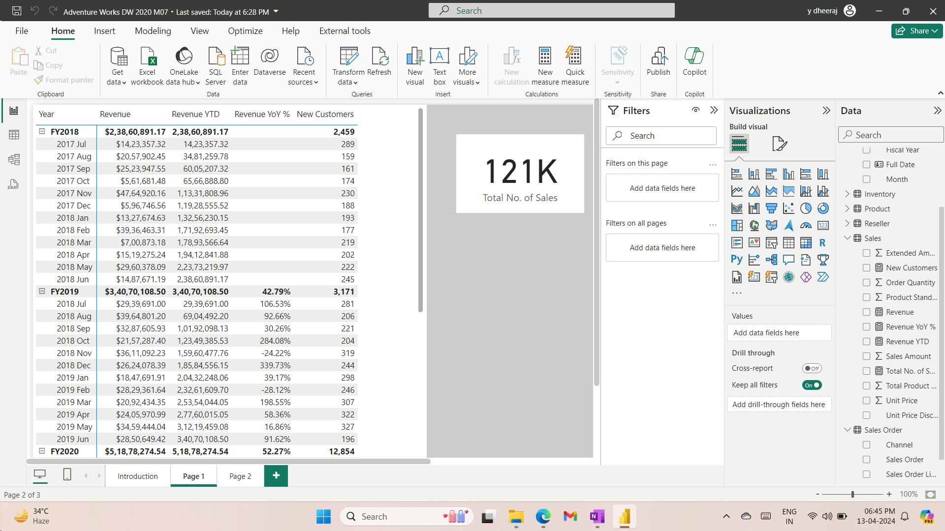
ii. Snapshot calculations
Occasionally, fact data is stored as snapshots in time. Common examples include inventory stock levels or account balances. A snapshot of values is loaded into the table on a periodic basis.
When summarizing snapshot values (like inventory stock levels), you can summarize values across any dimension except date. Adding stock level counts across product categories produces a meaningful summary, but adding stock level counts across dates does not. Adding yesterday's stock level to today's stock level isn't a useful operation to perform (unless you want to average that result).
When you are summarizing snapshot tables, measure formulas can rely on DAX time intelligence functions to enforce a single date filter.
Now, you'll add a measure to the Inventory table that sums the UnitsBalance value for a single date. The date will be the last date of each time period. It's achieved by using the LASTDATE function. Format the measure as a whole number with the thousands separator.
Stock on Hand =
CALCULATE(
    SUM(Inventory[UnitsBalance]),
    LASTDATE('Date'[Date])
)
Notice that the measure formula uses the SUM function. An aggregate function must be used (measures don't allow direct references to columns), but given that only one row exists for each product for each date, the SUM function will only operate over a single row.
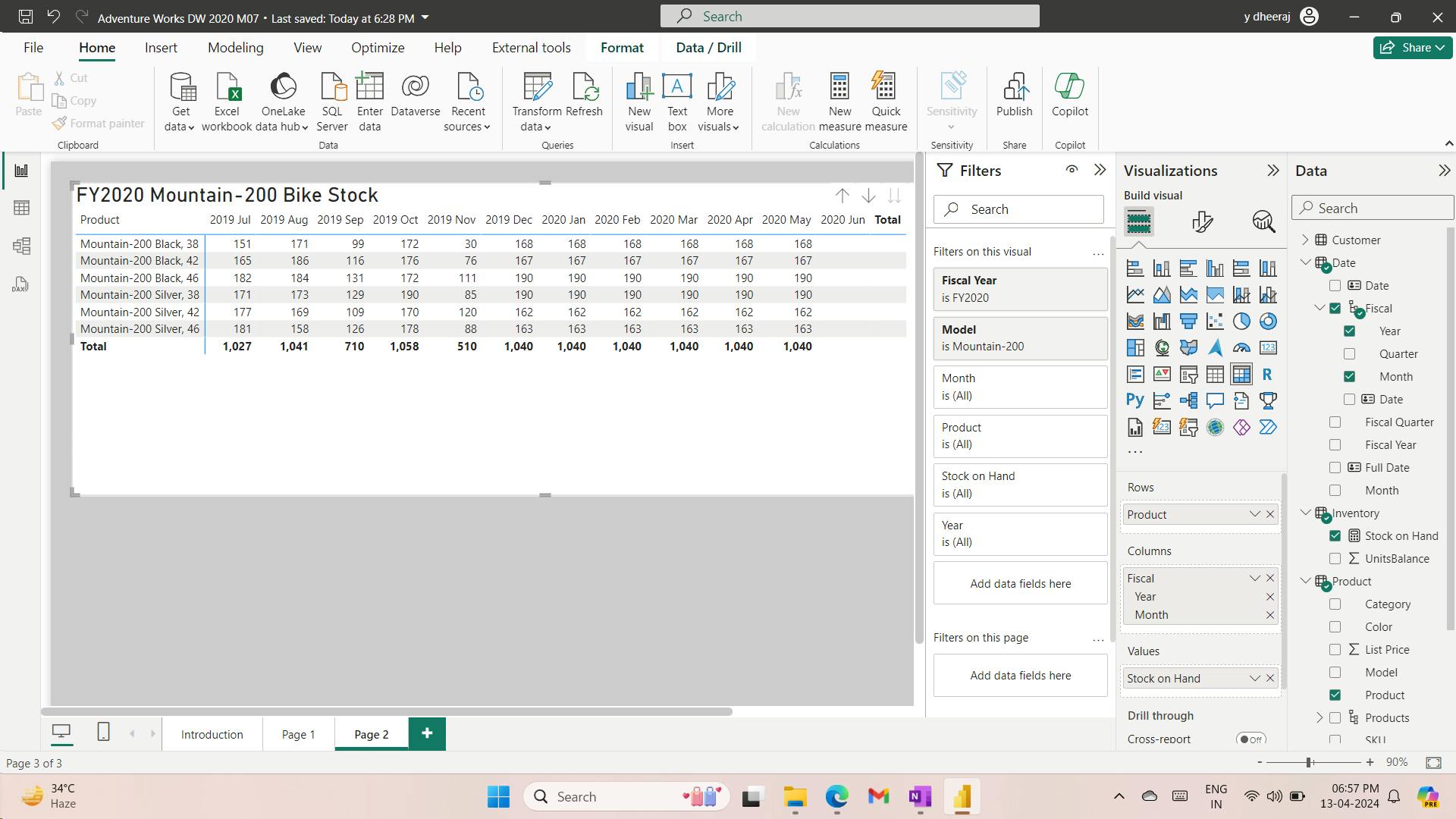
The measure returns BLANKs for June 2020 because no record exists for the last date in June. According to the data, it hasn't happened yet.
Filtering by the last date in filter context has inherent problems: A recorded date might not exist because it hasn't yet happened, or perhaps because stock balances aren't recorded on weekends.
Your next step is to adjust the measure formula to determine the last date that has a non-BLANK result and then filter by that date. You can achieve this task by using the LASTNONBLANK DAX function.
Stock on Hand =
CALCULATE(
    SUM(Inventory[UnitsBalance]),
    LASTNONBLANK(
        'Date'[Date],
        CALCULATE(SUM(Inventory[UnitsBalance]))
    )
)
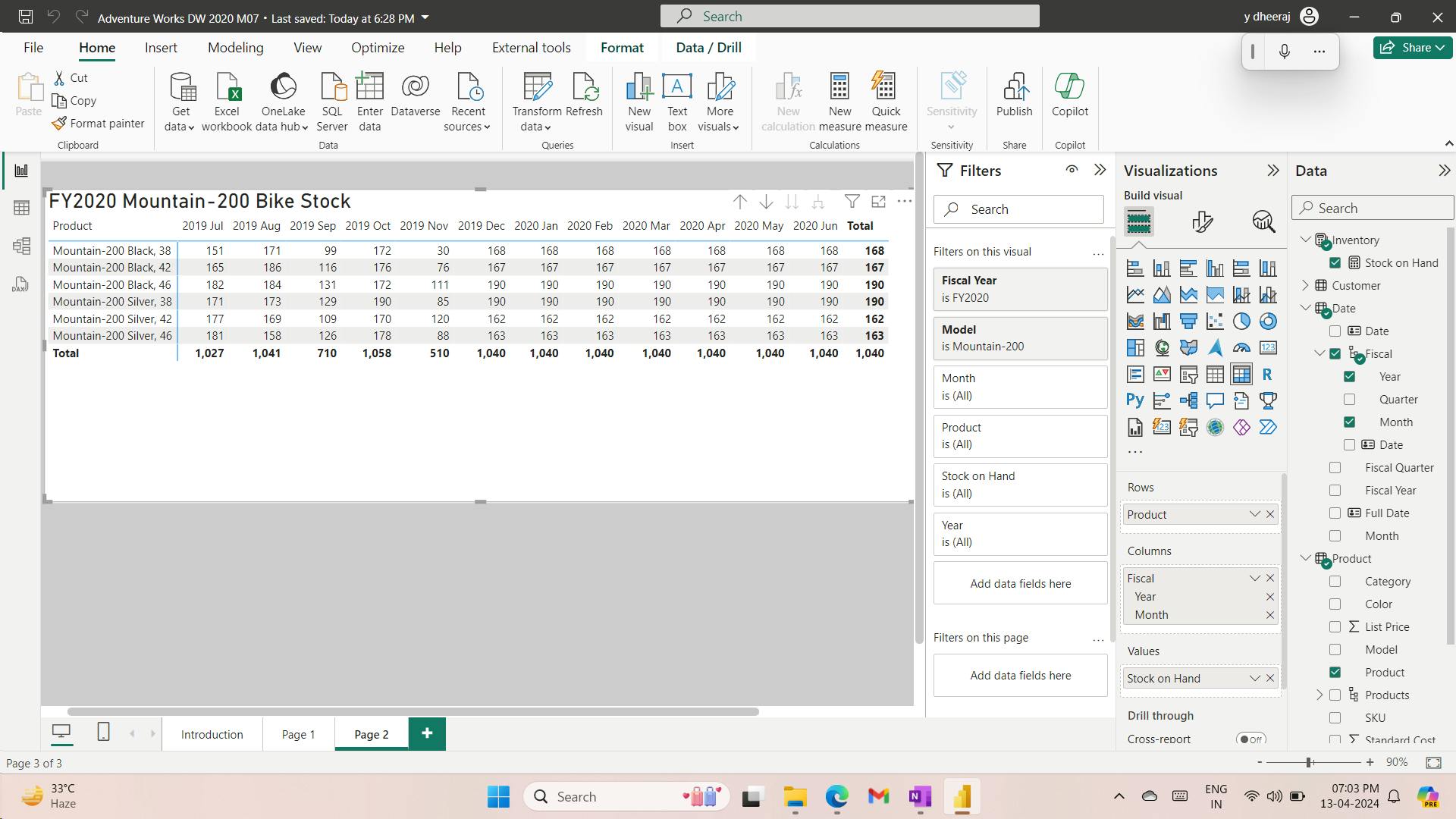
4. Exercise - Create Advanced DAX Calculations in Power BI Desktop
i. Lab story
In this lab, you’ll create measures with DAX expressions involving filter context manipulation.
In this lab you learn how to:
Use the CALCULATE() function to manipulate filter context
Use Time Intelligence functions
ii. Work with Filter Context
iii. Create a matrix visual
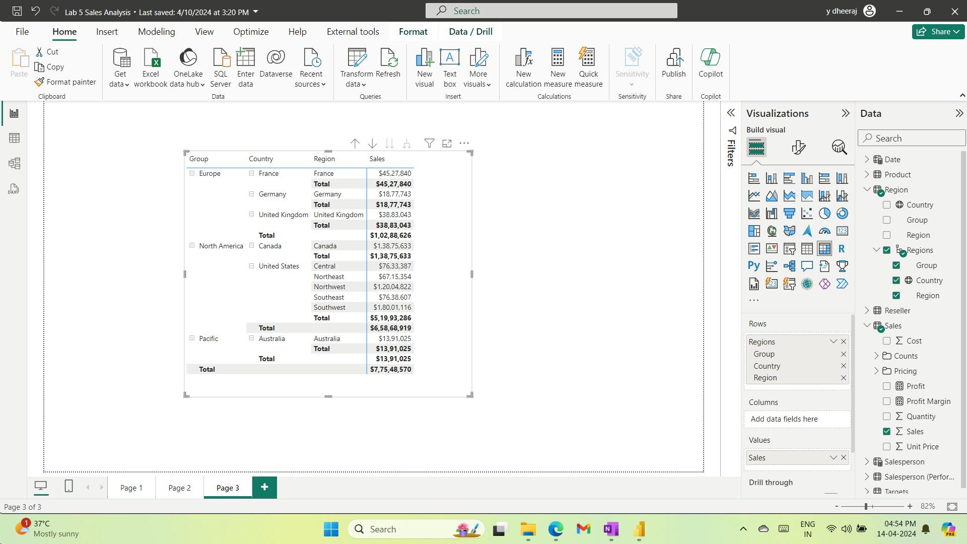
iv. Manipulate filter context
use the CALCULATE() function to manipulate filter context.
 Sales All Region =

 CALCULATE(SUM(Sales[Sales]), REMOVEFILTERS(Region))
The CALCULATE() function is a powerful function used to manipulate the filter context. The first argument takes an expression or a measure (a measure is just a named expression). Subsequent arguments allow modifying the filter context.
The REMOVEFILTERS() function removes active filters. It can take either no arguments, or a table, a column, or multiple columns as its argument.
In this formula, the measure evaluates the sum of theSalescolumn in a modified filter context, which removes any filters applied to the columns of theRegiontable.
 Sales % All Region =
 DIVIDE(
  SUM(Sales[Sales]),
  CALCULATE(
  SUM(Sales[Sales]),
  REMOVEFILTERS(Region)
  )
 )
The DIVIDE() function divides the Sales measure (not modified by filter context) by the Sales measure in a modified context, which removes any filters applied to the Region table.
 Sales % Country =
 DIVIDE(
  SUM(Sales[Sales]),
  CALCULATE(
  SUM(Sales[Sales]),
  REMOVEFILTERS(Region[Region])
  )
 )
The difference is that the denominator modifies the filter context by removing filters on theRegioncolumn of theRegiontable, not all columns of theRegiontable. It means that any filters applied to the group or country columns are preserved. It will achieve a result that represents the sales as a percentage of country.
 Sales % Country =
 IF(
  ISINSCOPE(Region[Region]),
  DIVIDE(
  SUM(Sales[Sales]),
  CALCULATE(
  SUM(Sales[Sales]),
  REMOVEFILTERS(Region[Region])
  )
  )
 )
The IF() function uses the ISINSCOPE() function to test whether the region column is the level in a hierarchy of levels. When true, the DIVIDE() function is evaluated. When false, a blank value is returned because the region column isn’t in scope.
 Sales % Group =
 DIVIDE(
  SUM(Sales[Sales]),
  CALCULATE(
  SUM(Sales[Sales]),
  REMOVEFILTERS(
  Region[Region],
  Region[Country]
  )
  )
 )
To achieve sales as a percentage of group, two filters can be applied to effectively remove the filters on two columns.
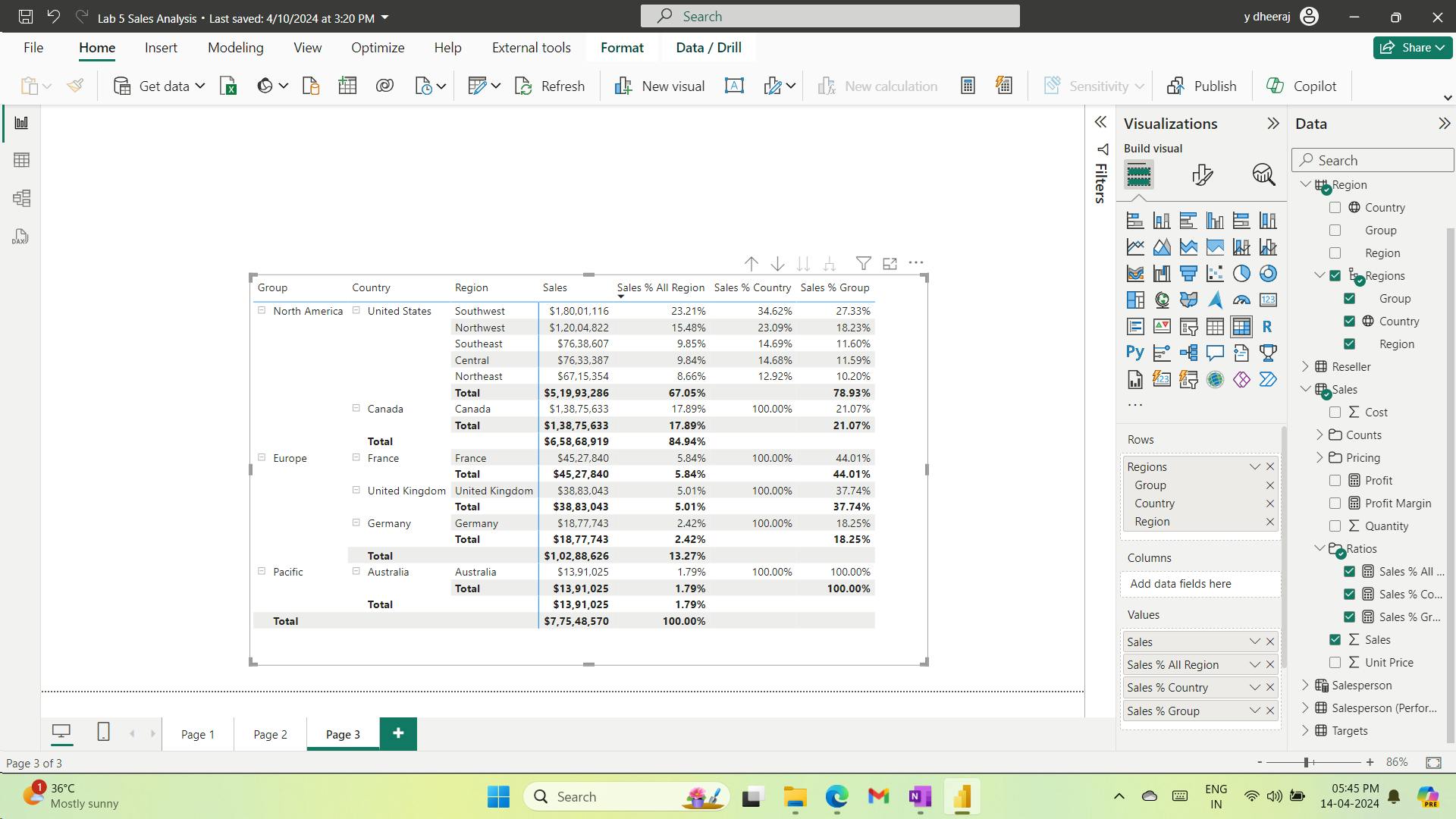
v. Work with Time Intelligence
vi. Create a YTD measure
 Sales YTD =
 TOTALYTD(SUM(Sales[Sales]), 'Date'[Date], "6-30")
The TOTALYTD() function evaluates an expression—in this case the sum of theSalescolumn—over a given date column. The date column must belong to a date table marked as a date table, as was done in theCreate DAX Calculations in Power BI Desktoplab.
The function can also take a third optional argument representing the last date of a year. The absence of this date means that December 31 is the last date of the year. For Adventure Works, June in the last month of their year, and so “6-30” is used.
The TOTALYTD() function performs filter manipulation, specifically time filter manipulation. For example, to compute YTD sales for September 2017 (the third month of the fiscal year), all filters on theDatetable are removed and replaced with a new filter of dates commencing at the beginning of the year (July 1, 2017) and extending through to the last date of the in-context date period (September 30, 2017).
Many Time Intelligence functions are available in DAX to support common time filter manipulations.
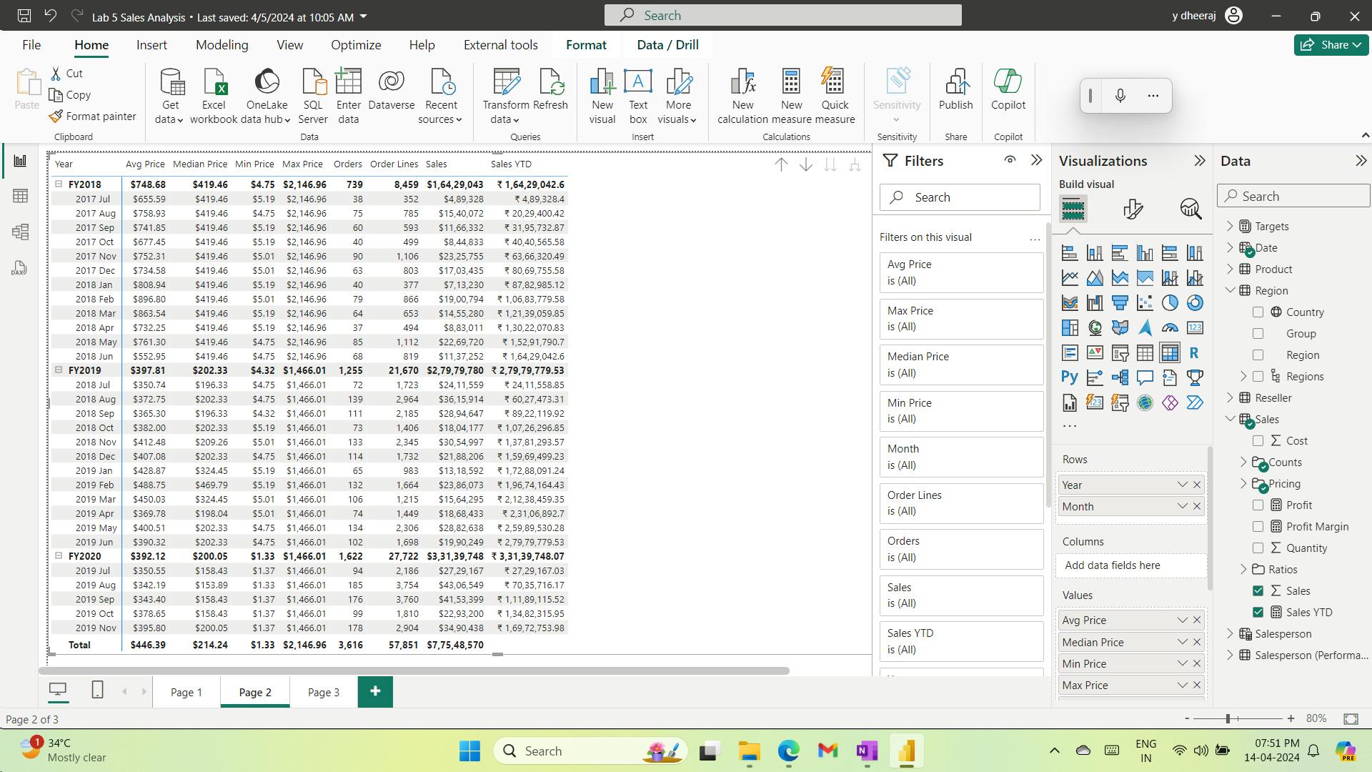
vii. Create a YoY growth measure
 Sales YoY Growth =
 VAR SalesPriorYear =
  CALCULATE(
  SUM(Sales[Sales]),
  PARALLELPERIOD(
  'Date'[Date],
  -12,
  MONTH
  )
  )
 RETURN
  SalesPriorYear
TheSalesPriorYearvariable is assigned an expression that calculates the sum of theSalescolumn in a modified context that uses the PARALLELPERIOD() function to shift 12 months back from each date in filter context.
modified
 Sales YoY Growth =
 VAR SalesPriorYear =
  CALCULATE(
  SUM(Sales[Sales]),
  PARALLELPERIOD(
  'Date'[Date],
  -12,
  MONTH
  )
  )
 RETURN
  DIVIDE(
  (SUM(Sales[Sales]) - SalesPriorYear),
  SalesPriorYear
  )
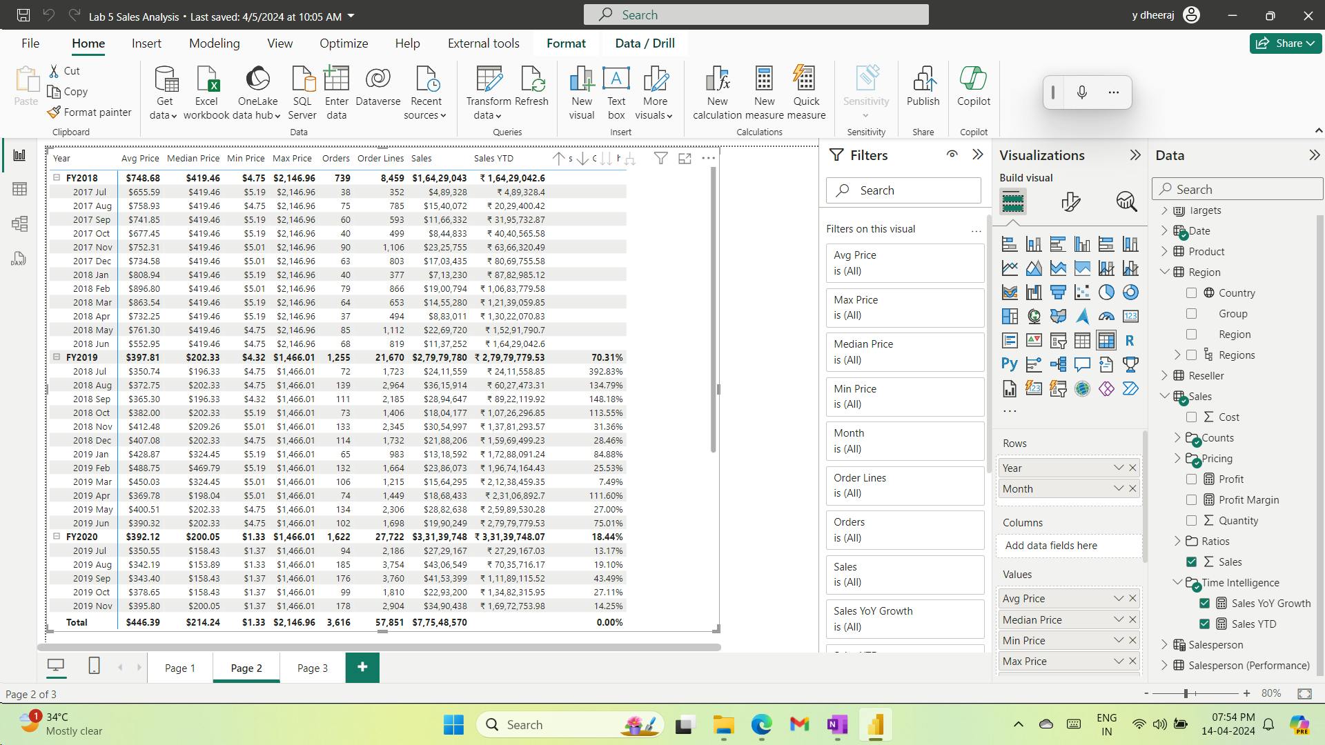
5. Check your knowledge
In the context of semantic model calculations, which statement best describes time intelligence?
Filter context modifications involving a date table
Time intelligence calculations modify date filter contexts.
You're developing a semantic model in Power BI Desktop. You've just added a date table by using the CALENDARAUTO function. You've extended it with calculated columns, and you've related it to other model tables. What else should you do to ensure that DAX time intelligence calculations work correctly?
Mark as a Date table.
You must mark the date table so that Power BI can correctly filter its dates.
You have a table that stores account balance snapshots for each date, excluding weekends. You need to ensure that your measure formula only filters by a single date. Also, if no record is on the last date of a time period, it should use the latest account balance. Which DAX time intelligence function should you use?
LASTNONBLANK
The LASTNONBLANK function will return the last date in the filter context where a snapshot record exists. This option will help you achieve the objective.
6. Summary
In this module,
you learned that time intelligence calculations are concerned with modifying the filter context for date filters.
You were introduced to many DAX time intelligence functions, which support the creation of calculations, such as year-to-date (YTD) or year-over-year (YoY).
You also learned that life-to-date (LTD) calculations can help you count new occurrences over your fact data, and that snapshot data can be filtered in a way to help guarantee that only a single snapshot value is returned.
Learning objectives
By the end of this module, you'll be able to:
Define time intelligence.
Use common DAX time intelligence functions.
Create useful intelligence calculations.
IX. Module 9 Optimize a model for performance in Power BI
| Course | Microsoft Power BI Data Analyst |
| Module 9/17 | Optimize a model for performance in Power BI |

Performance optimization, also known as performance tuning, involves making changes to the current state of the semantic model so that it runs more efficiently. Essentially, when your semantic model is optimized, it performs better.
1. Introduction to performance optimization
As a data analyst, you will spend approximately 90 percent of your time working with your data, and nine times out of ten, poor performance is a direct result of a bad semantic model, bad Data Analysis Expressions (DAX), or the mix of the two.
A smaller sized semantic model uses less resources (memory) and achieves faster data refresh, calculations, and rendering of visuals in reports. Therefore, the performance optimization process involves minimizing the size of the semantic model and making the most efficient use of the data in the model, which includes:
Ensuring that the correct data types are used.
Deleting unnecessary columns and rows.
Avoiding repeated values.
Replacing numeric columns with measures.
Reducing cardinalities.
Analyzing model metadata.
Summarizing data where possible.
In this module, you will be introduced to the steps, processes, and concepts that are necessary to optimize a semantic model for enterprise-level performance.
By the end of this module, you're able to:
Review the performance of measures, relationships, and visuals.
Use variables to improve performance and troubleshooting.
Improve performance by reducing cardinality levels.
Optimize DirectQuery models with table level storage.
Create and manage aggregations.
2. Review performance of measures, relationships, and visuals
semantic model - multiple tables, complex relationships, intricate calculations, multiple visuals, or redundant data - a potential exists for poor report performance
i. Identify report performance bottlenecks
optimal performance - create efficient semantic model - has fast running queries and measures.
improve the model - analyzing the query plans and dependencies and then making changes to further optimize performance.
a. Analyze performance
Performance analyzer - how long a visual to refresh when initiated by a user
Performance analyzer - accurate results - clear visual cache, clear data engine cache
b. Review results
DAX query - The time it took for the visual to send the query, along with the time it took Analysis Services to return the results.
Visual display - The time it took for the visual to render on the screen, including the time required to retrieve web images or geocoding.
Other - The time it took the visual to prepare queries, wait for other visuals to complete, or perform other background processing tasks. If this category displays a long duration, the only real way to reduce this duration is to optimize DAX queries for other visuals, or reduce the number of visuals in the report.
ii. Resolve issues and optimize performance
a. Visuals
number of visuals on the report page,
use drill-through pages and report page tooltips.
b. DAX query
Performance analyzer highlights potential issues but does not tell you what needs to be done to improve them. - use Dax studio to analyse further
try using different DAX functions
c. Semantic model
Performance analyzer - DAX query - high duration value > 120ms - relationships, columns, or metadata in your model, or it could be the status of the Auto date/time option
d. Relationships
relationship cardinality properties are correctly configured.
e. Columns
remove an unnecessary column
try to deal with them at the source when loading data
f. Metadata
Metadata is information about other data.
Power BI metadata contains information on your semantic model, such as
the name,
data type and
format of each of the columns,
the schema of the database,
the report design,
when the file was last modified,
the data refresh rates, and much more.
use Power Query Editor: Unnecessary columns, Unnecessary rows, Data type, Query, names,
Column details
Column quality - percentage of items in the column are valid
Column distribution - frequency and distribution of the values
Column profile - statistics chart and a column distribution chart
Column profiling based on top 1000 rows > Column profiling based on entire data set.
data - compressed and stored to the disk by the VertiPaq storage engine
g. Auto date/time feature
Auto date/time option - enabled globally - automatically creates a hidden calculated table for each date column
Disabling Auto date/time option - lower the size of your semantic model and reduce the refresh time.
3. Use variables to improve performance and troubleshooting
Variables in your DAX formulas to help you write less complex and more efficient calculations.
Variables in your semantic model:
Improved performance - remove the need to evaluate the same expression multiple times, reduce query processing time.
Improved readability -
Simplified debugging
Reduced complexity
i. Use variables to improve performance
Sales YoY Growth =
DIVIDE (
    ( [Sales] - CALCULATE ( [Sales], PARALLELPERIOD ( 'Date'[Date], -12, MONTH ) ) ),
    CALCULATE ( [Sales], PARALLELPERIOD ( 'Date'[Date], -12, MONTH ) )
)
Sales YoY Growth =
VAR SalesPriorYear =
    CALCULATE ( [Sales], PARALLELPERIOD ( 'Date'[Date], -12, MONTH ) )
VAR SalesVariance =
    DIVIDE ( ( [Sales] - SalesPriorYear ), SalesPriorYear )
RETURN
    SalesVariance
ii. Use variables to improve readability
iii. Use variables to troubleshoot multiple steps
4. Reduce cardinality
Cardinality is a term that is used to describe the uniqueness of the values in a column.
Cardinality is also used in the context of the relationships between two tables, where it describes the direction of the relationship.
i. Identify cardinality levels in columns
Power Query Editor to analyze the metadata, the Column distribution - display statistics on how many distinct and unique items were in each column in the data.
Distinct values count - The total number of different values found in a given column.
Unique values count - The total number of values that only appear once in a given column.

Low level of cardinality - more optimized performance; column that has a lot of repeated values in its range (unique count is low).
High level of cardinality - column that has a lot of unique values in its range (unique count is high).
Optimized performance - have more Lower cardinality columns & less high cardinally columns in your semantic model.
ii. Reduce relationship cardinality
iii. Improve performance by reducing cardinality levels
Reducing data - loaded into your model - improve the relationship cardinality of the report.
Reduce a model size - use a summary table from the data source - A disadvantage - might lose the ability to drill into data because the detail no longer exists. This tradeoff could be mitigated by using a mixed model design.
each table can have its Storage Mode property set as Import or DirectQuery.
Reduce the model size - set the Storage Mode property for larger fact-type tables to DirectQuery.
LO
Performance optimization - performance tuning, changes to the current state of the semantic model - runs more efficiently. - semantic model - optimized - performs better.
smaller sized semantic model - uses less resources (memory) and achieves faster data refresh, calculations, and rendering of visuals in reports
performance optimization process - Ensuring the correct data types, Deleting unnecessary columns and rows, Avoiding repeated values,
Replacing numeric columns with measures, Reducing cardinalities, Analyzing model metadata,
semantic model - multiple tables, complex relationships, intricate calculations, multiple visuals, or redundant data - a potential exists for poor report performance
Performance analyzer - for ccaurate results - clear visual cache, clear data engine cache ; highlights potential issues but does not tell you what needs to be done to improve them
Column profiling based on top 1000 rows > Column profiling based on entire data set.
Disabling Auto date/time option - lower the size of your semantic model and reduce the refresh time.
Use variables
Cardinality - uniqueness of the values in a column, direction of the relationship
Low level of cardinality - more optimized performance; column that has a lot of repeated values in its range (unique count is low).
High level of cardinality - column that has a lot of unique values in its range (unique count is high).
Optimized performance - have more Lower cardinality columns & less high cardinally columns in your semantic model.
Reduce the model size - mixed model design - set the Storage Mode property for larger fact-type tables to DirectQuery.
5. Optimize DirectQuery models with table level storage
DirectQuery - connecting directly to data in its source repository, queries might time out, only the schema is loaded.
i. Implications of using DirectQuery
as data changes frequently and near real-time reporting
large data without the need to pre-aggregate
data sovereignty restrictions to comply with legal requirements.
multidimensional data source that contains measures such as SAP Business Warehouse (BW)
ii. Behavior of DirectQuery connections
iii. Limitations of DirectQuery connections
Performance - depends on the performance of the underlying data source.
Security
Data transformation - data that is sourced from DirectQuery has limitations
Modeling - modeling capabilities aren't available, or are limited
iv. Optimize performance
examine the queries - sent to the underlying source
a. Optimize data in Power BI Desktop
reduce the number of visuals on report page; reduce the number of fields in visual; remove unnecessary columns and rows.
b. Optimize the underlying data source (connected database)
Avoid the use of complex calculated columns because the calculation expression will be embedded into the source queries.
It is more efficient to push the expression back to the source because it avoids the push down. You could also consider adding surrogate key columns to dimension-type tables.
v. Customize the Query reduction options
Power BI Desktop gives you the option to send fewer queries and to disable certain interactions that will result in a poor experience if the resulting queries take a long time to run.
Applying these options prevents queries from continuously hitting the data source, which should improve performance.
6. Create and manage aggregations
aggregation - reduces the table sizes in the semantic model - improve the query performance; data is cached - smaller cache; speed up the refresh process.
7. Check your knowledge
What benefit do you get from analyzing the metadata?
The benefit of analyzing the metadata is that you can clearly identify data inconsistences with your semantic model.
What can be achieved by removing unnecessary rows and columns?
Deleting unnecessary rows and columns will reduce a semantic model size and it's good practice to load only necessary data into your semantic model.
Which of the following statements about relationships in Power BI Desktop is true?
A working relationship can be created as long as there is at least one common column between them.
8. Summary
optimize performance and reduce the size of the model.
You started the optimization process by using Performance analyzer and other tools to review the performance of measures, relationships, and visuals, and then made improvements based on the analysis results.
Next, you used variables to write less complex and more efficient calculations. You then took a closer look at the column distribution and reduced the cardinality of your relationships.
At that stage, the semantic model was more optimized.
You considered how the situation would be different if your organization used a DirectQuery model, and then you identified how to optimize performance from Power BI Desktop and the source database.
Finally, you used aggregations to significantly reduce the size of the semantic model.
Learning objectives
By the end of this module, you will be able to:
Review the performance of measures, relationships, and visuals.
Use variables to improve performance and troubleshooting.
Improve performance by reducing cardinality levels.
Optimize DirectQuery models with table level storage.
Create and manage aggregations.
X. Module 10 Design Power BI reports
| Course | Microsoft Power BI Data Analyst |
| Module 10/17 | Design Power BI reports |

Power BI - 30 core visuals
This module will guide you through selecting the most appropriate visual type to meet your design and report layout requirements.
1. Introduction
i. Report structure

ii. Report pages
2. Design the analytical report layout
3. Design visually appealing reports
4. Report objects
5. Select report visuals
6. Select report visuals to suit the report layout
7. Format and configure visualizations
8. Work with key performance indicators
9. Exercise - Design a report in Power BI desktop
i. Lab story
In this lab, you’ll create a three-page report. You’ll then publish it to Power BI, where you’ll open and interact with the report.
In this lab you learn how to:
Design a report
Configure visual fields and format properties
ii. Create a Report
iii. Design page 1
In the visual fields pane, in the X-axis well/area, for the Month field, select the down-arrow, and then select Show Items With No Data.
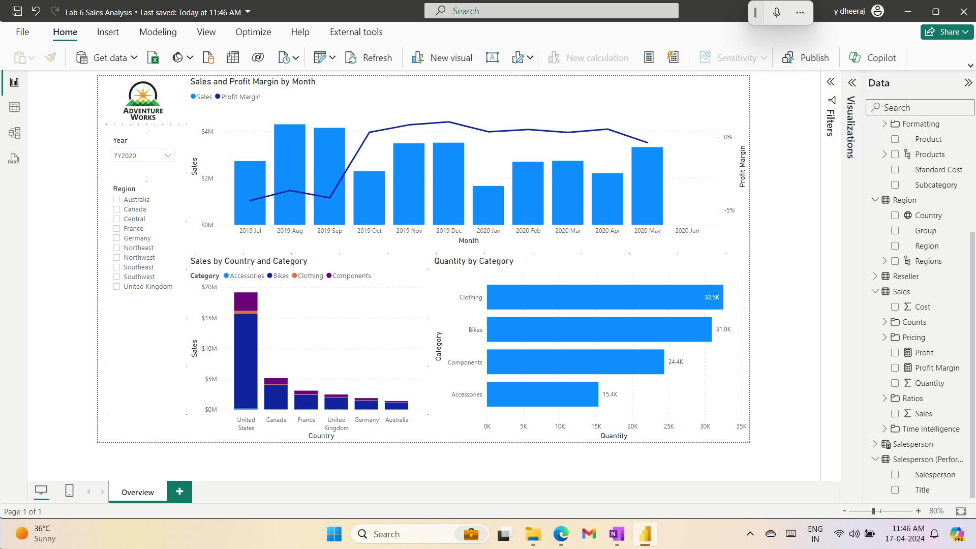
iv. Design page 2
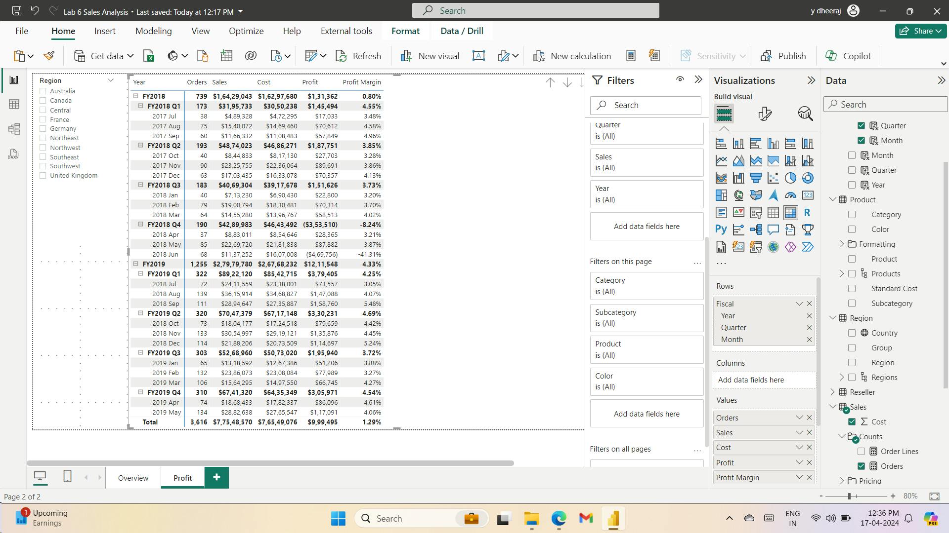
v. Design page 3
simulate the performance of row-level security filters
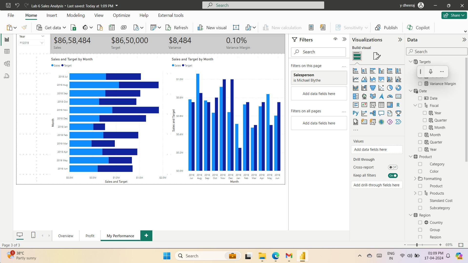
vi. Publish the report
vii. Explore the report
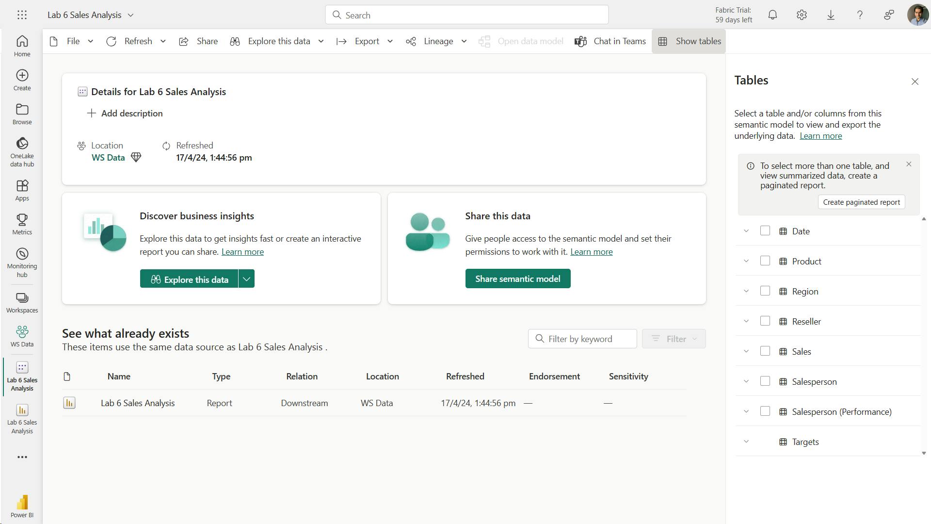
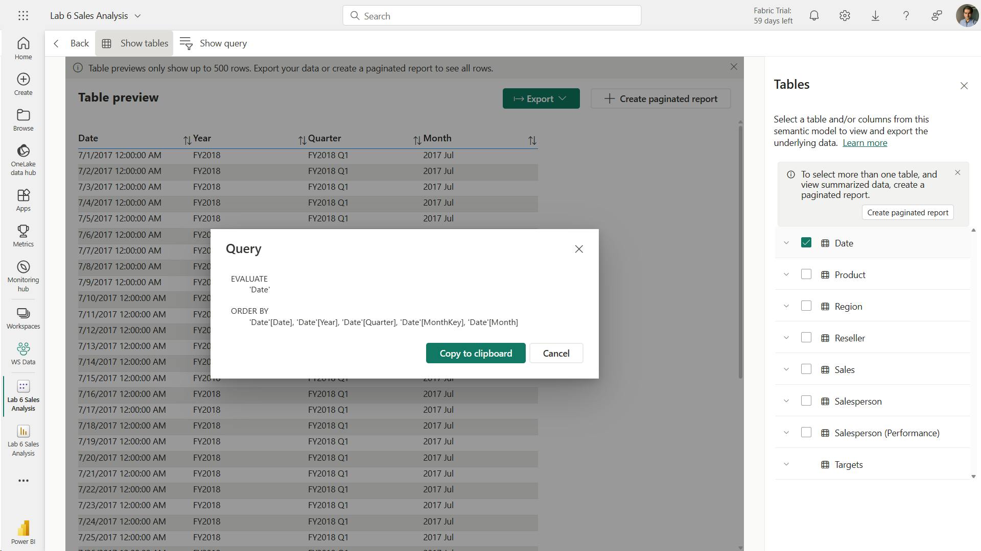
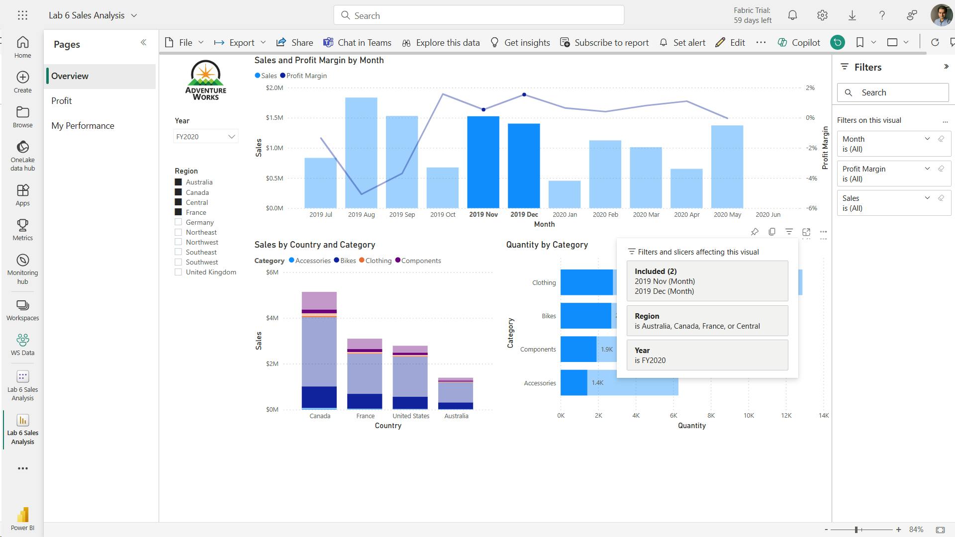
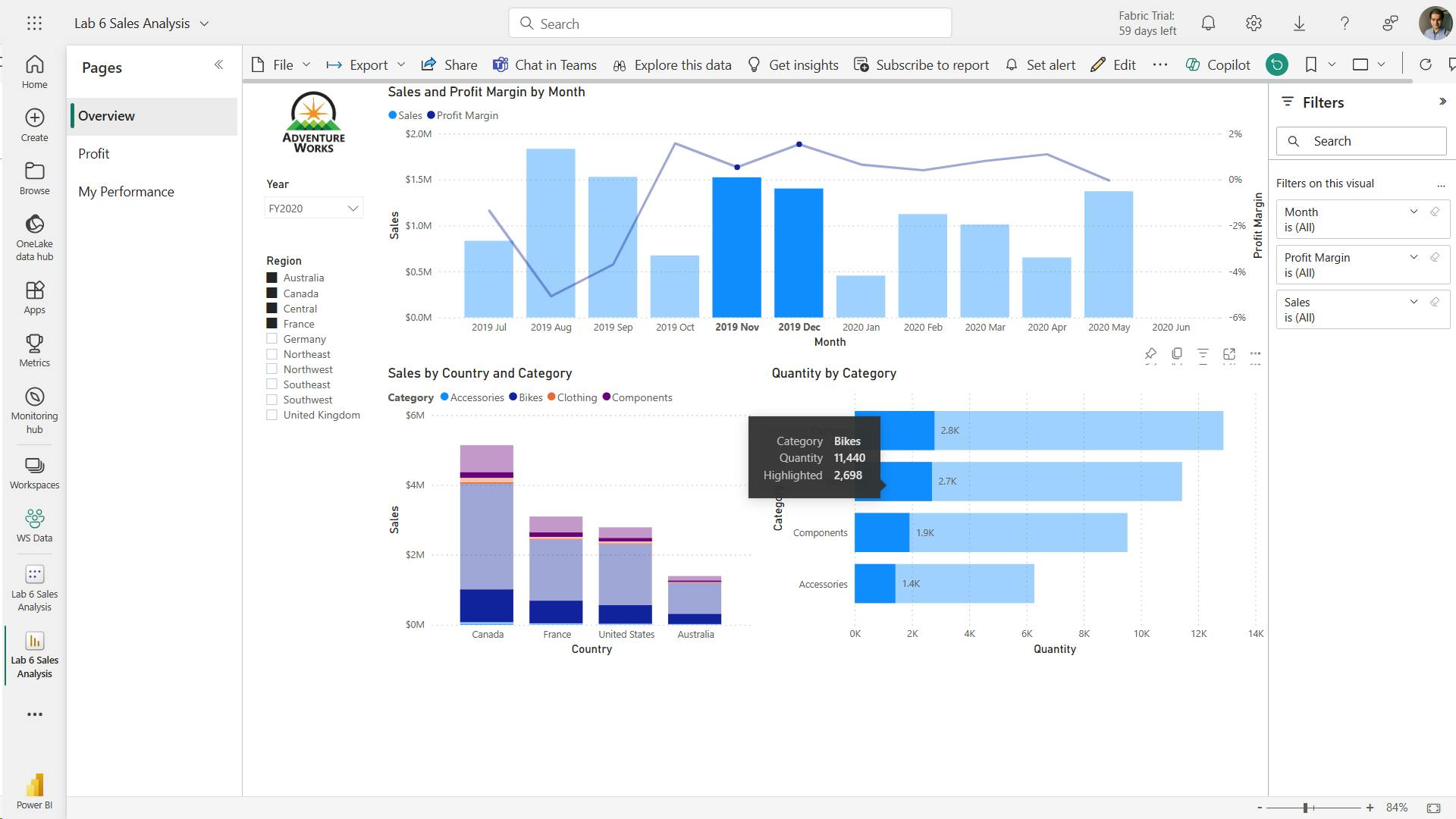
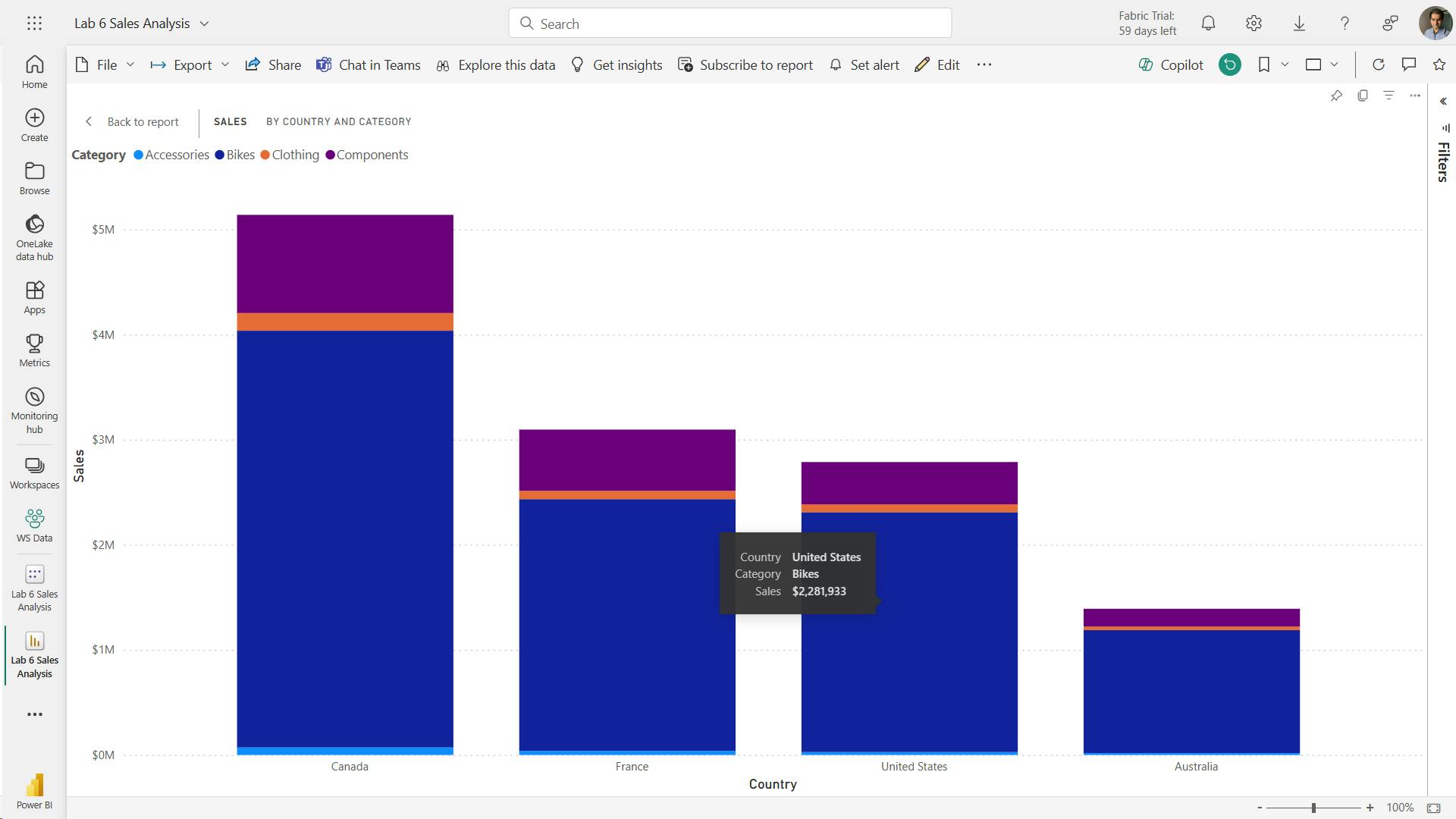
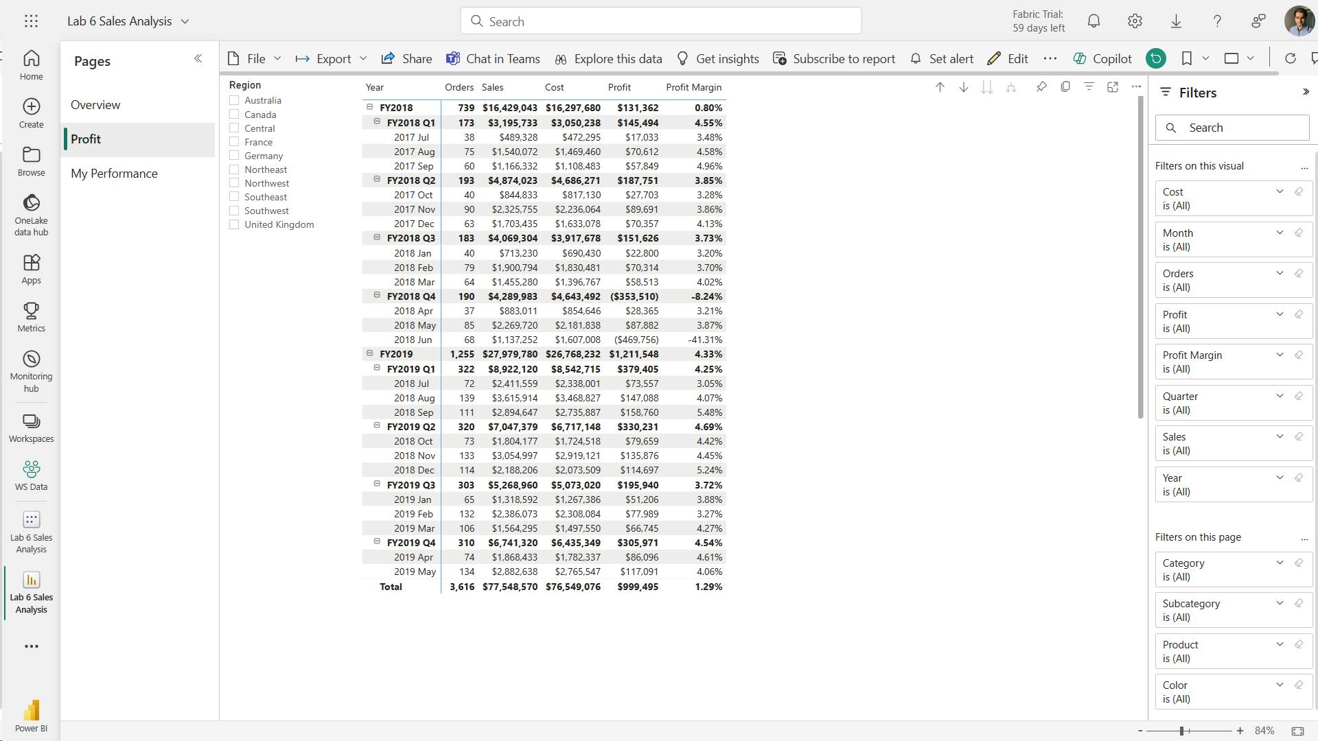
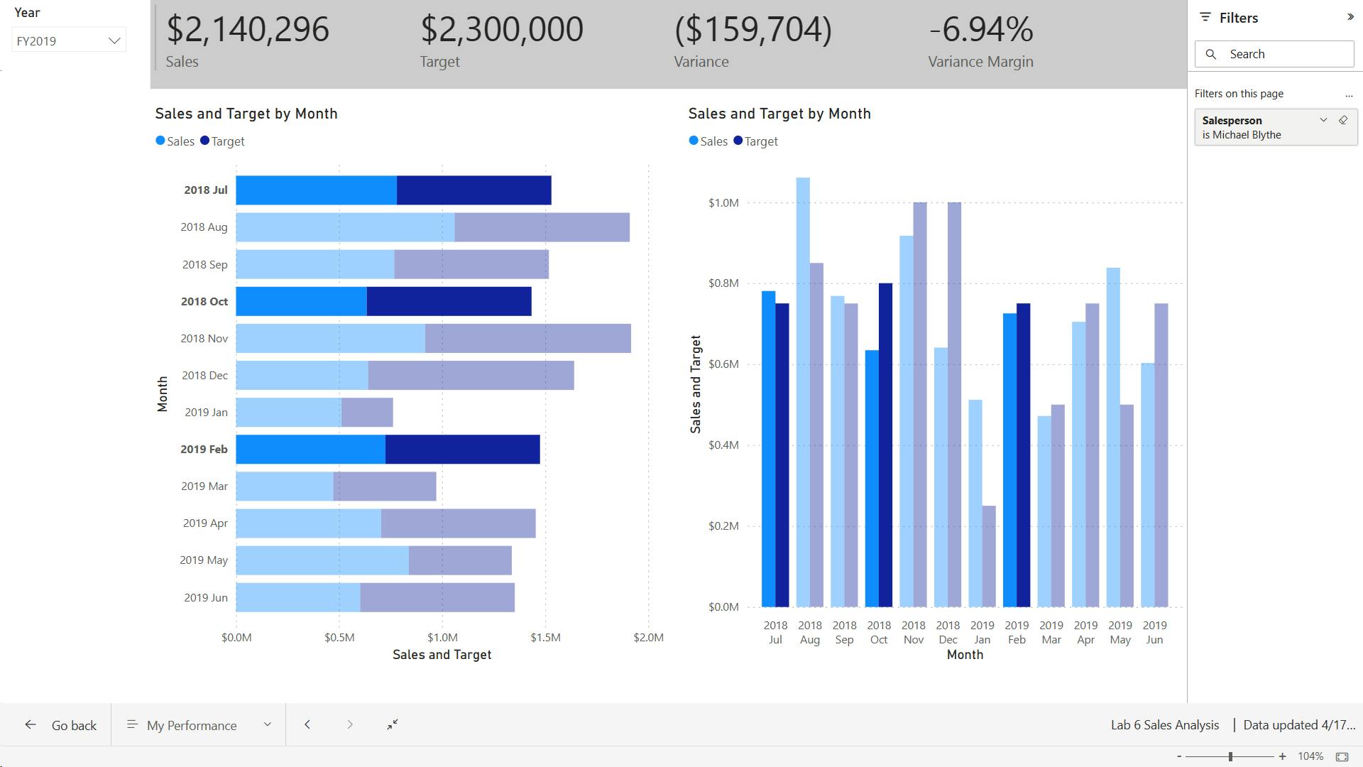
10. Check your knowledge
At the Contoso Skateboard Company, Brandon is designing a dashboard report to show inventory stock levels over time. What type of report visual should Brandon choose to effectively show the stock levels?
A line chart is probably the most effective way to visualize a time series, such as stock inventory levels over time.
At the Contoso Skateboard Company, Sakura is designing an analytical report. It must include a visual that allows report consumers to explore and discover detailed sales values over time and by store. What type of report visual should Sakura choose to support the report consumer requirement?
A matrix visual allows the report consumer to drill down on the columns and rows to reveal detailed values.
At the Contoso Skateboard Company, James is designing a dashboard report. It must prominently show values of sales revenue, units sold, cost of goods sold, and profit, and each value should be compared to a target value. What type of report visual should James choose to support the report consumer requirement?
A KPI visual can show and compare actual and target values.
11. Summary
Learning objectives
In this module, you will:
Learn about the structure of a Power BI report.
Learn about report objects.
Select the appropriate visual type to use.
XI. Module 11 Configure Power BI report filters
| Course | Microsoft Power BI Data Analyst |
| Module 11/17 | Configure Power BI report filters |

1. Introduction to designing reports for filtering
Filtering - semantic model (RLS), Report, Page, Visual, Measure.
i. semantic model (RLS)
Power BI report queries a single semantic model
semantic model can enforce row-level security (RLS) to restrict access to a subset of data, and different users will see different data
report - can't override RLS
ii. Report structure
Power BI report is hierarchical
iii. Measure
measure is a model object that is designed to summarize data
Measure DAX formulas - modify filter context by using the CALCULATE or CALCULATETABLE functions, intelligence functions - flexibility to add, remove, or modify filters - override filters applied to report structure.
A good example of a measure that overrides report filters is a three-month moving average calculation.
To compute the result for March, the filter context for month must expand to encompass January, February, and March.
The CALCULATE function or a time intelligence function can modify the filter context to produce that result.
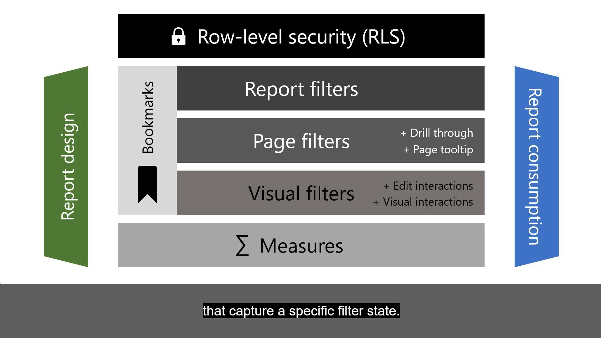
2. Apply filters to the report structure
3. Apply filters with slicers
slicers filter - by default filter all other visuals on the page, edit visual interactions to restrict filtering between two visuals
slicer is a visual that propagates filters to other visuals on the same page or (when synced) across other pages.
The slicer layout is responsive to the data type of the field. Field data types are either text, numeric, or date.
By default, a text field will produce a list slicer, a numeric field will produce a numeric range "between" filter, and a date field will produce a date range "between" filter, allowing value selection with calendar controls.
4. Design reports with advanced filtering techniques
Beyond filters and slicers, report authors can employ other filtering techniques, such as:
Visual interactions
Drillthrough
Report tooltip
Bookmarks
Report options
Query reduction options
i. Visual interactions
disabling cros filtering filter propagation.
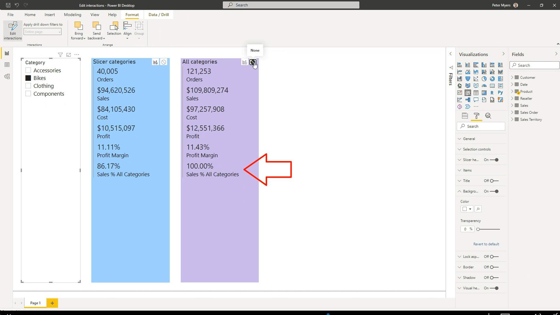
cross filters propagated
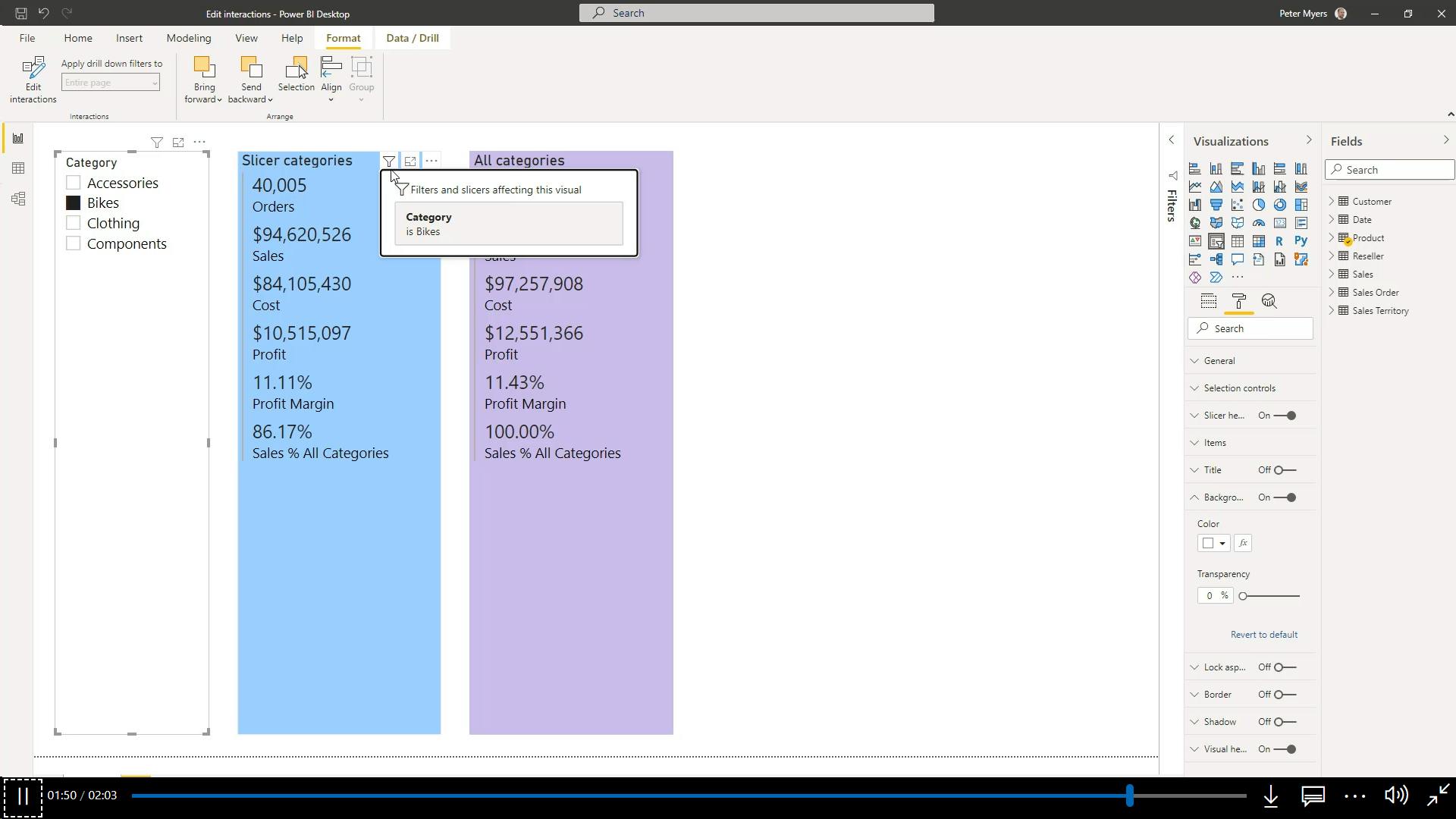
no cross filters propagated
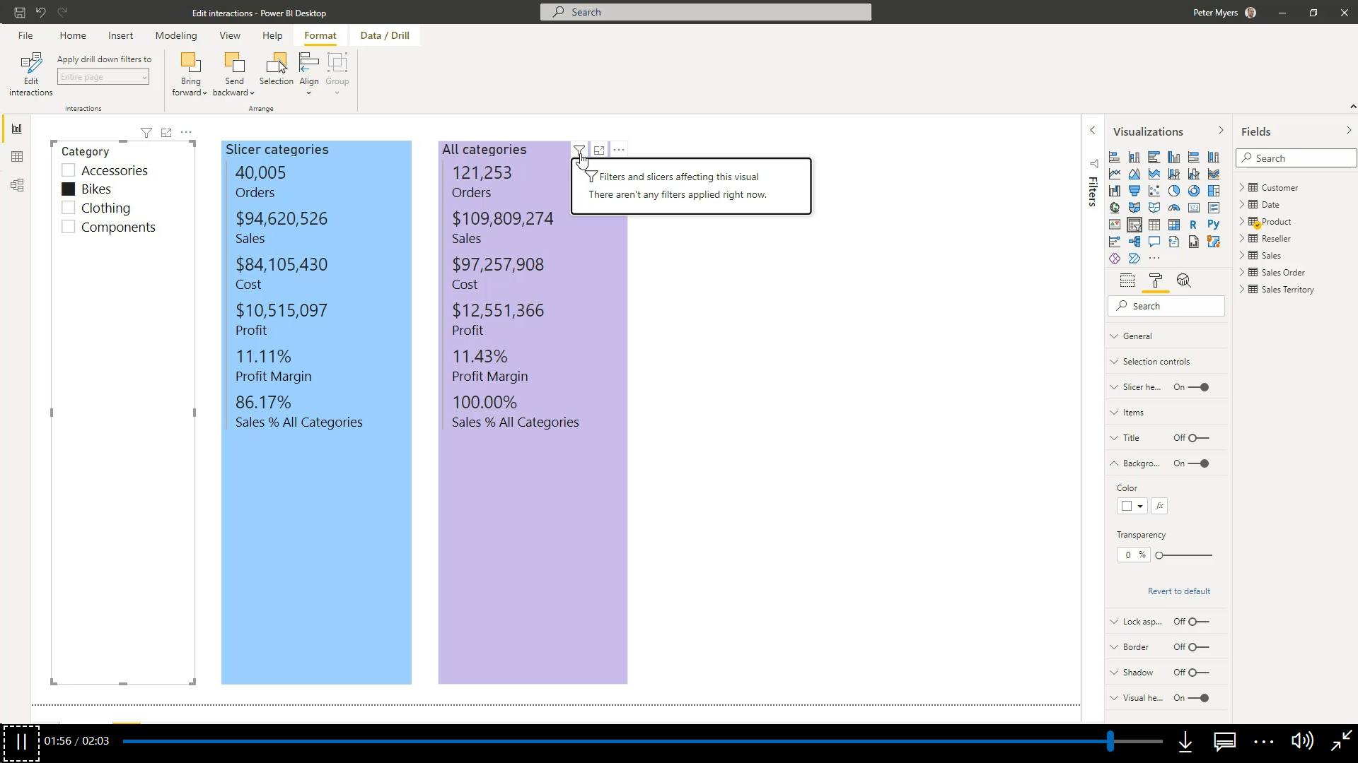
ii. Drillthrough
Add drillthrough pages to allow report consumers to drill from visuals. By default, the drillthrough action propagates all filters that apply to the visual to the drillthrough page.
iii. Report tooltip
By default, the report tooltip receives all filters that apply to the visual.
iv. Bookmarks
Bookmarks capture a specific view of a report, including filters, slicers, the page selection, and the state of visuals
v. Report options
vi. Query reduction options
can configure report settings to reduce the number of queries that are sent to the semantic model. Fewer queries will result in better responsiveness as report consumers update filters or slicers or cross filter report pages.
Consider enabling the query reduction options when the semantic model uses DirectQuery table storage or when imported data volumes are large and calculations are complex and slow.
5. Consumption-time filtering
In reading view, report consumers can use many different filter techniques when viewing a Power BI report, such as:
Using slicers.
Using filters.
Applying interactive filtering actions.
Determining applied filters.
Working with persistent filters.- Persistent filters is a feature that saves report consumer's slicer and filter settings. It automatically applies the settings when the report consumer reopens the report. That way, Power BI remembers previously applied filters. You can revert to default filters (that are saved in the report by the report author) by selecting Reset to default.
6. Select report filter techniques
7. Case study - Configure report filters based on feedback
8. Check your knowledge
Which of the following capabilities is unique to the Filters pane?
Top N filtering can only be achieved in the Filters pane.
Which of the following capabilities is unique to slicers?
Horizontal orientation can only be achieved with slicers.
At the Contoso Skateboard Company, John is responsible for developing a report for the sales director. One report page includes a date slicer and many visuals. When the sales director uses the slicer, all but one of the visuals, a Decomposition Tree visual, should receive the slicer filters. How should John configure the requirement?
By editing visual interactions, John can restrict the slicer from filtering the Decomposition Tree visual.
9. Summary
After you have gained an understanding of how filters work in Power BI reports, you'll be on your way to developing reports that allow report consumers to focus on the data that interests them. The main takeaway is that, at design time, you will have two main techniques to apply filters: the Filters pane and slicers. Make sure that you avoid using both techniques in the same report because it can create confusion for your report consumers.
When you're ready to deliver your report, it might be helpful to provide a demonstration (or video) to show how you intend report consumers to use the report. That approach will allow you to show how to apply filters and provide lessons on how to apply interactive filtering actions, such as include/exclude groups, cross filtering, report page drillthrough, and bookmarks.
Filtering - semantic model (RLS), Report, Page, Visual, Measure.
report - can't override RLS
Measure DAX formulas - modify filter context by using the CALCULATE or CALCULATETABLE functions, intelligence functions - flexibility to add, remove, or modify filters - override filters applied to report structure.
slicers filter - by default filter all other visuals on the page, edit visual interactions to restrict filtering between two visuals
Beyond filters and slicers, other filtering techniques - Visual interactions, Drillthrough, Report tooltip, Bookmarks, Report options, Query reduction options
Bookmarks capture a specific view of a report, including filters, slicers, the page selection, and the state of visuals
Learning objectives
In this module, you will:
Design reports for filtering.
Design reports with slicers.
Design reports by using advanced filtering techniques.
Apply consumption-time filtering.
Select appropriate report filtering techniques.
XII. Module 12 Enhance Power BI report designs for the user experience
| Course | Microsoft Power BI Data Analyst |
| Module 12/17 | Enhance Power BI report designs for the user experience |

1. Design reports to show details
An analytical report layout can integrate a guided analytical experience. That way, the report design is aligned to the automatic and unconscious processes that take place when the report consumer looks at the report.
The guided analytical experience allows navigation between three levels:
High-level metrics
Supporting visuals
Details, when required
You can show details by using four different techniques:
Use drillable visuals
Add tooltips
Add drillthrough
Embed paginated reports
2. Design reports to highlight values
Power BI supports several techniques to highlight values:
Conditional formatting
Overlaid analytics
Anomaly detection
Specialized visuals
3. Design reports that behave like apps
4. Work with bookmarks
Bookmarks capture different state, relating to data, display, and the current page. By default, a new bookmark captures all state types, but you can decide to disable any of them.
5. Design reports for navigation
6. Work with visual headers
7. Design reports with built-in assistance
8. Tune report performance
test your report in the Power BI Report Server to see how it works from a user's perspective
9. Optimize reports for mobile use
10. Exercise - Enhance Power BI reports
i. Lab story
In this lab you learn how to:
Sync slicers
Create a drill through page
Apply conditional formatting
Create and use bookmarks
ii. Get started – Sign in
iii. Get started – Open report
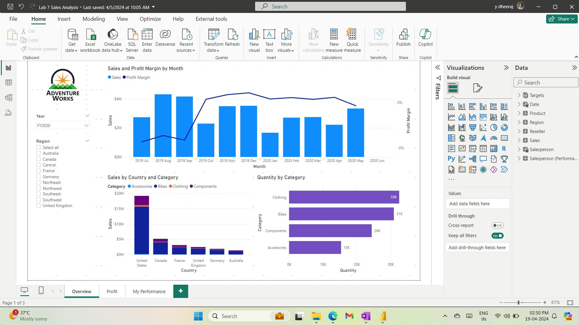
iv. Sync slicers
you’ll sync the Year and Region slicers
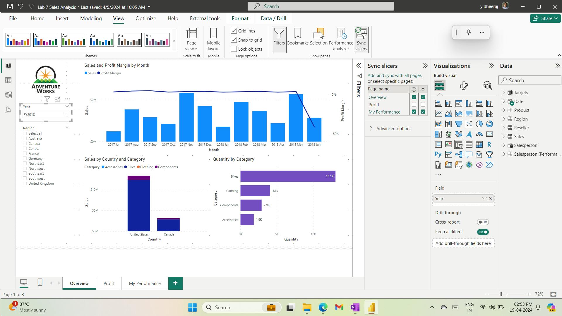
v. Configure drill through
you’ll create a new page and configure it as a drill through page
vi. Create a drill through page
you’ll create a new page and configure it as a drill through page
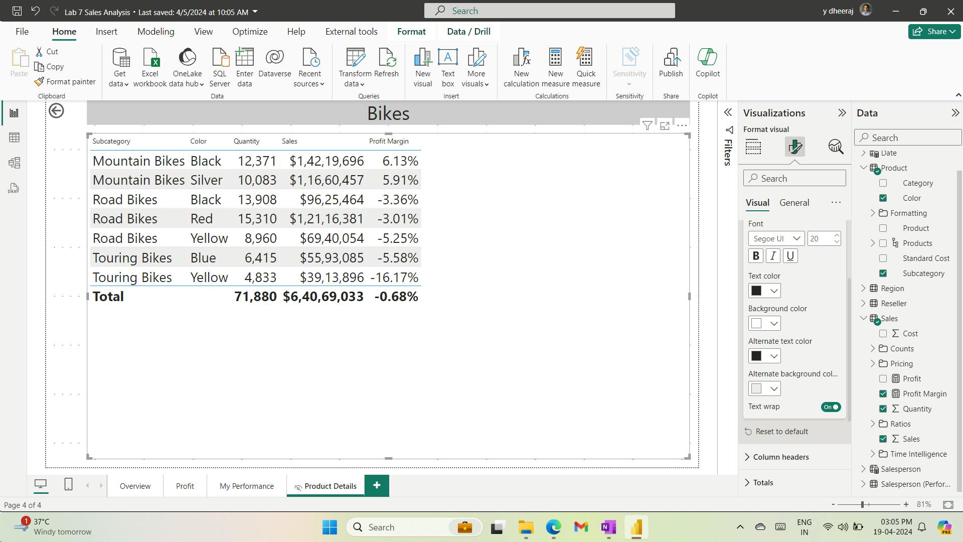
vii. Add Conditional Formatting
viii. Add conditional formatting
you’ll enhance the drill through page with conditional formatting.
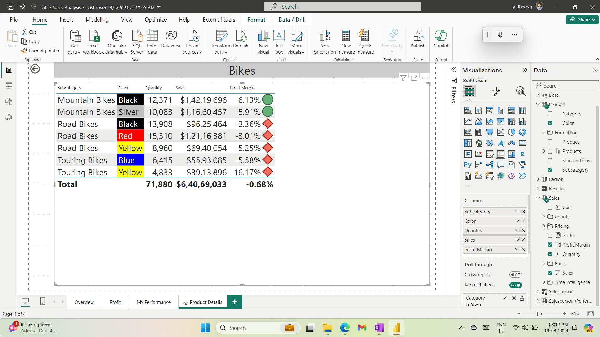
ix. Add Bookmarks and Buttons
you’ll enhance the My Performance page with buttons, allowing the report user to select the visual type to display
x. Add bookmarks
you’ll add two bookmarks, one to display each of the monthly sales/targets visuals.
Disabling the Data option means the bookmark won’t use the current filter state. That’s important because otherwise the bookmark would permanently lock in the filter currently applied by the Year slicer
bookmark to ignore filters (Data option off)
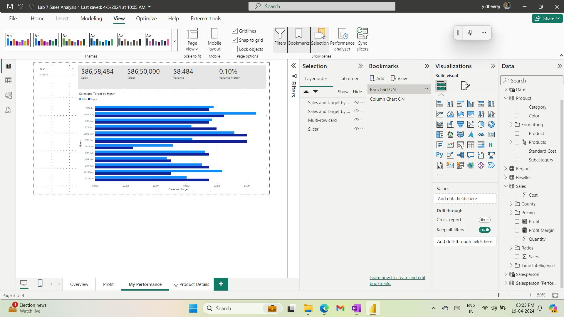
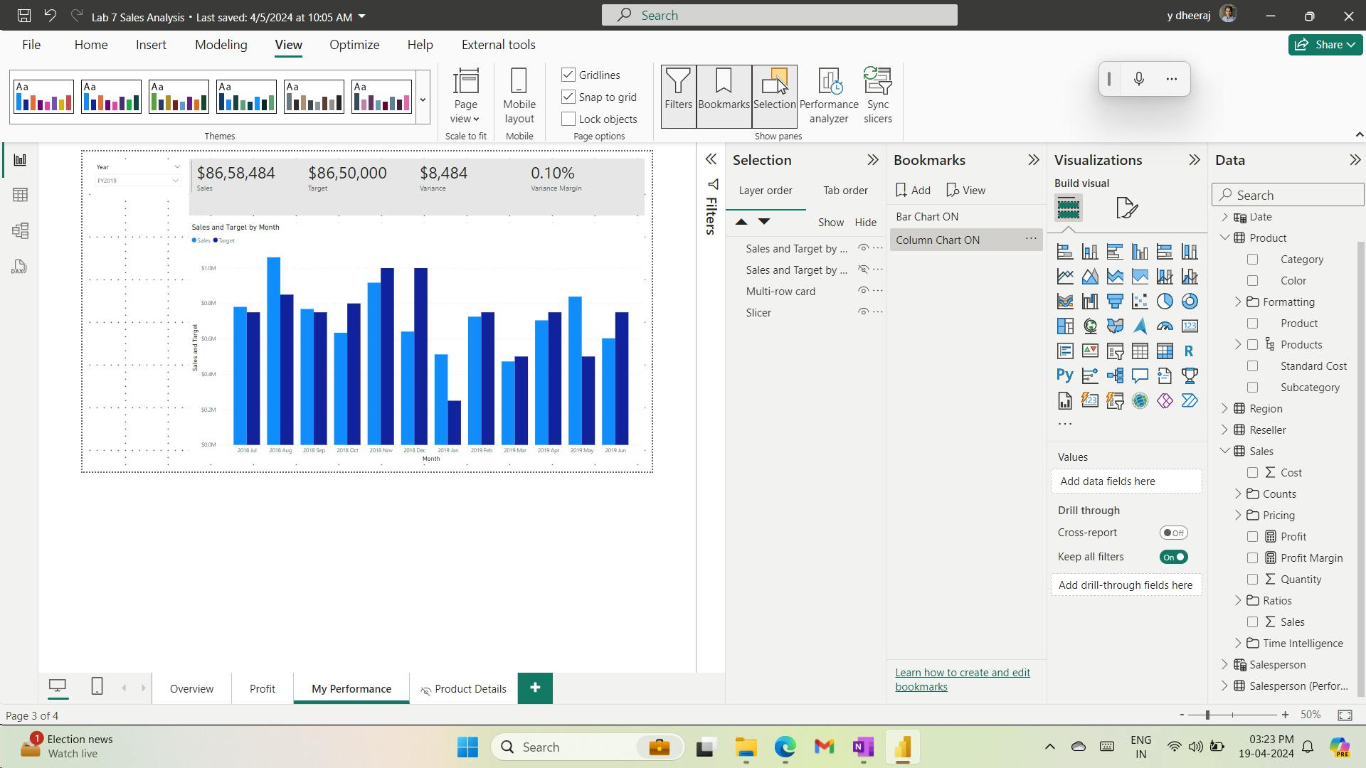
xi. Add buttons
you’ll add two buttons, and assign bookmark actions to each.
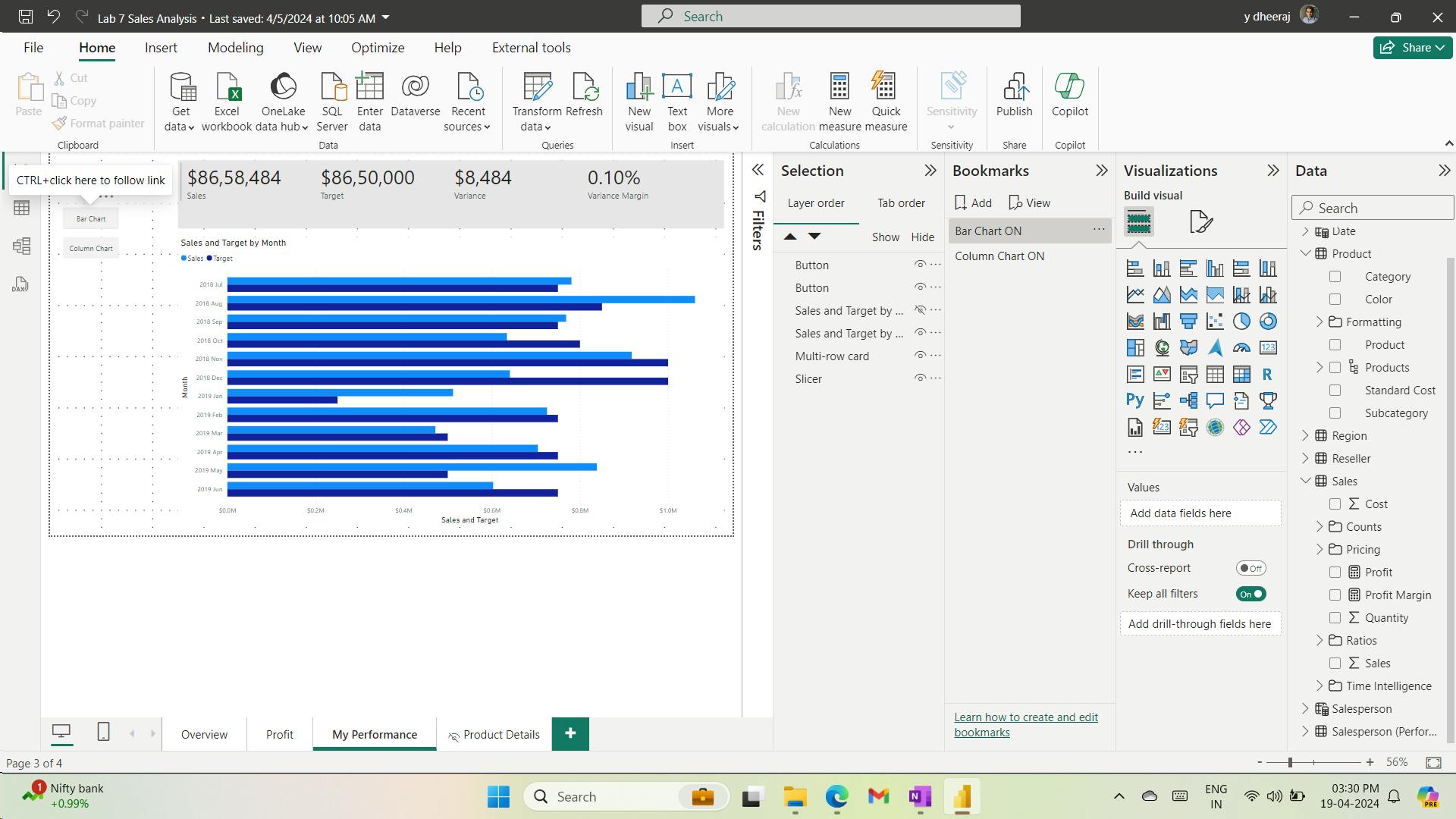
xii. Publish the report
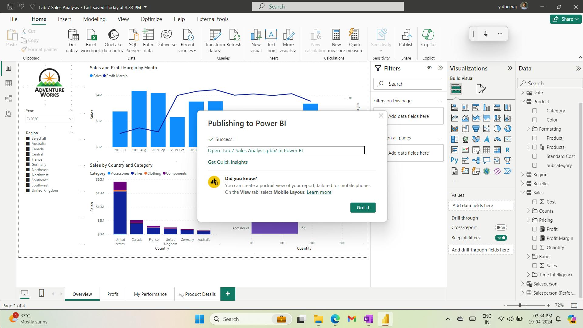
xiii. Explore the report
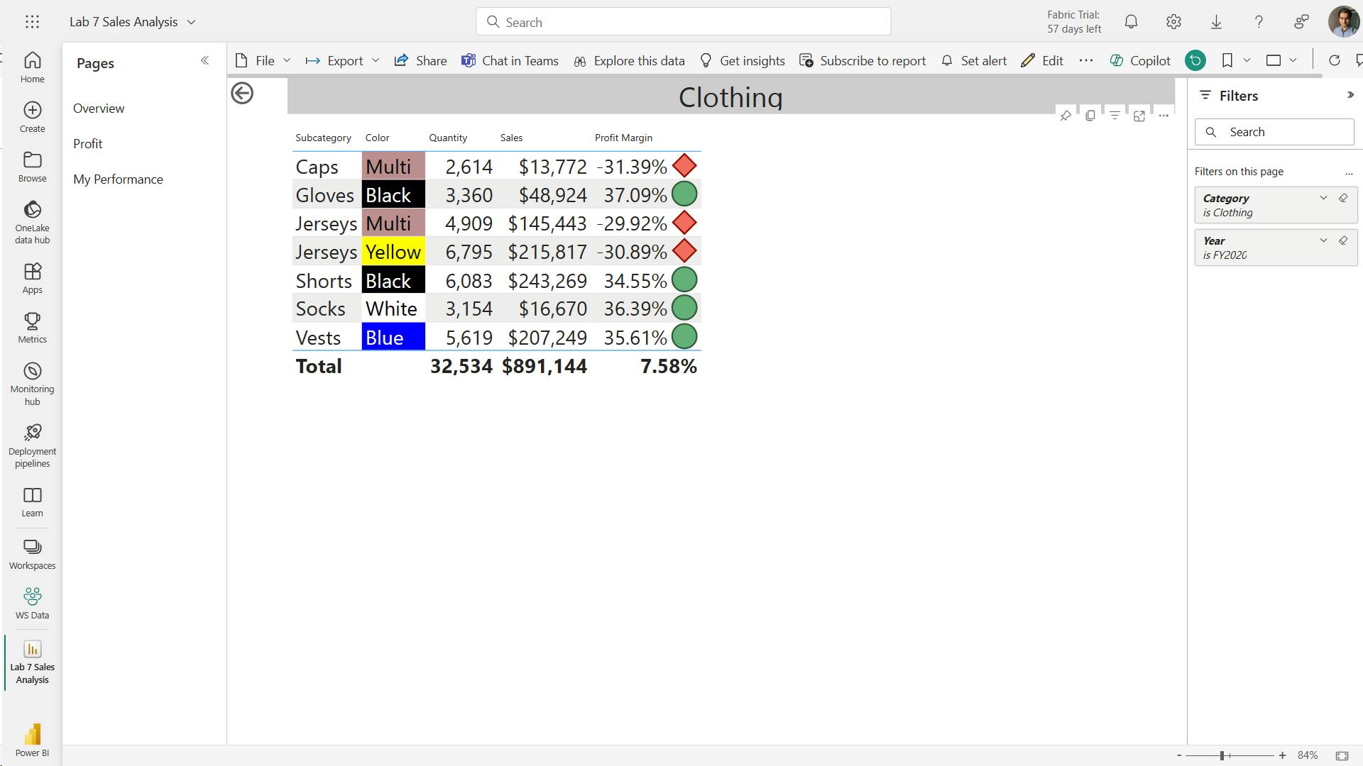
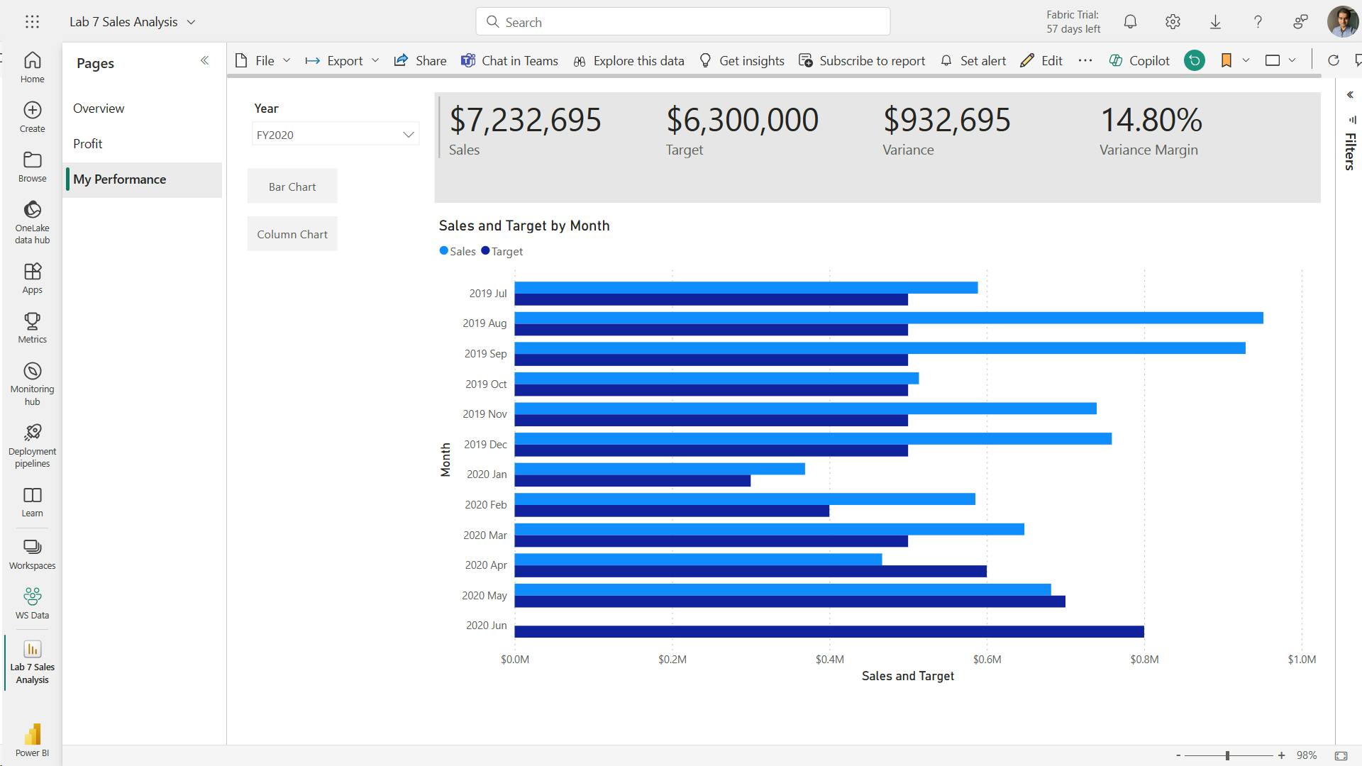
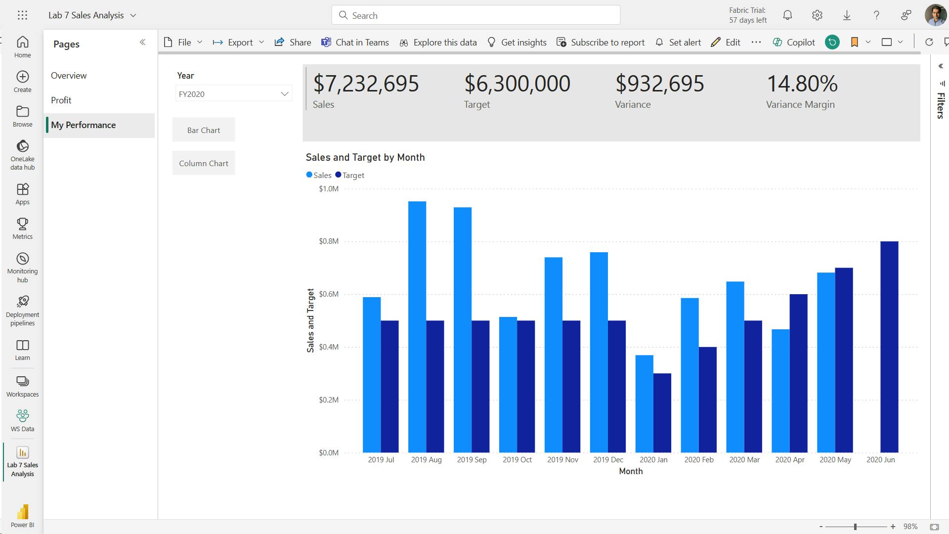
11. Check your knowledge
At the Contoso Skateboard Company, Sally is creating a report to show sales over time. Sally is aware that occasional spikes occur in sales revenue that could be attributed to many different reasons, such as a marketing campaign. Sally needs to ensure that supporting visuals provide explanation for the spikes. What type of visual should Sally use?
Adding anomaly detection to a line chart visual will highlight anomalies and provide accompanying explanations as data visuals.
The Q&A visual allows for the entry of natural language questions that are answered by data visuals. It can’t provide explanation for spikes in data.
At the Contoso Skateboard Company, Sanjay is authoring a report that will be distributed to sales managers. The report contains some sensitive data that shouldn’t be exported. Which report design feature can Sanjay configure to ensure that data isn’t exported?
Correct. By disabling the More options (…) icon, report consumers can’t export data.
Page tooltips allow your report consumers to gain deeper insights quickly and efficiently from a visual. It can’t restrict the exporting of data.
What is the purpose of the Display state in bookmarks?
The Display state captures the visibility of report objects, such as shapes, images, buttons, and text boxes.
12. Summary
Sync slicers
drill through page
conditional formatting
bookmarks
buttons
Learning objectives
In this module, you will:
Design reports to show details.
Design reports to highlight values.
Design reports that behave like apps.
Work with bookmarks.
Design reports for navigation.
Work with visual headers.
Design reports with built-in assistance.
Use specialized visuals.
XIII. Module 13 Perform analytics in Power BI
| Course | Microsoft Power BI Data Analyst |
| Module 13/17 | Perform analytics in Power BI |

You'll learn how to use Power BI to perform data analytical functions, how to identify outliers in your data, how to group data together, and how to bin data for analysis. You'll also learn how to perform time series analysis.
Finally, you'll work with advanced analytic features of Power BI, such as Quick Insights, AI Insights, and the Analyze feature.
1. Introduction to analytics
Analytics - data mining, big data analytics, machine learning, AI, and predictive analytics.
technical aspects of analytics - predictive capabilities, solve business problems.
Additionally, analytics can help with fraud detection, image recognition, sentiment analysis
2. Explore statistical summary
statistical summary - quick and simple description of data.
Power BI - statistical analysis - DAX functions, visuals: histograms, bell curves, advanced analytics visuals, statistical programming languages: Python, R.
TOPN DAX function
Top 10 Products =
SUMX ( TOPN ( 10, Product, Product[Total Sales]), [Total Sales] )
3. Identify outliers with Power BI visuals
outlier - anomaly in data.
i. Use a visual to identify outliers
scatter chart - relationship between two numerical, display patterns in large sets of data, displaying outliers
ii. Use DAX to identify outliers
Outliers =
CALCULATE (
    [Order Qty],
    FILTER (
        VALUES ( Product[Product Name] ),
        COUNTROWS ( FILTER ( Sales, [Order Qty] >= [Min Qty] ) ) > 0
    )
)
4. Group and bin data for analysis
putting values into equal-sized groups (binning).
Grouping - categories of data.
Binning - grouping continuous fields, such as numbers and dates.
5. Apply clustering techniques
Clustering - identify a segment (cluster) of data that is similar to each other but dissimilar to the rest of the data
6. Conduct time series analysis
Time series analysis - analyzing a series of data in time order - trends and make predictions
7. Use the Analyze feature
Analyze feature - analyzing why your data distribution looks the way that it does.
8. Create what-if parameters
what-if parameters to run scenarios and scenario-type analysis on your data
what-if parameters - look at historical data to analyze potential outcomes
what-if parameters - look forward, to predict or forecast what could happen in the future.
9. Use specialized visuals
specialized visuals - AI visuals - Power BI uses machine learning to discover and display insights from data
The three main AI visuals are:
Key influencers
Decomposition tree
Q&A
i. Key influencers
Key influencers visual - understand the factors that drive a particular metric - will analyze the data, rank the factors that matter, and then present them as key influencers.
ii. Decomposition tree
Decomposition Tree - visualize data across multiple dimensions, automatically aggregates data, enables to drill down into dimensions in any order - ad hoc exploration and conducting root cause analysis
iii. Q&A
Q&A visual - ask questions of their data and receive responses as data visualizations
10. Exercise - Perform Advanced Analytics with AI Visuals
In this lab, you’ll create the Sales Exploration report.
In this lab you learn how to:
Create animated scatter charts Use a visual to forecast values
i. Lab story
ii. Get started – Sign in
iii. Get started – Create a semantic model
iv. Create the report
v. Create an animated scatter chart
you’ll create a scatter chart that can be animated.
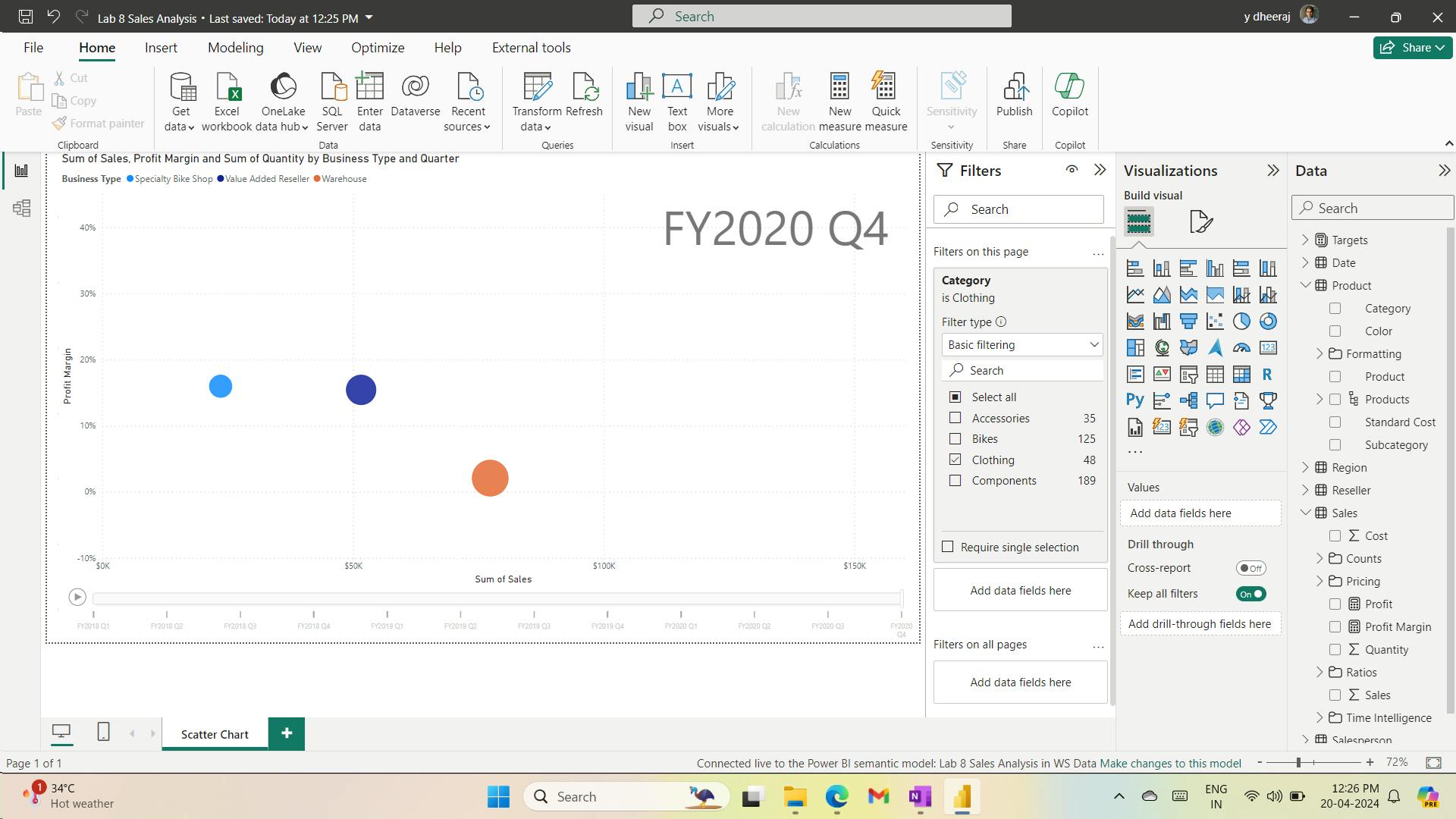
vi. Create a forecast
you’ll create a forecast to determine possible future sales revenue.
When forecasting over a time line, you’ll need at least two cycles (years) of data to produce an accurate and stable forecast.
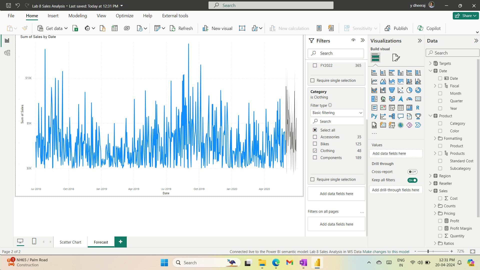
11. Check your knowledge
What Power BI feature can give an in-depth analysis of the distribution of data?
The Analyze feature allows a user to understand why the distribution looks the way that it does. Correct. The Analyze feature gives an in-depth analysis of the distribution of data.
How can you access the time series chart visual?
Time series charts can be imported from AppSource. Correct. Time series charts can be imported from AppSource.
What visual should be used to display outliers?
The scatter chart is best to display outliers. Correct. The scatter chart displays outliers best.
12. Summary
Additionally, analytics can help with fraud detection, image recognition, sentiment analysis
outlier - anomaly in data.
scatter chart - relationship between two numerical, display patterns in large sets of data, displaying outliers
Grouping - categories of data.
Binning - grouping continuous fields, such as numbers and dates.
Clustering - identify a segment (cluster) of data that is similar to each other but dissimilar to the rest of the data
Time series analysis - analyzing a series of data in time order - trends and make predictions
Analyze feature - analyzing why your data distribution looks the way that it does.
what-if parameters to run scenarios and scenario-type analysis on your data
what-if parameters - look at historical data to analyze potential outcomes
what-if parameters - look forward, to predict or forecast what could happen in the future.
specialized visuals - AI visuals - Power BI uses machine learning to discover and display insights from data - Key influencers, Decomposition tree, Q&A.
Decomposition Tree - visualize data across multiple dimensions, automatically aggregates data, enables to drill down into dimensions in any order - ad hoc exploration and conducting root cause analysis
Q&A visual - ask questions of their data and receive responses as data visualizations
When forecasting over a time line, you’ll need at least two cycles (years) of data to produce an accurate and stable forecast.
Learning objectives
In this module, you'll:
Explore statistical summary.
Identify outliers with Power BI visuals.
Group and bin data for analysis.
Apply clustering techniques.
Conduct time series analysis.
Use the Analyze feature.
Use advanced analytics custom visuals.
Review Quick insights.
Apply AI Insights.
XIV. Module 14 Create and manage workspaces in Power BI
| Course | Microsoft Power BI Data Analyst |
| Module 14/17 | Create and manage workspaces in Power BI |

Learn how to navigate the Power BI service, create and manage workspaces and related items, and distribute reports to users.
1. Introduction
load and transform data from numerous sources - build visuals - create DAX equations - publish report to Power BI - share these reports - workspace
A workspace is a centralized repository in which you can collaborate with colleagues and teams to create collections of reports and dashboards.
workspaces to house reports and dashboards for use by multiple teams
highest level of security is maintained by controlling who can access semantic models, reports, and dashboards.
2. Distribute a report or dashboard
3. Monitor usage and performance
4. Recommend a development life cycle strategy
Deployment pipeline
5. Troubleshoot data by viewing its lineage
Lineage view - relationships between the artifacts in a workspace and their external dependencies.
6. Configure data protection
7. Check your knowledge
How is the Admin workspace role different from other types of workspace roles?
Admin is the only role that can remove any users. Only Admins can add and remove users from a workspace.
Which one of the following options is the best description of a workspace?
A workspace is a centralized location or repository that allows you to collaborate with colleagues and teams to create collections of reports, dashboards, and so on. A workspace is a centralized location or repository that allows you to collaborate with colleagues and teams to create collections of reports, dashboards, and so on.
What feature in Power BI service can you use to troubleshoot the flow of data from its source to its destination?
Lineage view Lineage view allows you to view and troubleshoot the data flow from source to destination.
8. Summary
A workspace is a crucial feature of Power BI that allows you to share reports, build dashboards, and collaborate with your teams.
Power BI workspaces can help increase performance in your reports, ensure that appropriate security requirements are applied, make it easier for you to share content, and more.
With this information, you can add to your toolkit the ability to manage workspaces in Power BI service so that you can build your dashboards in the most efficient way possible.
Learning objectives
In this module, you will:
Create and manage Power BI workspaces and items.
Distribute a report or dashboard.
Monitor usage and performance.
Recommend a development lifecycle strategy.
Troubleshoot data by viewing its lineage.
Configure data protection.
XV. Module 15 Manage semantic models in Power BI
| Course | Microsoft Power BI Data Analyst |
| Module 15/17 | Manage semantic models in Power BI |

Microsoft Power BI - single semantic model to build many reports.
scheduled semantic model refreshes and resolving connectivity errors.
1. Introduction
one semantic model can be used by multiple users
make the reports more dynamic so that they can filter the data themselves
2. Use a Power BI gateway to connect to on-premises data sources
Two types of on-premises gateways are:
Organization mode - multiple users to connect to multiple on-premises data sources and is suitable for complex scenarios.
Personal mode - one user to connect to data sources. This type of gateway can be used only with Power BI and it can't be shared with other users, so it is suitable in situations where you're the only one in your organization who creates reports. You will install the gateway on your local computer, which needs to stay online for the gateway to work.
i. on-premises gateway
When you are working in the cloud and interacting with an element that is connected to an on-premises data source, the following actions occur:
The cloud service creates a query and the encrypted credentials for the on-premises data source. The query and credentials are sent to the gateway queue for processing.
The gateway cloud service analyzes the query and pushes the request to Microsoft Azure Service Bus.
Service Bus sends the pending requests to the gateway.
The gateway gets the query, decrypts the credentials, and then connects to one or more data sources with those credentials.
The gateway sends the query to the data source to be run.
The results are sent from the data source back to the gateway and then to the cloud service. The service then uses the results.

ii. Troubleshoot an on-premises data gateway
how to run a network port test
how to provide proxy information for your gateway
current data center region that you're in
3. Configure a semantic model scheduled refresh
Power BI deactivates your refresh schedule after four consecutive failures or when the service detects an unrecoverable error that requires a configuration update, such as invalid or expired credentials. It is not possible to change the consecutive failures threshold.
If a semantic model displays a small warning icon, you'll know that the semantic model is currently experiencing an issue. Select the warning icon to get more information.
4. Configure incremental refresh settings
Incremental refresh should only be used on data sources and queries that support query folding
Quicker refreshes - Only data that needs to be changed gets refreshed
Reduced resource consumption - Because you only need to refresh the smaller the amount of data, the overall consumption of memory and other resources is reduced.
You can define an incremental refresh policy to solve this business problem. This process involves the following steps:
i. Define the filter parameters.
ii. Use the parameters to apply a filter.
iii. Define the incremental refresh policy.
iv. Publish changes to Power BI service.
5. Manage and promote semantic models
Power BI provides two ways to endorse your semantic models:
Promotion - Promote your semantic models when they're ready for broad usage.
Certification - Request certification for a promoted semantic model. Certification can be a highly selective process, so only the truly reliable and authoritative semantic models are used across the organization.
6. Troubleshoot service connectivity
If your data source credentials are not up to date, you'll need to take further action to investigate and resolve the issue.
7. Boost performance with query caching (Premium)
Query Caching is a local caching feature that maintains results on a user and report basis. Query caching reduces load time and increases query speed, especially for semantic models that aren't refreshed often and are accessed frequently.
8. Check your knowledge
Where are semantic model-scheduled refreshes configured?
Power BI service semantic model-scheduled refreshes are configured in Power BI service.
What reserved parameters configure the start and end of where Incremental refresh should occur?
RangeStart and RangeEnd RangeStart and RangeEnd configure the start and end of where Incremental refresh should occur.
What is the difference between Promotion and Certification when you are endorsing a semantic model?
Promotion is for broad usage while Certification needs permission granted on the Admin Tenant settings. Promotion does not need specific permissions while Certification requires permission from the semantic model owner to access to the semantic model.
9. Summary
This module allowed you to take advantage of the following features of Power BI to help you manage your semantic models:
Two data refresh options to help you automate the refresh process and make it more efficient.
Endorsement features for your most critical semantic models to help your users identify the semantic models that they should use.
The on-premises gateway and ideas on how to troubleshoot potential connectivity issues.
These semantic model management techniques will help you to increase the ease of access and up-to-date nature of your semantic models, and will help you build high-quality reports and dashboards so that your users can make real-time decisions.
Learning objectives
In this module, you will:
Use a Power BI gateway to connect to on-premises data sources.
Configure a scheduled refresh for a semantic model.
Configure incremental refresh settings.
Manage and promote semantic models.
Troubleshoot service connectivity.
Boost performance with query caching (Premium).
XVI. Module 16 Create dashboards in Power BI
| Course | Microsoft Power BI Data Analyst |
| Module 16/17 | Create dashboards in Power BI |

Power BI report uses data from a single semantic model, a Power BI dashboard can contain visuals from different semantic models.
1. Introduction to dashboards
i. Dashboards vs. reports
| Dashboards | Reports |
| Create only in service | Create in Power BI Desktop (limited in service) |
| Single page | Multiple pages |
| Static tiles | Interactive visuals |
| Read-only tiles | Filters pane |
dashboards and reports can be refreshed to show the latest data.
ii. Get started with dashboards
Dashboards are created by pinning report visuals, and are then called tiles within reports.
2. Configure data alerts
Data alerts can notify you or a user that a specific data point is above, below, or at a specific threshold that you can set.
3. Explore data by asking questions
4. Review Quick insights
5. Add a dashboard theme
6. Pin a live report page to a dashboard
Dashboards are intended to be a collection from various sources, not just as a "launching pad" for reports.
We recommend that you pin at the tile level first and foremost, and if needed, the entire report page can also be pinned. Seeing an entire report page in a dashboard tile can be difficult.
7. Configure a real-time dashboard
Power BI's real-time streaming semantic models, you can stream data and update dashboards as soon as the data is logged.
i. Stream in Power BI

Data - from streaming data source - stored in a temporary cache, not a semantic model - means you can't make changes to the semantic model.
visualize the data from a streaming data source - create a tile directly on a dashboard and use a custom streaming data source.
tiles - optimized because no database exists to pull the data from - These types of tiles have low latency and are best suited for data that doesn't need additional transformations, such as temperature or humidity.
ii. Visualize real-time data in Power BI
8. Set mobile view
9. Exercise - Create a Power BI dashboard
i. Lab story
In this lab, you’ll create the Sales Monitoring dashboard in the Power BI service using an existing report.
In this lab you learn how to:
Pin visuals to a dashboard
Use Q&A to create dashboard tiles
ii. Get started – Sign in
iii. Get started – Publish the report
iv. Create a dashboard
In this task, you’ll create the Sales Monitoring dashboard. You’ll pin a visual from the report, and add a tile based on an image data URI, and use Q&A to create a tile.
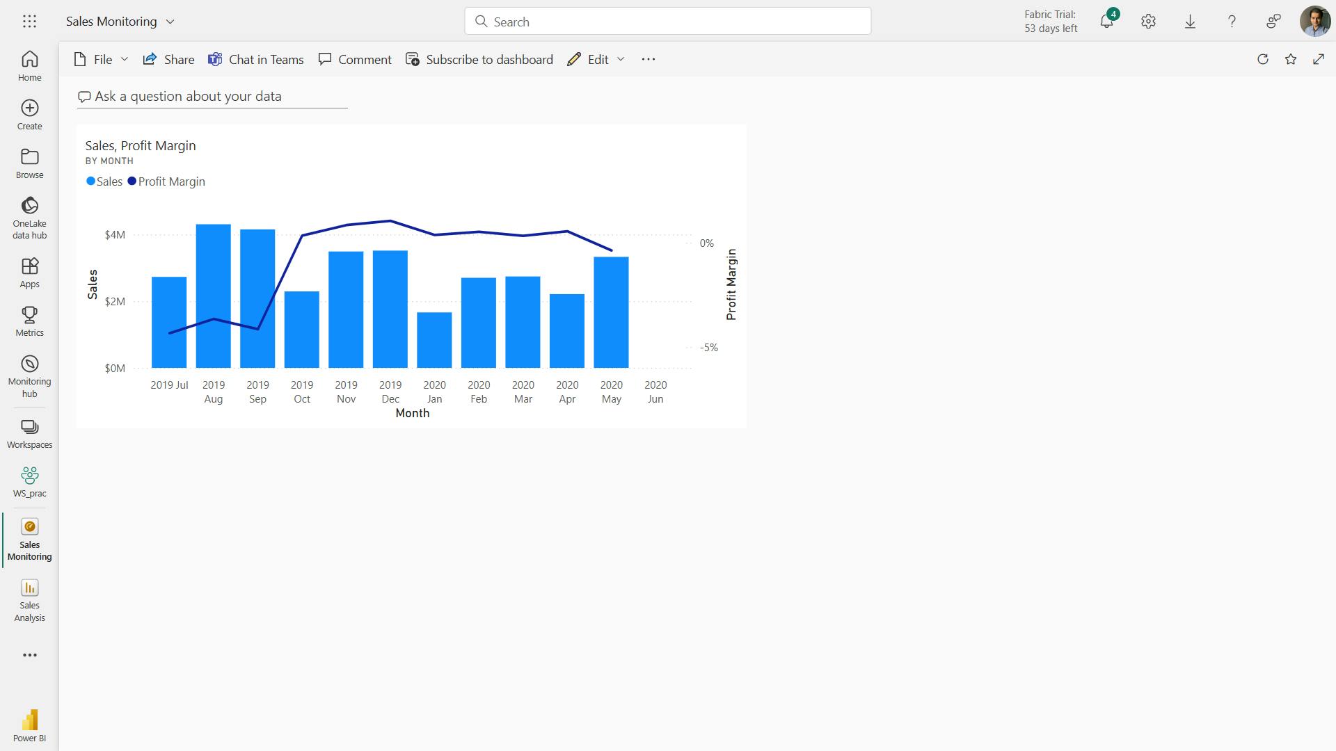
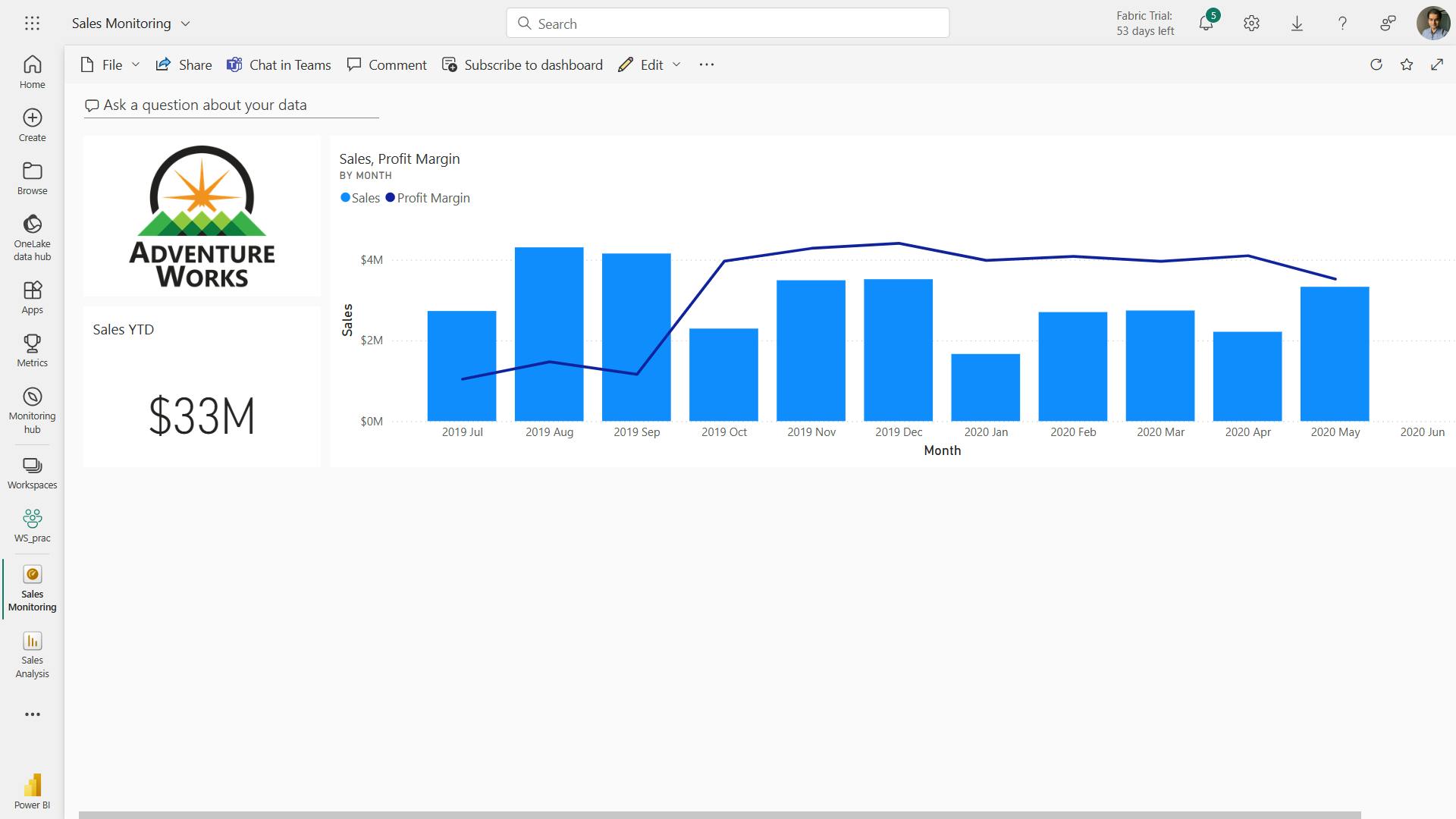
v. Edit tile details
In this task, you’ll edit the details of two tiles.
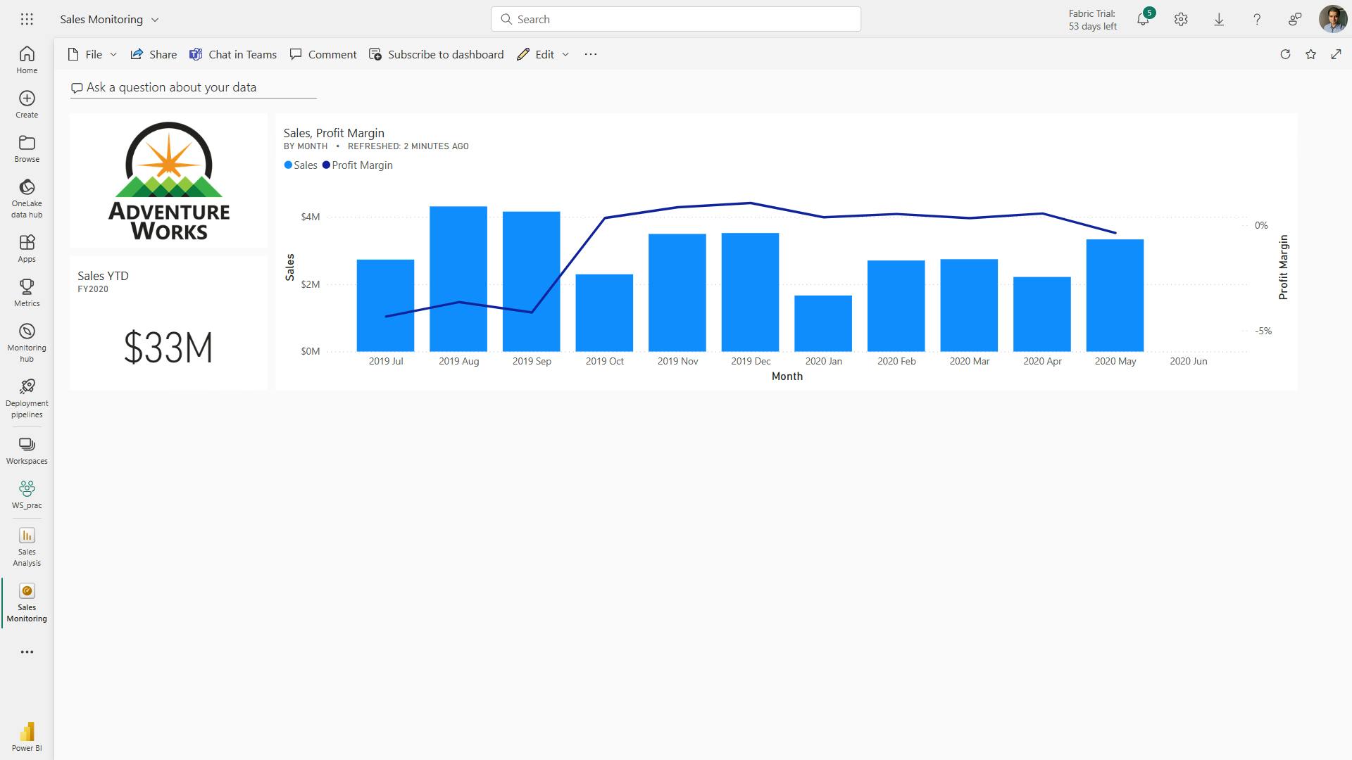
vi. Refresh the Semantic model
In this exercise, you’ll first load sales order data for June 2020 into the AdventureWorksDW2020 database. You’ll then open your Power BI Desktop file, perform a data refresh, and then upload the file to your workspace.
vii. Update the lab database
No data:
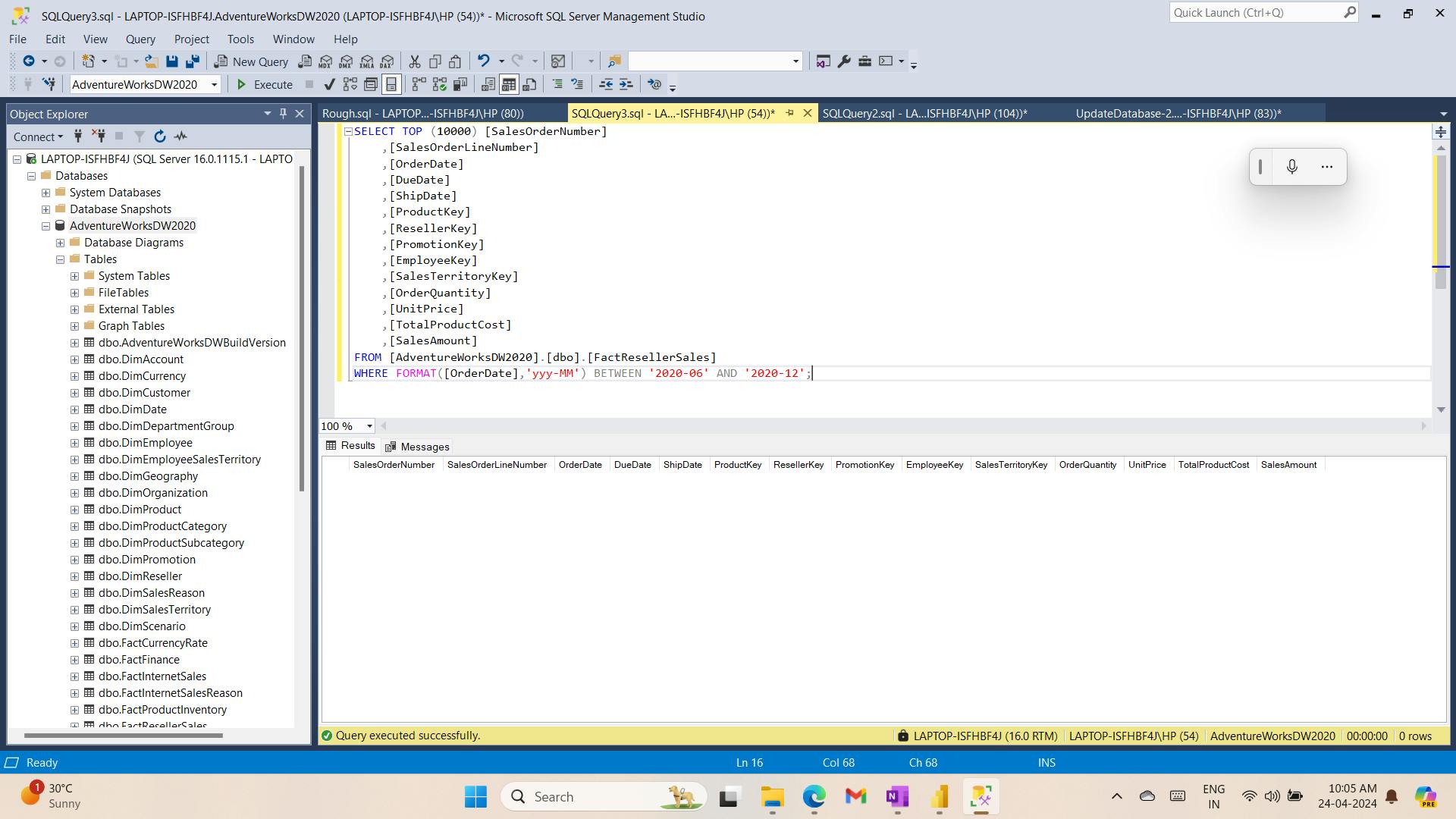
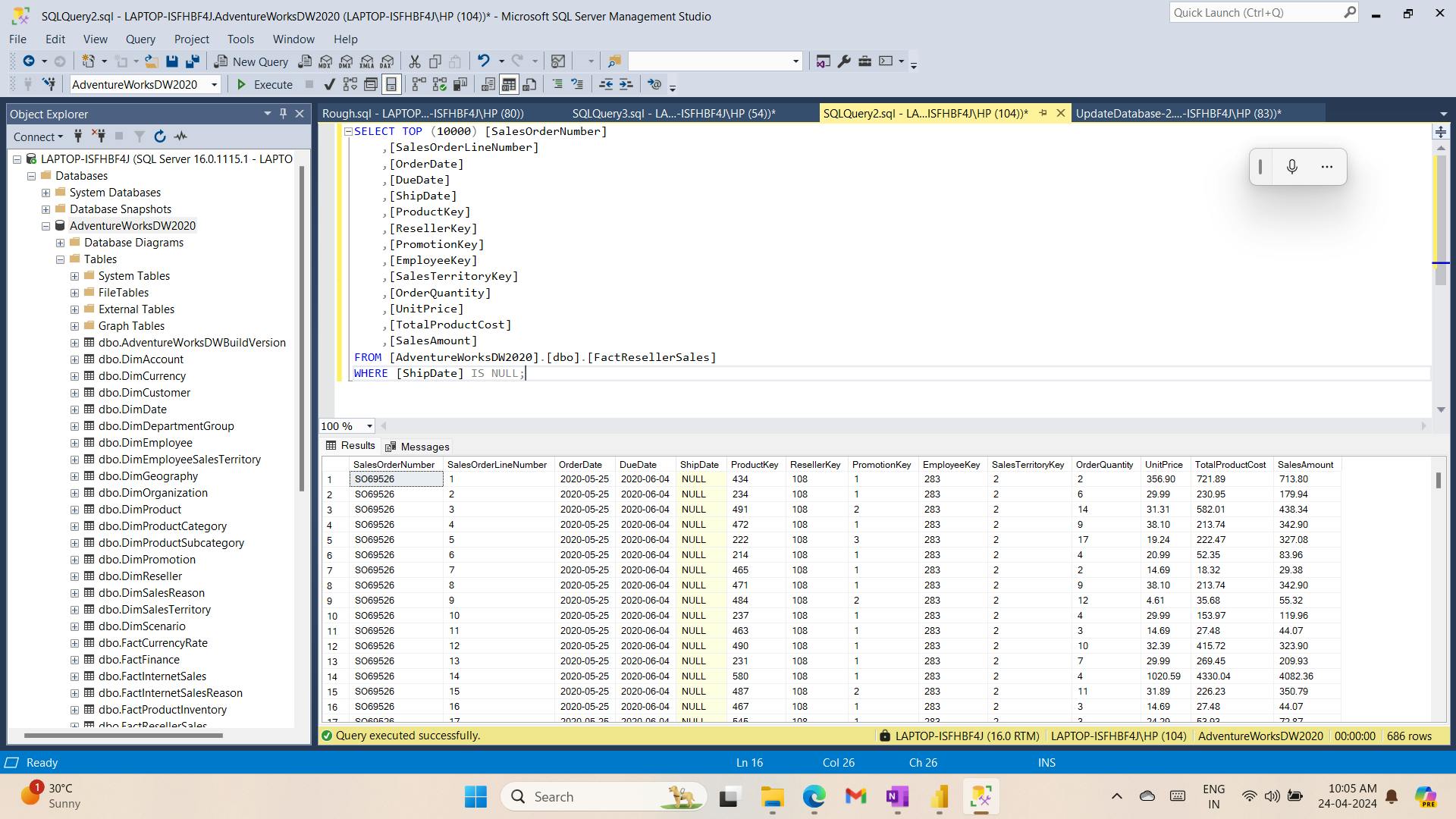
Now,
UPDATE [dbo].[FactResellerSales] SET [ShipDate] = DATEADD(DAY, 7, [OrderDate]) WHERE [ShipDate] IS NULL;
Load data from csv file:
--Add June 2020 sales
BULK INSERT [dbo].[FactResellerSales] FROM 'F:\Power BI\filesfrom internet\Allfiles\Resources\ResellerSales_202006.csv' WITH
(
    DATAFILETYPE = 'widechar'
    ,FIRSTROW = 2
    ,FIELDTERMINATOR = ','
    ,ROWTERMINATOR = '\n'
    ,TABLOCK
);
GO
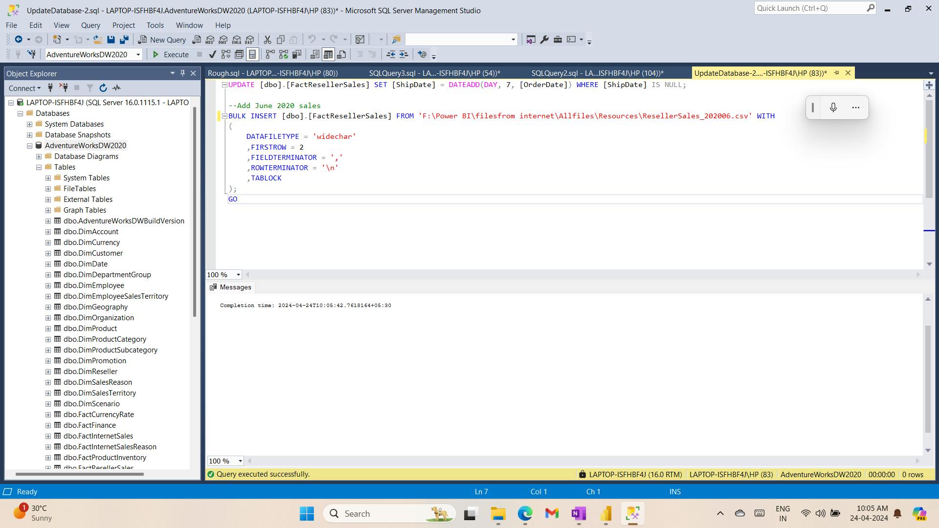
Data:
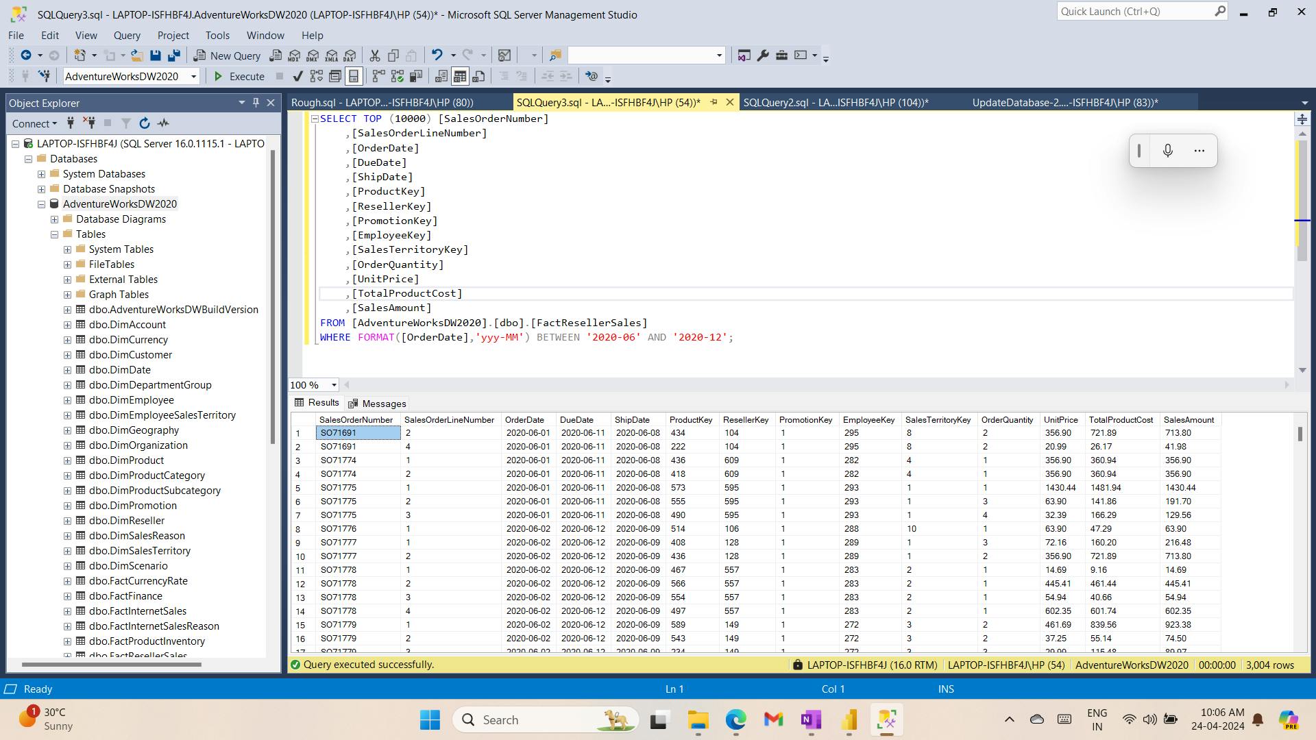
viii. Refresh the Power BI Desktop file
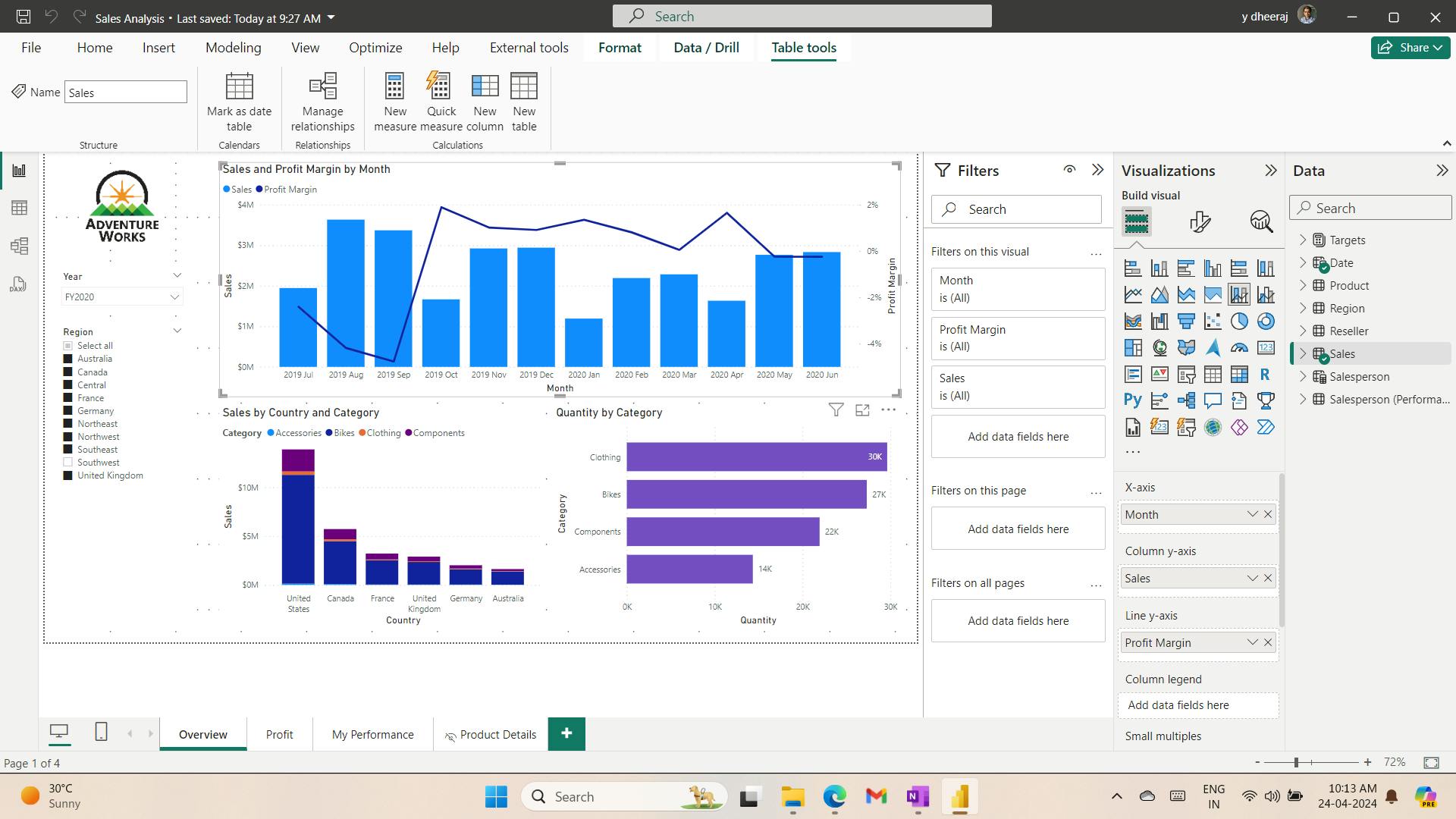
ix. Review the dashboard
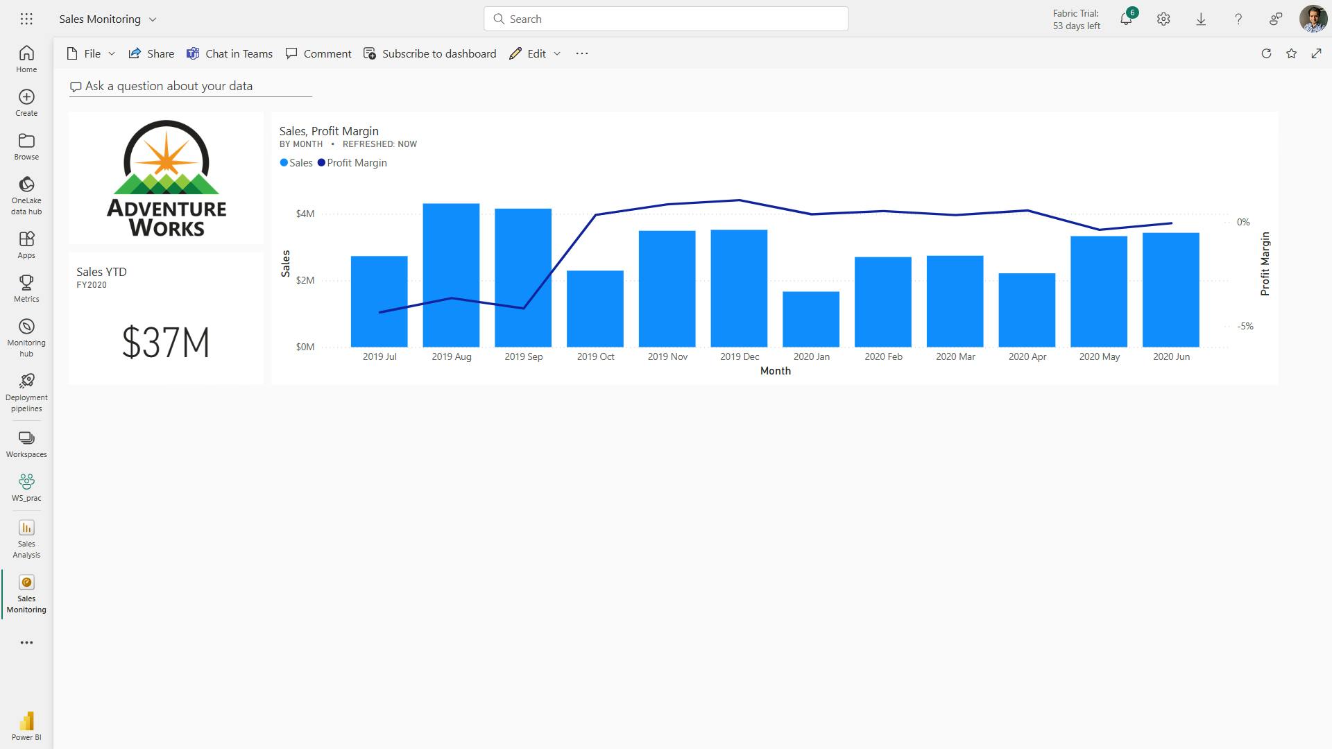
10. Check your knowledge
What is a dashboard?
A canvas of report elements that can be built in Power BI service. Correct. Dashboards can only be built in Power BI service.
What is one way that reports and dashboards differ?
In reports, you can have multiple pages; in dashboards, you can have only one page. Correct. You can have only one-page dashboards, but you can have multiple page reports.
Where can you configure and set data alerts?
Data alerts can be set only in Power BI service on specific visuals such as KPI cards, gauges, and cards. Correct. Data alerts can be set only in Power BI service on specific visuals.
11. Summary
In this module, you have learned about dashboards: what they are, why you need them, and what tiles and pinning are in relation to dashboards. You have also learned how to accomplish several tasks around dashboards, such as:
Setting mobile view.
Adding a theme to the visuals in your dashboard.
Configuring data classification.
Adding real-time semantic model visuals to your dashboards.
Pinning a live report page to a dashboard.
With this new knowledge, consider how you can transform the data that you have to create a story. Dashboards can help you visualize that story.
Learning objectives
In this module, you'll:
Set a mobile view.
Add a theme to the visuals in your dashboard.
Add real-time semantic model visuals to your dashboards.
Pin a live report page to a dashboard.
XVI. Module 17 Implement row-level security
| Course | Microsoft Power BI Data Analyst |
| Module 17/17 | Implement row-level security |

Row-level security (RLS) allows you to create a single or a set of reports that targets data for a specific user. In this module, you'll learn how to implement RLS by using either a static or dynamic method and how Microsoft Power BI simplifies testing RLS in Power BI Desktop and Power BI service.
1. Introduction
Row-level security (RLS) uses a DAX filter as the core logic mechanism.
2. Configure row-level security with the static method
RLS - static (fixed value in the DAX filter) or dynamic method (DAX function) - DAX filter as the core logic mechanism.
RLS involves several configuration steps, which should be completed in the following order:
Create a report in Microsoft Power BI Desktop.
Import the data.
Confirm the semantic model between both tables.
Create the report visuals.
Create RLS roles in Power BI Desktop by using DAX.
Test the roles in Power BI Desktop.
Deploy the report to Microsoft Power BI service.
Add members to the role in Power BI service.
Test the roles in Power BI service.
3. Configure row-level security with the dynamic method
userprincipalname() function
4. Exercise - Enforce row-level security in Power BI
In this exercise, you’ll enforce row-level security to ensure that a salesperson can only analyze sales data for their assigned region(s).
In this exercise you learn how to:
Enforce row-level security
Choose between dynamic and static methods
i. Lab story
ii. Get started
iii. Enforce row-level security
In this task, you’ll enforce row-level security to ensure a salesperson can only see sales made in their assigned region(s).
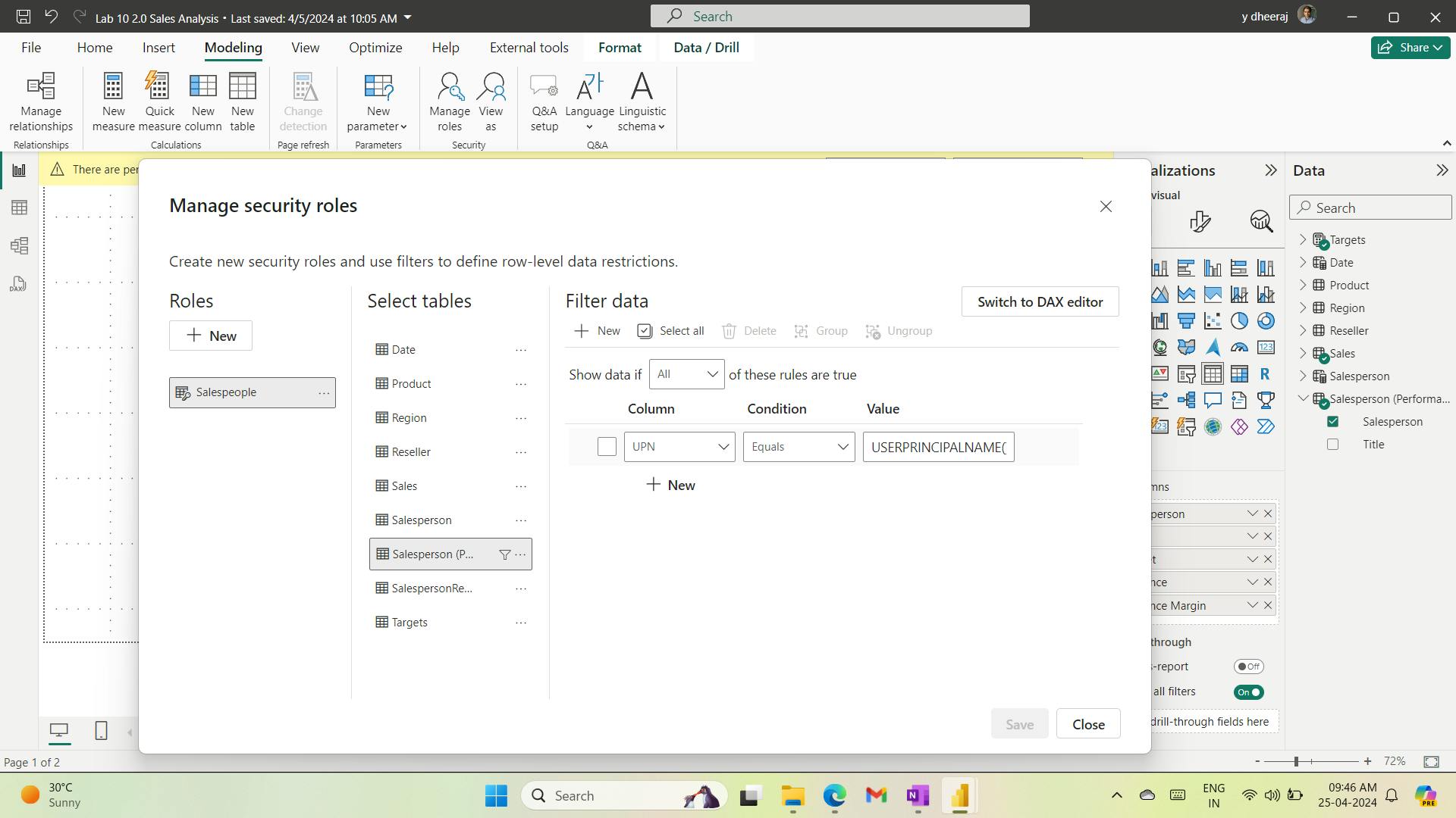
after:
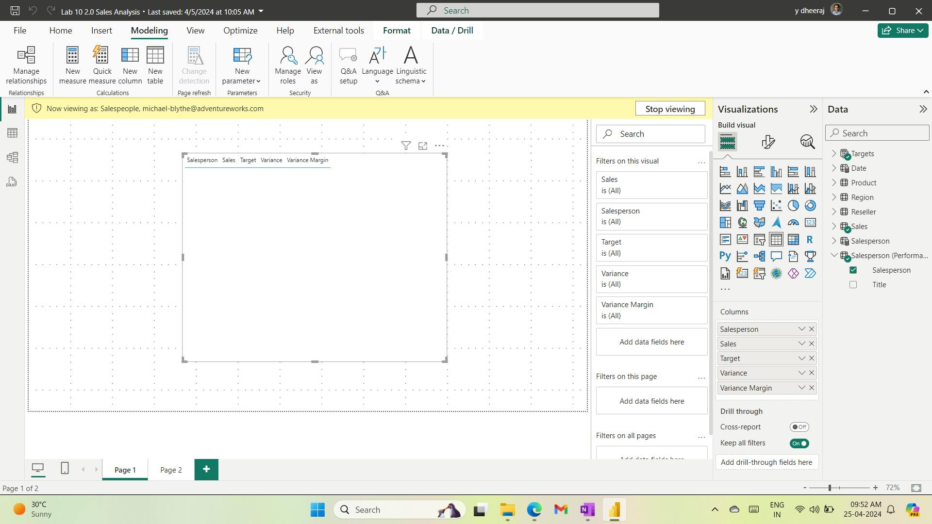
Not working for me.
5. Check your knowledge
Which function will tell you the username of the person who is signed in to Power BI service?
USERPRINCIPALNAME() The USERPRINCIPALNAME() function will tell you which user is signed in to view a report.
Where can you test RLS by using different security roles?
Both Power BI Desktop and Power BI service You can use Power BI Desktop and Power BI service to test RLS.
6. Summary
This module described row-level security (RLS), the ability in Power BI to limit what a user sees on a specific report.
RLS targets the data to a specific user, for instance, only allowing a manager to see the salary of their direct reports.
RLS is implemented with a combination of Power BI Desktop and Power BI service. To implement RLS, you can create a DAX formula that restricts their data access, which makes RLS versatile.
You can use DAX to indicate that someone can only see records in the United States or sales transactions that are below a certain dollar amount.
This programmatic approach means that RLS can be used in a variety of solutions.
After you have created the DAX formula in a specific security role, you can deploy the report and then add users to that role. RLS is an effortlessly implemented, powerful security feature of Power BI.
Learning objectives
In this module, you will:
Configure row-level security by using a static method.
Configure row-level security by using a dynamic method.
Conclusion
Learning Objectives,
Discover data analysis
Get started building with Power BI
Get data in Power BI
Prepare the data
Model the data
Visualize and analyze the data
Deploy and maintain items